Box and Whisker Plots
530 likes | 729 Vues
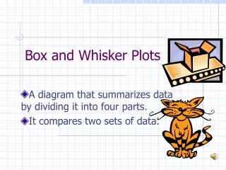
Box and Whisker Plots. An interactive lesson. Introduction. A box-and-whisker plot can be useful for handling many data values. They allow people to explore data and to draw informal conclusions when two or more variables are present.

Box and Whisker Plots
E N D
Presentation Transcript
Box and Whisker Plots An interactive lesson
Introduction • A box-and-whisker plot can be useful for handling many data values. • They allow people to explore data and to draw informal conclusions when two or more variables are present. • It shows only certain statistics rather than all the data. • Box and whisker plots consists of the median, the quartiles, and the smallest and greatest values in the distribution.
A box plot summarizes data using the median, upper and lowerquartiles, and the extreme (least and greatest) values. It allows you to see important characteristics of the data at a glance.
How to make a Box and Whisker Plot • Put your set of date in increasing numerical order (if it isn’t already).Example:100, 27, 34, 54, 59, 18, 52, 61, 78, 68, 82, 87, 85, 93, 91.Should now look like this …18, 27, 34, 52, 54, 59, 61, 68, 78, 82, 85, 87, 91, 93, 100.
Step 2 - Median • Find the median of your set of data*Remember the median is the value exactly in the middle of an ordered set of numbers*18, 27, 34, 52, 54, 59, 61, 68, 78, 82, 85, 87, 91, 93, 100. Q: What would you do it you had an even set of numbers?
Step 3 – Lower Quartile • Next, we consider only the values to the left of the median 18, 27, 34, 52, 54, 59, 61, 68, 78, 82, 85, 87, 91, 93, 100. We find the median of those numbers 18, 27, 34, 52, 54, 59, 61 Q: This number is call the lower quartile. Can you guess why?
Step 4 – Upper Quartile • Next, we consider only the values to the right of the median 18, 27, 34, 52, 54, 59, 61, 68, 78, 82, 85, 87, 91, 93, 100. We find the median of those numbers 78, 82, 85, 87, 91, 93, 100. Q: This number is call the upper quartile. Can you guess why?
Step 5 – Highest/Lowest Values • Now indicate your lowest and highest values 18, 27, 34, 52, 54, 59, 61, 68, 78, 82, 85, 87, 91, 93, 100.
Step 6 - Drawing • Now we are ready to begin to draw our graph. 18, 27, 34, 52, 54, 59, 61, 68, 78, 82, 85, 87, 91, 93, 100. Plot the lowest value, lower quartile, median, upper quartile, and the highest value on a number line.
Put a line through the Lower Quartile, Median, and Upper Quartile. Then Put a box around those lines
Lastly draw a line from your extreme values to the box There is your Box and Whisker Plot Q: Can you guess where the graph gets it’s name?
Example Problem: The gas mileages in miles per gallon (mpg) of 4-cylinder manual transmission cars are in a table on the next slide
24 25 28 28 29 29 29 30 30 31 31 32 32 32 33 34 37 38 38 39 42 44 44 44 To make a box plot, organize the data by either making a stem and leaf plot or just arranging the data in order least to greatest.
24 25 28 28 29 29 29 30 30 31 31 32 32 32 33 34 37 38 38 39 42 44 44 44Find the median of the data. It is 32This divides the data in half. The lower half :24 25 28 28 29 29 29 30 30 31 31 32 and the upper half:32 32 33 34 37 38 38 39 42 44 44 44
Find the median of the top half of the data. 32 32 33 34 37 38 38 39 42 44 44 44This is called the high median, upper quartile or quartile 3. It is 38.
Take the lower half of the data and find the median of it.24 25 28 28 29 29 29 30 30 31 31 32This data, 29, is called the low median, lower quartile or quartile 1.
Next, find the lower and upper extremes. This simply means the lowest data, 24, and the highest data, 44.Let’s organize all 5 pieces of data together so we can see them.
Lower extreme = 24Lower quartile(Q1) =29Median (Q2) = 32Upper quartile(Q3) =38Upper extreme(Q4)=44The data is now divided into quartiles(4ths) so each quartile represents one-fourth of the data.
Next, make a number line that will best display the 5 pieces of data (24 29 32 38 44)
Place a dot above the number line to show the lower extreme and one for the upper extreme.
Put a vertical slash above the number line for the median and one for the lower and upper quartiles.
Enclose the vertical slashes into a box. Draw a line from the right center of the box to the upper extreme and one from the lower end of the box to the lower extreme, forming the whiskers.
You must label the number line to tell what the data represents.Miles per gallon (mpg)
All graphs must have a title that clearly represents what your graph is showing. Miles per Gallon of 4-cylinder Cars Miles per gallon (mpg)
Interpreting the Box Plot: Study your Box and Whisker Plot to determine what it is telling you. Make a statement about what it is saying, then support the statement with facts from your graph.
You should include the following in your interpretation: • Range or spread of the data and what it means to your graph • Quartiles—compare them. What are they telling you about the data? • Median- this is an important part of the graph, and should be an important part of the interpretation. • Percentages should be used to interpret the data, where relevant.
We will now interpret the data we have on mpg of 4-cylinder cars. We will do this step-by-step, then put all the interpretation together as our final summary.
Miles per Gallon of 4-cylinder Cars Miles per gallon (mpg)
Make a statement about what it is saying, then support the statement with facts from your graph: The Box and Whisker Plot clearly shows that there is a lot of different gas mileages on various 4-cylinder vehicles
Miles per Gallon of 4-cylinder Cars Miles per gallon (mpg)
Range or spread of the data and what it means to your graph The mileage ranged from 24 miles per gallon(mpg) to a high of 44 mpg. This is a 20 miles per gallon spread, which in car mileage is quite a bit of difference.
Quartiles—compare them. What are they telling you about the data? The first quartile reads as 32 mpg which means that 75% of the vehicles in this study got 32 mpg or more. The 3rd quartile tells us that 25% of these cars got 38 mpg or higher which is really good mileage.
Median- this is an important part of the graph, and should be an important part of the interpretation. The median cuts the data in half. The median is 32 mpg. Therefore half the cars in the study received 32 mpg or higher.
Put all the data together in a summary that is clearly stated, uses facts based on the graph, and is easy to follow.
The Box and Whisker Plot clearly shows that there is a lot of different gas mileages on various 4-cylinder vehicles. The mileage ranged from 24 miles per gallon(mpg) to a high of 44 mpg. This is a 20 miles per gallon spread, which in car mileage is quite a bit of difference.
The first quartile reads as 32 mpg which means that 75% of the vehicles in this study got 32 mpg or more. The 3rd quartile tells us that 25% of these cars got 38 mpg or higher which is really good mileage.
The median cuts the data in half. The median is 32 mpg. Therefore half the cars in the study received 32 mpg or higher. From this study, we can conclude that there is a wide range of gas mileage that should be considered when traveling or purchasing a vehicle.
Mean Absolute Deviation Mean Absolute Deviation, referred to as MAD, is a better measure of dispersion than the standard deviation when there are outliers in the data. An outlier is a data point which is far removed in value from the others in the data set. It is an unusually large or an unusually small value compared to the others.
Outlier Test scores for 6 students were : 85, 92, 88, 80, 91 and 20. The score of 20 would be an outlier. The standard deviation is greatly changed when the outlier is included with the data. The mean absolute deviation would be a better choice for measuring the dispersion of this data.
Mean Absolute Deviation 1. Find the mean of the data. • Subtract the mean from each value – • the result is called the deviation from • the mean. • Take the absolute value of each • deviation from the mean. 4. Find the sum of the absolute values. 5. Divide the total by the number of items.
Find the mean absolute deviation Test scores for 6 students were : 85, 92, 88, 80, 91 and 20. • Find the mean: • (85+92+88+80+91+20)/6=76 2. Find the deviation from the mean: 85-76=9 92-76=16 88-76=12 80-76=4 91-76=15 20-76=-56
Find the mean absolute deviation Test scores for 6 students were : 85, 92, 88, 80, 91 and 20. 3. Find the absolute value of each deviation from the mean:
Find the mean absolute deviation Test scores for 6 students were : 85, 92, 88, 80, 91 and 20. 4. Find the sum of the absolute values: 9 + 16 + 12 + 4 + 15 + 56 = 112 5. Divide the sum by the number of data items: 112/6 = 18.7 The mean absolute deviation is 18.7.
Analyzing the data Using the previous problem, would the standard deviation be less than, greater than, or equal to the mean absolute deviation? Test scores for 6 students were : 85, 92, 88, 80, 91 and 20. Answer Now
Analyzing the data The mean absolute deviation would be less then the standard deviation because of the outlier in the data. Calculating the standard deviation, it is 25.4, whereas the mean absolute deviation is 18.7, thus confirming our predicted outcome.
Find the mean absolute deviation Test scores for 6 students were : 85, 92, 88, 80, 91 and 74. • Find the mean: • (85+92+88+80+91+74)/6=85 2. Find the deviation from the mean: 85-85=0 92-85=7 88-85=3 80-85=-5 91-85=6 74-85=-11
Find the mean absolute deviation Test scores for 6 students were : 85, 92, 88, 80, 91 and 74. 3. Find the absolute value of each deviation from the mean:
Find the mean absolute deviation Test scores for 6 students were : 85, 92, 88, 80, 91 and 74. 4. Find the sum of the absolute values: 0 + 7 + 3 + 5 + 6 + 11 = 32 5. Divide the sum by the number of data items: 32/6 = 5.3 The mean absolute deviation is 5.3.
Analyzing the data Why is the mean absolute deviation so much smaller in the second problem? Answer Now