
Elements of Art
E N D
Presentation Transcript
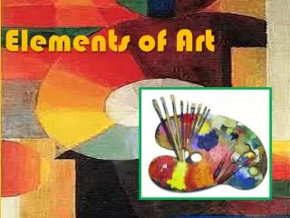
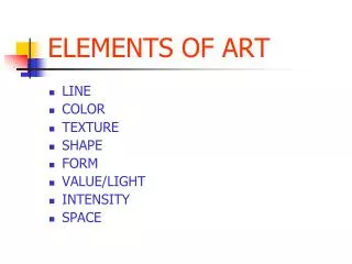
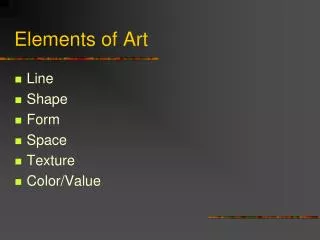
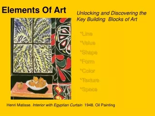
Elements of Art • The elements of art are line, shape, form, space, texture, value and colour. Artists manipulate these elements, mix them in with principles of design and compose a piece of art. Not every work has every last one of these elements contained within it, but there are always at least two present. For example, a sculptor, by default, has to have both form and space in a sculpture, because these elements are three-dimensional. They can also be made to appear in two-dimensional works through the use of perspective and shading
Why Are the Elements of Art Important • Why are the elements of art important? The elements of art are important for several reasons. A person can't create art without utilizing at least a few of them. Also, knowing what the elements of art are enables us to describe what an artist has done and analyze what is going on in a particular piece and then communicate our thoughts and findings using a common language. Knowing these elements will allow you to analyze, appreciate, write and chat about art, as well as being of help should you create art your self.
Line: • Lines are not only those we draw with pens and pencils. In art they can be positions of bodies, objects or images and even a glance seen in someone’s eyes • For example, can you see the invisible line coming from this girl’s eyes? Where does it point? See how your eyes follow along this glancing line. There are three major categories of lines: VERTICAL, HORIZONTAL, and DIAGONAL. • Our responses to them in art are often related to when our bodies are in those positions, or to things we see and experience in nature. For example, we understand the rigid feeling of a strong vertical line when we place our body at attention, or the calm, restful feeling we have when we lie down horizontally. • VERTICAL lines imply that our body is stiff, dignified, formal or still. Consequently, when we see a very upright figure in Egyptian art, we project our feelings and accurately envision a regal, important figure • HORIZONTAL lines in art give us calm, quiet feelings, because they bring ideas of sleep and rest. If an artist wanted to show a composed, peaceful setting, many horizontal lines would help elicit this effect from the viewer. • DIAGONAL lines are the most active. They imply movement, tension, sometimes violence. Imagine a jogger whose legs and arms are formed into zigzags by diagonals. The whole thrust of a runner’s body is forward—on yet another diagonal. • Remember these qualities of the three types of lines as you view works of art. They’ll help you get more in tune with what the artist is trying to express.
COLOUR • Colours have great appeal to us and can exert powerful forces upon viewers. Artists use that power and appeal in many ways, so Colour is a complex element. Here are some basic concepts that will help you deal immediately with this important component. • Purest colours are found in white light. White light, from the sun or artificial light sources, contains within it all colours in their unadulterated form. The pure colours from light are typified by the rainbow, sometimes referred to as the colours of the spectrum. They are red, orange, yellow, green, blue, indigo, and violet. You should be aware that these “prismatic” colours from white light are not the same as “pigmental” man-made colours, and some different properties and rules apply to their use.
COLOUR • People have not always been able to paint with light, so we have developed colours from nature’s materials, or pigments. Pig mental colours can be arranged into the colour wheel so we can see major colour relationships useful in art. Since almost all the colours you see in art are pig mental colours, it will help you to know their unique properties and relationships.
COLOUR • Colours are described in art by three characteristics: hue, value and intensity. Hue simply refers to a colour’s name—red, blue, pink, mauve, etc. • Value, or tone, refers to the colour’s lightness or darkness. You can achieve a range of differing values from one colour by lightening or darkening it with other colours or the neutrals, black and white. For example, a light value of red is pink; a dark value of red is maroon or burgundy. (There is much more to say about Value in art. This will be discussed in another section). • Intensity refers to a colour’s purity that is, how bright or dull it is. When colours are mixed, like in creating different values, they lose their intensity. • All pig mental colours can be mixed from three primary colours—red, yellow and blue. Green, orange and purple are “secondary colours,” and when used or mixed together with primaries, they create even more colours called the tertiary colours. Placing the colours on a colour wheel, you can easily see a variety of useful associations. For example, analogous colours (those colours next to each other on the colour wheel), since they are “related,” by sharing a colour, can create a restful, calm feeling in the viewer
COLOUR • Colours at opposite points on the colour wheel, termed “complementary” colours, arouse a very different reaction since they “contrast.” You can see how an artist could project the idea of tension, aggression, or agitation simply by manipulating the colour choices in his or her work. To test this attitude from an illusory image, place a large piece of green paper next to a large piece of red and stare at them intently. Soon they will appear to vibrate, as the opposing colours compete within your eyes. • Other illusions colours produce are created by the viewer’s response to them, sometimes based upon his or her own experiences in nature or environmental circumstances. Some colours “feel” warm and some “feel” cool, usually because we relate them to what we’ve experienced in living, like the heat of the yellow sun or red flames. Warm colours seem to advance toward our eyes and cool colours seem to recede. Red also seems active, vital and exciting, perhaps because it’s the colour of blood, and reminds us of our early hunting ancestry. Consider the fact that when we view nature, the backdrop behind the scene is often a cool blue sky. • Our feelings about colour even “colour” our speech. We’ve all heard, “I was so mad I could see red!” But why are we “green with envy?” Why is truth “blue?” Artists know what strong emotions colours evoke and some artists use colour as a powerful vehicle to express and release their own deep feelings. Whatever the rationales for our responses to colours, we’re touched psychologically, and artists through the ages have manipulated our emotions by their use of colours.
Important Colour Relationships • When you understand colour relationships, you’ll begin to have fun expressing just the right message using colour in any creative project. Use the colour wheel to find these:
complementary colours • These colours are opposite from each other on the colour wheel and are very vibrant and active when used together because they stimulate our eye and get our attention. Perhaps that’s why we use red and green for traffic lights, for example. To find complementary colours, draw a line from one colour directly across the center of the colour wheel to its complement. You’ll see that a line from red will lead to green. Now find the complements of yellow and blue.
Analogous colours • Analogous colours are next to each other on the colour wheel. If you wanted a more subdued colour scheme, you’d want to select colours that have something in common, like yellow, yellow-green and green, rather than the vibrancy of the complementary colours. Circle another group of analogous colours using the colour wheel. • Colour • Colour always has three characteristics, which are hue, value, and the intensity. Hue means the shades, value refers to the lightness or the darkness and intensity refers to the brightness or dullness of the work of art. • Indigo • Blue • Green • Yellow • Orange • Red
PRIMARY COLOURS • YELLOW+BLUE=GREEN • BLUE+RED=PURPLE • RED+YELLOW=ORANGE
What is a secondary colour? • Answer: Orange, green, and purple are secondary colours. They are created by mixing two of the three primary colours together • secondary colors are made by mixing two primary colors together: red and yellow to get orange, yellow and blue to get green, or red and blue to get purple. The secondary color you get depends on the proportions in which you mix the two primaries. If you mix three primary colors together, you get a tertiary color. Secondary colors are made by mixing two primary colors together. Red and yellow make orange; red and blue make purple; yellow and blue make green.If then these secondary colours are mixed, they produce what are called 'Tertiary Colours'