Introduction to Design Elements
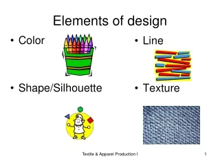
Introduction to Design Elements. Graphic design elements are the building blocks of graphics. Line Color Value Shape Form Space Texture . Graphic design elements. Lines. Line Characteristics Width - thick, thin, tapering, uneven Length - long, short, continuous, broken

Introduction to Design Elements
E N D
Presentation Transcript
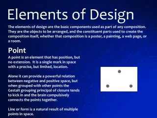
Graphic design elementsare the building blocks of graphics. Line Color Value Shape Form Space Texture Graphic design elements
Lines • LineCharacteristics • Width - thick, thin, tapering, uneven • Length - long, short, continuous, broken • Direction - horizontal, vertical, diagonal, curving, perpendicular, oblique, parallel, radial, zigzag • Focus - sharp, blurry, fuzzy, choppy • Feeling - sharp, jagged, graceful, smooth • Line Types • Outlines - Lines made by the edge of an object or its silhouette. • Gesture Lines - Lines that are energetic and which catch the movement and gestures of an active figure. • Sketch Lines - Lines that capture the appearance of an object or impression of a place. • Calligraphic Lines - Greek word meaning “beautiful writing.” Precise-elegant handwriting or lettering done by hand. Also artwork that has flowing lines like an elegant handwriting. • Implied Line - Lines that are not actually drawn but created by a group of objects seen from a distance. The direction an object is pointing to, or the direction a person is looking at. • Lines can be straight or curved.
Lines • How are lines used in the composition on this slide?
Properties of Color Hueis another word for color. Chroma is the intensity or purity of color. Tint is a color mixed with white. Tone is a color mixed with gray. Shade is a color mixed with black. Properties of Color
Color and contrast • Using color can enhance or detract from a composition. • www.lighthouse.org/color_contrast.htm • Color wheels help determine which colors are in greatest contrast. • Color Selection on the Web • Use Kuler from Adobe • Color Scheme Designer • Colors are additive (transmitted): via monitors, projectors, television or subtractive (reflected), printed material, canvas, the world around us.
Color Categories • Categories of Color • Primary colors are Red, Yellow, Blue; these colors cannot be created by mixing other colors • Secondary colors are Orange, Violet, Green; these colors are created by mixing two primaries • Intermediate colors are Red Orange, Yellow Green, Blue Violet, etc.; mixing a primary with a secondary creates these colors. • Complementary colors are yellow & violet, orange & blue; opposite each other on the color wheel.
Color Harmonies • Color Harmonies • Analogous colors are adjacent to each other on the color wheel. • Triadic colors are three equally spaced colors on the color; blue, yellow, and purple • Monochromatic colors are the same color but with different values and intensity of that color • Warm colors are from the red, orange, yellow side of the color wheel • Cool colors are from the opposite side of the color wheel
Use color to label or show hierarchy. Use color to represent or imitate reality. Use color to unify, separate, or emphasize. Use color to decorate. Use color consistently. Color in design
Value • Value is the range of lightness and darkness within a picture • Tint is adding white to color paint to create lighter values such as light blue or pink. • Shade is adding black to paint to create dark values such as dark blue or dark red. • High-Key is where the picture is all light values. • Low-Key is where the picture is all dark values. • Value Contrast is where light values are placed next to dark values to create contrast or strong differences. • Value Scale is a scale that shows the gradual change in value from its lightest value, white to its darkest value black.
Shape • Shapes are enclosed objects that can be created by line or created by color and value changes that define their edges. • Examples are… • Geometric: Circle, rectangle, triangle • Organic: Leafs, shells, flowers, (the porpoise) • Positive: solid forms such as a the porpoise at right • Negative: Space around the positive shape of the porpoise • Static: Shapes that appear stable and resting (the opposite of the porpoise • Dynamic: Shapes that appear to be in motion (the porpoise)
Sphere: shaded with radial gradient and 34% mesh texture. Form • Form is the three-dimensionality of an shape • Types of Form: • 2D: Square, triangle, Circle • 3D: Cube, Pyramid, Sphere
Space • Space in a two-dimensional drawing or painting refers to the arrangement of objects on the picture plane • Categories • Positive • Negative • Picture Plane • Composition • Focal Point
Space – Nonlinear Perspective • Nonlinear Perspective is the method of showing depth that incorporates the following techniques • Position: Placing an object higher on the page makes it appear farther back then objects placed lower on the page. • Overlapping: When an object overlaps another object it appears closer to the viewer, and the object behind the object appears farther away. • Size Variation: Smaller objects look farther away in the distance. Larger objects look closer. • Color: Bright colors look like they are closer to you and neutral colors look like they are farther away. • Value: Lighter values look like they are farther back and darker value look like they are closer. For example, in a landscape the mountains often look bluish and lighter then the trees or houses that are closer to you.
Space – Linear Perspective • Linear Perspective is the method of using lines to show the illusion of depth in a picture. The following are types of linear perspective. • One-point perspective-When lines created by the sides of tables or building look like that are pointing to the distance and they all meet at one point on the horizon this is one-point perspective. To see an example stand in the middle of the hallway and look at the horizontal lines in the brick or the corner where the ceiling meets the wall. See how they move to one point on the horizon. • Two-point perspective-Here the lines look like they are meeting at two points on the horizon line.
Texture • Texture is the surface quality of an object created by varying dark and light areas. • Roughness • Smoothness • Depth • Real Textureis the actual texture of an object. Artist may create real texture in art to give it visual interest or evoke a feeling. A piece of pottery may have a rough texture so that it will look like it came from nature or a smooth texture to make it look like it is machine made. • Implied Texture is the where a two-dimensional piece of art is made to look like a certain texture but in fact is just a smooth piece of paper. Like a drawing of a tree trunk may look rough but in fact, it is just a smooth piece of paper
The basis of good graphic design is use of design elements and their thoughtful application in the form of design principles. Clearly identify what you are trying to accomplish — use design to convey your message. Brainstorm alternatives. Summary