Building Your Website: A Guide to Coding and Optimizing Your Mockup
This guide details the essential steps to transform your mockup into a functional website using HTML & CSS. Learn to slice images from your design and ensure all code is semantic and W3C compliant. We discuss the importance of optimizing images for better load times, especially on slow connections or mobile devices. Find out how to structure your HTML and CSS efficiently, choose between liquid and fixed layouts, and understand the significance of image formats. Get ready to build a beautiful, welcoming website!

Building Your Website: A Guide to Coding and Optimizing Your Mockup
E N D
Presentation Transcript
BUILDING YOUR SITE ART340
Coding Your Mockup • To build your site, you will slice your images and use HTML & CSS to piece your site together. • Code must be semantic and standards compliant (W3C). Shiny, Happy People Welcome. This is my website. I hope you like it.
Optimizing Images • Why Optimize? • Believe it or not, some people still use modem connections. • Not to mention, there are users that will access your site from other devices such as mobile phones, where connection and processing speeds are not as fast as desktop computers.
Slicing the images • To build your site, there are design elements (imagery) that will need to be created from the original design file. • These can include background images, logos, header images, text-based images do not use web fonts, special bullets, icons, etc. • Images can be sliced in Photoshop & Illustrator using the slice tool.
Download Time • Factors that affect download time: connection speed, computer speed, web server activity, traffic on Internet • Currently, the average connection speed in the U.S. is somewhere between 5-10mbps. • Download Time Calculator: http://cdn.articulate.com/images/blogs/wom/uploads/2008/02/downloadcalc.html • Test Your Connection Speed: http://www.speedtest.net
How to Optimize Images • When saving images for the web: • Go to File > Save for Web & Devices • Select the file type from the pop-up menu. • Use jpegs, pngs or gifs dependent on your image. • Once your selections are made, click save and name the file. • All images will be saved in the selected folder.
Transparent Images • Two types of transparency: • Binary, or index color (Both GIF & PNG): Pixels are either completely transparent or opaque. • Alpha (PNG): Image can have 254 levels of transparency. • Not supported in IE6 or earlier • When would we want to use a GIF? PNG? JPEG?
Large background images • Disable all other layers. • Draw a large marquee around the design that includes the entire element. • Keep in mind that larger browsers will be able to see past the image. • Save for web. Balance file size and quality.
Repeating background images • For bg images that repeat, or simple gradient backgrounds, a smaller slice can be made. • In this example, the bg image would repeat-x on the body. • Set a bg color on the body, as well.
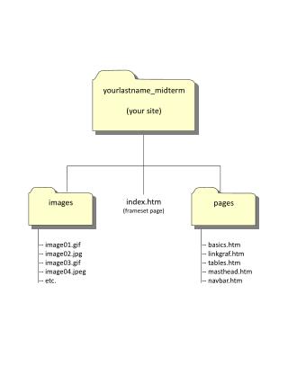
Setting up your documents • Make a folder in your web folder named “project2.” • Inside that folder make another folder named “images.” • Save the .css file to your project folder. Rename to sample.css. • Set up your site definition in Dreamweaver. • Create a new HTML document. • Browse to attach stylesheet. • Save your document as index.html. • Copy & Paste HTML into index.html. Save. • Ready to begin!
Building the HTML structure • For most sites, you would set up your container divsor markup. • #container: wraps around everything • #header: contains the logo or header image • #navigation: unordered list • #content: bulk of page content • #columns • #footer • For CSS Zen Garden, the HTML structure is provided.
CSS Zen Garden Structure • #container • #intro • #pageHeader • #quickSummary • #preamble • #supportingText • #explanation • #participation • #benefits • #requirements • #footer • #linkList • #linkList2 • #lselect • #larchives • #lresources
#container #intro #supportText #linkList
CSS Zen Garden Structure • To see the structure in more detail: http://student.santarosa.edu/~erogier/CSS%2050.11C/samples/final-color-div.html
Liquid vs. Fixed • When building a site, you will have to determine whether you will build your site in a liquid or a fixed layout. • Liquid Layouts: Adaptable and Flexible. Fills the browser window. Content reflows when the browser window and columns resize. • Fixed Layouts: Pixel Perfect. Remains at the pixel width specified by the designer.
Liquid or Fluid Layouts • Resizes and adapt to the changing window size. • Example: http://htmlandcssbook.com/code-samples/chapter-15/liquid-layout.html Image Source: http://matthewjamestaylor.com/blog/perfect-3-column-dimensions.gif
Fixed-width Layouts • Keep the content of a particular width, measured in pixels, regardless of the window size. • Has a wrapper or container that everything fits inside. • At most, 960px-1050px for layout width. • Example: http://htmlandcssbook.com/code-samples/chapter-15/fixed-width-layout.html Image Source: http://www.cs.unh.edu/cit/502/resource/tutorials/fall09/sdrolet/images/Fixed_Layout.jpg
Floating and Positioning • Once your layout is determined, you need to decide how your columns will be positioned next to each other. • Floating moves an element to the left or right, and the following elements wrap around it. • Can require the markup to be in a specific order. • Positioning is a way to specify the exact location of an element on page. • Take markup out of the original flow.
CSS Reset • As a designer, you want ultimate control over the elements in your layout. • Used to reset browser margins and padding: html, body, div, h6, h5, h4, h3, h2, h1, p, ul, li{margin: 0;padding: 0; }
Where to start? • Look at your layout. • Look at the HTML markup. • It can be helpful to find another site that uses a similar layout & deconstruct. • Tip: Print out your mockups and highlight the sections on your mockup as they correspond to the HTML markup. • Begin!