Download
1 / 57
570 likes | 647 Vues
Investigating wave motions and forecast improvements using multi-year data sets, focusing on seasonal height anomalies and harmonic wave properties. Explore teleconnection patterns and explained variance percentages.

E N D
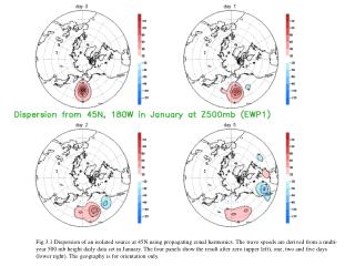
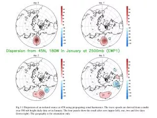
Fig.3.1 Dispersion of an isolated source at 45N using propagating zonal harmonics. The wave speeds are derived from a multi-year 500 mb height daily data set in January. The four panels show the result after zero (upper left), one, two and five days (lower right). The geography is for orientation only.
Fig.3.2 As Fig. 3.1 Dispersion of the same isolated source at 45N, but now using propagating spherical harmonics. The wave speeds are derived from a multi-year 500 mb height daily data set in January. The four panels show the result after zero (upper left), one, two and five days (lower right). The geography is for orientation only. The contours are every 20 gpm.
Fig. 3.3. The percent improvement of 1-day EWP forecasts over Persistence along 50N (dashed line) and 50S (solid line) in DJF. For zonal waves 6 and 7 the rms error in the SH is cut in half by taking wave motion (as per EWP) into account.
1 Fig.3.4 The amplitude and phase speed in April for harmonic waves, as a function of zonal wavenumber and latitude, in 200 mb velocity potential as determined from 12 hourly data for the period 1979-2003. The zonal wavenumber is on a log scale.
. Fig.4.1 Display of Teleconnection for seasonal (JFM) mean 500 mb height. Shown are the correlation between the basepoint (noted above the map) and all other gridpoints (maps) and the timeseries of 500mb height anomaly (geopotential meters) at the basepoints. Contours every 0.2, starting contours +/- 0.3. Data source: NCEP Global Reanalysis. Period 1948-2005. Domain 20N-90N. On the left a pattern referred to as North Atlantic Oscillation (NAO). On the right the Pacific North American pattern (PNA).
Fig.4.2. Same as Fig 4.1, but now the base point is at 2.5S and 170E, i.e. outside the display area. The values of the time series have been multiplied by 5.
Fig. 4.3 EV(i),the variance explained by single gridpoints in % of the total variance, using equation 4.3. In the upper left for raw data, in the upper right after removal of the first EOT mode, lower left after removal of the first two modes. Contours every 4%. The timeseries shown are the residual height anomaly at the gridpoint that explains the most of the remaining domain integrated variance.
Fig.4.4 Display of four leading EOT for seasonal (JFM) mean 500 mb height. Shown are the regression coefficient between the height at the basepoint and the height at all other gridpoints (maps) and the timeseries of residual 500mb height anomaly (geopotential meters) at the basepoints. In the upper left for raw data, in the upper right after removal of the first EOT mode, lower left after removal of the first two modes. Contours every 0.2, starting contours +/- 0.1. Data source: NCEP Global Reanalysis. Period 1948-2005. Domain 20N-90N
Fig.5.1 Display of four leading EOFs for seasonal (JFM) mean 500 mb height. Shown are the maps and the time series. A postprocessing is applied, see Appendix I, such that the physical units (gpm) are in the time series, and the maps have norm=1. Contours every 0.2, starting contours +/- 0.1. Data source: NCEP Global Reanalysis. Period 1948-2005. Domain 20N-90N
Fig.5.2. Same as Fig 5.1, but now daily data for all Decembers, Januaries and Februaries during 1998-2002.
Fig.5.4 Display of four leading alternative EOT for seasonal (JFM) mean 500 mb height. Shown are the regression coefficient between the basepoint in time (1989 etc) and all other years (timeseries) and the maps of 500mb height anomaly (geopotential meters) observed in 1989, 1955 etc . In the upper left for raw data, in the upper right after removal of the first EOT mode, lower left after removal of the first two modes. A postprocessing is applied, see Appendix I, such that the physical units (gpm) are in the time series, and the maps have norm=1. Contours every 0.2, starting contours +/- 0.1. Data source: NCEP Global Reanalysis. Period 1948-2005. Domain 20N-90N
Fig.5.5, the same as Fig 5.1, but obtained by starting the iteration method (see Appendix II) from alternative EOTs, instead of regular EOT. Compared to Fig.5.1 only the polarity may have changed.
EOT-normal Q is diagonalized Qa is not diagonalized (1) is satisfied with αm orthogonal Q tells about Teleconnections Matrix Q with elements: qij=∑ f(si,t)f(sj,t) t iteration Rotation EOF Both Q and Qa Diagonalized (1) satisfied – Both αm and em orthogonal αm (em) is eigenvector of Qa(Q) Laudable goal: f(s,t)=∑ αm(t)em(s) (1) m Discrete Data set f(s,t) 1 ≤ t ≤ nt ; 1 ≤ s ≤ ns iteration Arbitrary state Rotation iteration Matrix Qa with elements: qija=∑f(s,ti)f(s,tj) s EOT-alternative Q is not diagonalized Qa is diagonalized (1) is satisfied with em orthogonal Qa tells about Analogues Fig.5.6: Summary of EOT/F procedures.
Fig 5.7. Explained Variance (EV) as a function of mode (m=1,25) for seasonal mean (JFM) Z500, 20N-90N, 1948-2005. Shown are both EV(m) (scale on the left, triangles) and cumulative EV(m) (scale on the right, squares). Red lines are for EOF, and blue and green for EOT and alternative EOT respectively.
Fig.5.8 Display of four leading EOFs for seasonal (OND) mean SST. Shown are the maps on the left and the time series on the right. Contours every 1C, and a color scheme as indicated by the bar. Data source: NCEP Global Reanalysis. Period 1948-2004. Domain 45S-45N
Fig.5.9 Display of four leading EOFs for seasonal (JFM) mean 500 mb streamfunction. Shown are the maps and the time series. A postprocessing is applied, see Appendix I, such that the physical units (m*m/s) are in the time series, and the maps have norm=1. Contours every 0.2, starting contours +/- 0.1. Data source: NCEP Global Reanalysis. Period 1948-2005. Domain 20N-90N
Fig. 6.1 The seasonal cycle of N, the degrees of freedom (dof; non-dimensional), and the standard deviation (sd; gpm) for 500 mb daily height for the NH (20N-pole) and the SH (20S-pole). Period analyzed is 1968-2004. The lines for sd are in red, for dof in blue. The lines for NH are full lines connecting squares, for SH dashed lines connecting triangles.
Fig.6.2 The dependence of the degrees of freedom (N), full line, on the lead of the forecast in a 5 year retrospective forecast data set with a T62L28 NCEP model of vintage 2002. The dashed line is the standard deviation around the model’s climate mean.
Fig. 7.1 The most similar looking 500 mb flow patterns in recorded history on a domain this size (20o to the pole). These particular analogues were found for the SH, 20S-90S, and correlate at 0.81. The climatology, appropriate for the date and the hour of the day, was removed.
Base(t=0) ---’Nature’-------------- Base(t)-------------- Analogue #1 (t=0) ----’Nature’---- Analogue #1 (t)-------- Analogue #2 (t=0) ----’Nature’---- Analogue #2 (t)-------- etc {Analysis(t=0) ----’Model’------ Forecast(t)--------------} Fig. 7.2: The idea of analogues. For a given ‘base’, which could be today’s weathermap, we seek in an historical data set for an analogue in roughly the same time of the year. The base and analogue are assigned t=0. The string of weathermaps following the analogue would be the forecast for what will follow the base. (Data permitting there could be more than one analogue.) As a process this is comparable to ‘integrating’ the model equations starting from an analysis at t=0, an analysis which is as close as possible to the true base. ‘Nature’ stands for a perfect model.
Fig. 7.3 The average correlation between a given flow and the nearest neighbor (analog) and the farthest removed flow (anti-analog; sign reversed) as a function of month. The record best analogs and antilogs are given by the upper lines. The domain is 20N to the pole, the variable is daily 500 mb height at 0Z, and the years 1968-2004.
Fig. 7.4 (a) The observed anomaly in monthly mean stream function (upper left), the same in b) but truncated to 50 EOFs, the constructed analogue in c) and the difference of c) and a) in d). Unit is 10**7 m*m/s. Results for February 1998.
Fig. 7.5(a) The observed anomaly in monthly mean 850 mb temperature (upper left), the specified 850 mb temperature by the constructed analogue in c) and the difference of c) and a) in d). Unit is K. Results for February 1998. Map b) is intentionally left void.
Fig.7.6: The skill (ACX100) of forecasting NINO34 SST by the CA method for the period 1956-2005. The plot has the target season in the horizontal and the lead in the vertical. Example: NINO34 in rolling seasons 2 and 3 (JFM and FMA) are predicted slightly better than 0.7 at lead 8 months. An 8 month lead JFM forecast is made at the end of April of the previous year. A 1-2-1 smoothing was applied in the vertical to reduce noise.
Fig. 7.7 An ensemble of 12 forecasts for Nino34. The release time is July 2005, data through the end of June were used. Observations (3 mo means) for the most recent 6 overlapping seasons are shown also. The ensemble mean is the black line with closed circles. The CA ensemble members were created by different EOF truncation etc (see text).
Fig.7.8: Dispersion of the source shown at 45N and 180W in upper left, out to 3 days. The dispersion is calculated through an analogue constructed to the initial state.
Fig.7.9: Dispersion after two days of sources released at 45N and longitudes 0E, 90E, 180W and 90W respectively. For ease of comparison the plots have been rotated such that the longitude of release is at the bottom. Fig.7.10
Fig.7.10 The fastest growing modes determined by repeated application of CA operator for Δt = 2 days on 500 mb height data, 20N-pole. Spatial patterns of the first mode are on the top row, while the time series (scaled to +/-1) and amplitude growth rate (% per day) are on the lower right. The 2nd mode (bottom row) has zero frequency - only a real part exists, no growth rate shown. Units for the maps are gpm/100 multiplied by the inverse of re-scaling (close to unity usually) applied to the time series. .
Fig 8.1 Month to month persistence of monthly mean temperature over the US.
Fig. 8.2: The difference between the temperature averaged over the last 10 years and the 30 year climatological mean for the four seasons. Units are in % of the local standard deviation.
Fig. 8.3 The local correlation between antecedent soil moisture and subsequent temperature over the US. Results are aggregated over 102 super Climate Divisions.
Fig.8.4 : The correlation between soil moisture at the end of February and the co-located temperature in February (lag 0) through May (lag 3). Correlations in excess of 0.15 are shaded. Contours every 0.15.
Fig. 8.5. The zonal mean zonal wind at 30mb at the equator from 1948 through September 2005. The time mean is removed. All data is monthly mean. Source is the global NCAR/NCEP Reanalysis.
Fig. 8.6: The correlation (*100.) between the Nino34 SST index in fall (SON) and the temperature (top) and precipitation (bottom) in the following JFM in the United States. Correlations in excess of 0.2 are shaded. Contours every 0.1 – no contours for -.1, 0 and +0.1 shown.
From Jae Schemm’s 5 year calibration data set (NCEP-GFS model) Fig. 9.1 Typical decrease of anomaly correlation with lead time (black dashes). From a practical point of view skill is too low for day-by-day forecasting after 5, 10 or 15 days (depending on criterion). However, the correlation remains slightly positive at longer leads (even after 30 days).
6-10day/wk2 Short range t=0 ----<---->------------------------ time --------------------------------------------- < -------------- > First season 0.5 mo lead < -------------- > ….. 1.5 mo lead 2nd season Averaging time < ------------- > …… < ------------- > Last season Lead time 12.5 months Fig. 9.2 A lay-out of the seasonal forecast, showing the averaging time, and the lead time (in red). Rolling seasonal means at leads of 2 weeks to 12.5 months leads are being forecast.
Fig. 9.3: The climatological pdf (blue) and a conditional pdf (red). The integral under both curves is the same, but due to a predictable signal the red curve is both shifted and narrowed. In the example the predictor-predictand correlation is 0.5 and the predictor value is +1. This gives a shift in the mean of +0.5, and the standard deviation of the conditional distribution is reduced to 0.866. Units are in standard deviations (x-axis). The dashed vertical lines at +/- 0.4308 separate a Gaussian distribution into three equal parts.
Fig.9.5 (Source: Dave Unger.) This figure shows the probability shift (contours), relative to 100*1/3rd, in the above normal class as a function of a-priori correlation (R , y-axis) and the standardized forecast of the predictand (F, x-axis). The prob.shifts increase with both F and R. The R is based on a sample of 30, using a Gaussian model to handle its uncertainty.
Fig.9.6 The looks of a tool used to make the seasonal prediction. The tool is CCA. The units are standard deviations multiplied by 10. Red (blue) values are positive (negative) anomalies. The size of the numeral indicates the level of a-priori skill. At the locations, indicated by only the plus sign, where a-priori skill is below the 0.3 correlation, no forecast is shown.
Extra 3: Dispersion experiment in the SH. Compare to Fig.7.9 for NH.
Extra 4: Effect of NH dispersion (EWP2) in the SH 10, 11, 12 days later, and 24 days later.