1.7
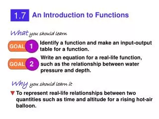
Represent Functions as Graphs. 1.7. Vocabulary. Relation — an pairing of a set of inputs with a set out outputs (includes functions). Graph the function y = x with domain 0, 2, 4, 6, and 8. 1. 2. EXAMPLE 1. Graph a function. SOLUTION. STEP 1. Make an input-output table.

1.7
E N D
Presentation Transcript
Vocabulary • Relation — an pairing of a set of inputs with a set out outputs (includes functions)
Graph the functiony = xwith domain 0, 2, 4, 6, and 8. 1 2 EXAMPLE 1 Graph a function SOLUTION STEP 1 Make an input-output table.
EXAMPLE 1 Graph a function STEP2 Plot a point for each ordered pair(x, y).
for Example 1 GUIDED PRACTICE 1. Graph the functiony = 2x - 1 with domain 1, 2, 3, 4, and 5. SOLUTION STEP 1 Make an input-output table. STEP2 Plot a point for each ordered pair(x, y).
Years since1997, t 0 1 2 3 4 5 6 Average score, s 511 512 511 514 514 516 519 EXAMPLE 2 Graph a function Sat Scores The table shows the average scores on the mathematics section of the Scholastic Aptitude Test (SAT) in the United States from 1997 to 2003 as a function of the time t in years since 1997. In the table, 0 corresponds to the year 1997, 1 corresponds to 1998, and so on. Graph the function.
EXAMPLE 2 Graph a function SOLUTION STEP1 Choose a scale. The scale should allow you to plot all the points on a graph that is a reasonable size. The t-values range from 0 to 6, so label the t-axis from 0 to 6 in increments of 1 unit. The s-values range from511to519, so label the s-axis from5 – 10to520in increments of2units.
EXAMPLE 2 Graph a function STEP2 Plot the points
WHAT IF?In Example 2, suppose that you use a scale on the s-axis from 0 to 520 in increments of 1 unit. Describe the appearance of the graph. 2. ANSWER The graph would be very large with all the points near the top of the graph. EXAMPLE 2 for Example 2 GUIDED PRACTICE
EXAMPLE 3 Write a function rule for a graph Write a rule for the function represented by the graph. Identify the domain and the range of the function. SOLUTION STEP 1 Make a table for the graph.
EXAMPLE 3 Write a function rule for a graph STEP 2 Find a relationship between the inputs and the outputs. Notice from the table that each output value is 1 more than the corresponding input value. STEP 3 Write a function rule that describes the relationship: y = x+ 1. ANSWER A rule for the function is y=x+ 1. The domain of the function is 1, 2, 3, 4, and 5. The range is 2, 3, 4, 5, and 6.
3. ANSWER y = 5 – x; domain:0, 1, 2, 3,and4, range: 1, 2, 3, 4,and5 for Example 3 GUIDED PRACTICE Write a rule for the function represented by the graph. Identify the domain and the range of the function.
4. ANSWER y = 5x + 5; domain:1, 2, 3,and4, range: 10, 15, 20 and25 for Example 3 GUIDED PRACTICE Write a rule for the function represented by the graph. Identify the domain and the range of the function.
EXAMPLE 4 Analyze a graph Guitar Sales The graph shows guitar sales (in millions of dollars) for a chain of music stores for the period 1999–2005. Identify the independent variable and the dependent variable. Describe how sales changed over the period and how you would expect sales in 2006 to compare to sales in 2005.
EXAMPLE 4 Analyze a graph SOLUTION The independent variable is the number of years since 1999. The dependent variable is the sales (in millions of dollars). The graph shows that sales were increasing. If the trend continued, sales would be greater in 2006 than in 2005.
5. Based on the graph in Example 4, is $1.4 million a reasonable prediction of the chain’s sales for 2006? Explain. REASONING ANSWER Yes; the graph seems to increase about $0.2 million every two years. EXAMPLE 4 for Example 4 GUIDED PRACTICE