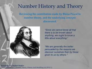
Matching History and Theory
250 likes | 526 Vues
Matching History and Theory. Keynesian Stimulus 1) Keynesian Stimulus – 1930’s Fine tuning in the 1960’s. Keynesian Economics and the Keynesian Short-Run Aggregate Supply Curve (cont'd). Keynesian Short-Run Aggregate Supply Curve

Matching History and Theory
E N D
Presentation Transcript
Matching History and Theory Keynesian Stimulus 1) Keynesian Stimulus – 1930’s Fine tuning in the 1960’s
Keynesian Economics and the Keynesian Short-Run Aggregate Supply Curve (cont'd) Keynesian Short-Run Aggregate Supply Curve The horizontal portion of the aggregate supply curve in which there is excessive unemployment and unused capacity in the economy
Figure 11-7 Demand-Determined Equilibrium Real GDP at Less Than Full Employment Keynes assumed prices will not fall when aggregate demand falls
Keynesian Economics and the Keynesian Short-Run Aggregate Supply Curve (cont'd) Real GDP and the price level, 1934–1940 Keynes argued that in a depressed economy, increased aggregate spending can increase output without raising prices. Data showing the U.S. recovery from the Great Depression seem to bear this out. In such circumstances, real GDP is demand driven.
Managing Economic “Fluctuations” “Fine-tuning” the economy – can it be done?
2 How the Phillips curve is related to the model of aggregate demand and aggregate supply Short-run aggregate supply (b) The Phillips Curve (a) The Model of AD and AS Inflation Rate (percent per year) Price level B B 106 6% 102 2 High aggregate demand Low aggregate demand A Phillips curve A Quantity of output Unemployment Rate (percent) 0 0 16,000 unemployment =4% 7% output =15,000 15,000 unemployment =7% 4% output =16,000 This figure assumes price level of 100 for year 2020 and charts possible outcomes for the year 2021. Panel (a) shows the model of aggregate demand & aggregate supply. If AD is low, the economy is at point A; output is low (15,000), and the price level is low (102). If AD is high, the economy is at point B; output is high (16,000), and the price level is high (106). Panel (b) shows the implications for the Phillips curve. Point A, which arises when aggregate demand is low, has high unemployment (7%) and low inflation (2%). Point B, which arises when aggregate demand is high, has low unemployment (4%) and high inflation (6%).
Shifts in Phillips Curve: Role of Expectations • Natural experiment for natural-rate hypothesis • Natural-rate hypothesis • Unemployment - eventually returns to its normal/natural rate • Regardless of the rate of inflation • Late 1960s (short-run), policies: • Expand AD for goods and services
Shifts in Phillips Curve: Role of Expectations • Natural experiment for natural-rate hypothesis • Expansionary fiscal policy • Government spending rose • Vietnam War • Great Society Programs • Monetary policy • The Fed – try to hold down interest rates • Money supply – rose 13% per year • High inflation (5-6% per year) • Unemployment decreased • Trade-off (Short-run AS)
Shifts in Phillips Curve: Role of Expectations • The long-run Phillips curve • Expression of the classical idea of monetary neutrality • Increase in money supply • Aggregate-demand curve – shifts right • Price level – increases • Output – natural rate • Inflation rate – increases • Unemployment – natural rate
6 The Phillips Curve in the 1960s This figure uses annual data from 1961 to 1968 on the unemployment rate and on the inflation rate (as measured by the GDP deflator) to show the negative relationship between inflation and unemployment.
7 The breakdown of the Phillips Curve This figure shows annual data from 1961 to 1973 on the unemployment rate and on the inflation rate (as measured by the GDP deflator). The Phillips curve of the 1960s breaks down in the early 1970s, just as Friedman and Phelps had predicted. Notice that the points labeled A, B, and C in this figure correspond roughly to the points in Figure 5.
4 How the long-run Phillips curve is related to the model of aggregate demand and aggregate supply Long-run Phillips curve Long-run aggregate supply (b) The Phillips Curve (a) The Model of AD and AS Inflation Rate Price level B B 1. An increase in the money supply increases aggregate demand . . . P2 P1 Aggregate demand, AD1 AD2 A A Unemployment Rate 0 0 3. . . . and increases the inflation rate . . . Quantity of output Natural rate of output Natural rate of output 2. . . . raises the price level . . . 4. . . . but leaves output and unemployment at their natural rates. Panel (a) shows the model of AD and AS with a vertical aggregate-supply curve. When expansionary monetary policy shifts the AD curve to the right from AD1 to AD2, the equilibrium moves from point A to point B. The price level rises from P1 to P2, while output remains the same. Panel (b) shows the long-run Phillips curve, which is vertical at the natural rate of unemployment. In the long run, expansionary monetary policy moves the economy from lower inflation (point A) to higher inflation (point B) without changing the rate of unemployment
The Cost of Reducing Inflation • The Volker disinflation • Paul Volker – chairman of the Fed, 1979 • Peak inflation: 10% • Sacrifice ratio = 5 (5% dec in GNP for 1% dec in inflation) • Reducing inflation – great cost • Rational expectations • Reducing inflation – smaller cost • 1984 inflation : • Drops to 4% due to tightening monetary policy • High unemployment: 10% • Low output
11 The Volcker Disinflation This figure shows annual data from 1979 to 1987 on the unemployment rate and on the inflation rate (as measured by the GDP deflator). The reduction in inflation during this period came at the cost of very high unemployment in 1982 and 1983. Note that the points labeled A, B, and C in this figure correspond roughly to the points in Figure 10.
The Cost of Reducing Inflation • The Greenspan era • Alan Greenspan – chair of the Fed, 1987 • Favorable supply shock (OPEC, 1986) • Falling inflation & falling unemployment • 1989-1990: high inflation & low unemployment • The Fed – raised interest rates • Contracted aggregate demand • 1990s – economic prosperity • Prudent monetary policy
Figure 11-9 Real GDP Determination with Fixed versus Flexible Prices
11 The Volcker Disinflation This figure shows annual data from 1979 to 1987 on the unemployment rate and on the inflation rate (as measured by the GDP deflator). The reduction in inflation during this period came at the cost of very high unemployment in 1982 and 1983. Note that the points labeled A, B, and C in this figure correspond roughly to the points in Figure 10.
The Cost of Reducing Inflation • The Greenspan era • 2001: recession • Depressed aggregate demand • Expansionary fiscal and monetary policy • Bernanke’s challenges • Ben Bernanke – chair, the Fed, 2006 • 1995-2006: booming housing market • New homeowners: subprime (high risk of default)
Friedman – steady growth rate of M1/M2 “Fine-tuning” the economy – can’t be done?
12 The Greenspan Era This figure shows annual data from 1984 to 2006 on the unemployment rate and on the inflation rate (as measured by the GDP deflator). During most of this period, Alan Greenspan was chairman of the Federal Reserve. Fluctuations in inflation and unemployment were relatively small.
Neo-Keynesian Models Real GDP Determination with Fixed and Flexible Prices
The Cost of Reducing Inflation • Bernanke’s challenges • 2006-2008: housing & financial crises • Housing prices declined > 15% • The new homeowners: underwater • Value of house < balance on mortgage • Mortgage defaults • Home foreclosures • Financial institutions – large losses • Depressing the aggregate demand
The Cost of Reducing Inflation • Bernanke’s challenges • 2004-2008: rising commodity prices • Increased demand from rapidly growing emerging economies • Prices of basic foods – rose significantly • Droughts in Australia • Demand increase from emerging economies • Increased use of agricultural products – biofuels • Contracting aggregate supply