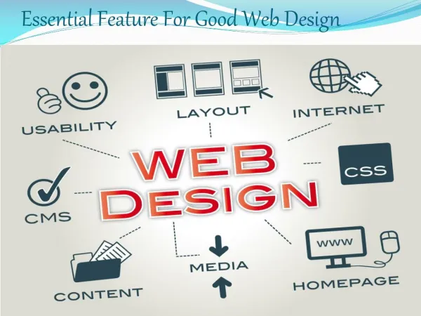
Good Web Design
Learn how to utilize color, text, graphics, and simplicity to enhance your website and engage viewers. See the importance of each element and how to avoid common design mistakes.


Good Web Design
E N D
Presentation Transcript
Good Web Design By Suchleen and Karamjit
Good use of Color • An appropriate use of color will contain 2 or 3 main colors that will mix well with a proper mood or tone for your website. • Do not overdo the color it will distract the viewer from the written work. Ex:
Text that is Easy to read • The text should not be too big or small depending on the text your are writing. For example title should be bigger then the text. • The color of the text should not blend in with the background, the best one to use is white background and black font for the text. Ex:
Meaningful Graphics • Graphics are important because they make what your website is. Well it has a lot of variety . • However overdoing will distract the viewer from the thing they came to do. Don’t add then 3 or 4 images per page. Ex:
Quality Graphics • A easy way to make the viewer see the photos is in high def. quality . • High quality product pictures are important for online retailers. • Ex:
Simplicity • Do not overload your site with complexe design, animation, or other effects so that you can impress your viewers. It won’t hepl them instead confuse them. • Keep your site simple. Uncluttered layouts allow your viewers to focus on your text. Ex:
That’s It So we went over a lot of basic things. But then again here are there example: See if you can remember them