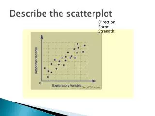
Making Scatterplot Graphs
Making Scatterplot Graphs. A Scatterplot is a graph that compares two quantitative variables. Each pair of values (one from each category) is represented on the graph with a dot. Association between Variables.

Making Scatterplot Graphs
E N D
Presentation Transcript
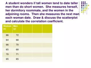
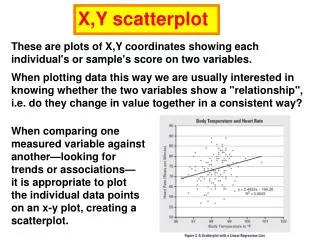
A Scatterplot is a graph that compares two quantitative variables. Each pair of values (one from each category) is represented on the graph with a dot.
Association between Variables • Two variables are associated if some values of the first variable tend to occur more often with some values of the second variable than with other values of that variable. • Positive Association: high values for the first variable occur with high values for the second variable • Negative Association: high values for the first variable occur with low values for the second variable.
Median HHI and Percent of Households Eligible for Food Stamps
Percent of Households Eligible for Food Stamps and Percent Unemployed