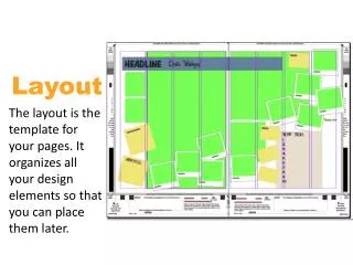
15 Layout
15 Layout. Controlling the position of elements Creating site layouts Designing for different sized screens. to control where each element sits on a page and how to create attractive page layouts.

15 Layout
E N D
Presentation Transcript
15 Layout Controlling the position of elements Creating site layouts Designing for different sized screens
to control where each element sits on a page and how to create attractive page layouts. • different ways to position elements using normal flow, relative positioning, absolute positioning and floats • how various devices have different screen sizes and resolution, and how this affects the design process. • difference between fixed width and liquid layouts, and how they are created • use grids to make your page designs look more professional.
Key Concepts in PositioningElements • CSS treats each HTML element as if it is in its own box. This box will either be a block-level box or an inline box. • Block-level elements start on a new line • Examples include: <h1> <p> <ul> <li> • Inlineelementsflow in between surrounding text • Examples include: <img> <b> <i>
Boxen • Block-level elements
Boxes • Inlineelements
Containing Elements • If one block-level element sits inside another block-level element then the outer box is known as the containing or parent element.
Controlling thePosition of Elements • CSS has the following positioning schemes • Normalflow • RelativePositioning • Absolute positioning
Position of Elements • Normal Relative Absolute
box offset properties Fixed Positioning Floating Elements
Normal flow • position:static • chapter-15/normal-flow.html
Relative Positioning • position:relative • chapter-15/position-relative.html
Absolute positioning • position:absolut
Absolute positioning • position:absolute • chapter-15/position-absolute.html
Fixed position • position:fixed • chapter-15/position-fixed.html
Overlapping elements • z-index • chapter-15/z-index.html
Floating elements • Float • chapter-15/float.htmld
Using float to place elements side by side • chapter-15/using-float.html
Clearing floats • Clearchapter-15/clear.html
Parents of floated elements Problem & solution • chapter-15/float-problem.html • chapter-15/float-solution.html
Creating multi-column layouts with floats • Width • Float • Margin • chapter-15/columns-two.html • chapter-15/columns-three.html
Screen Sizes • designingfor the web, you are faced with the unique challenge that different users will have different sized screens.
PageSizes • designers often try to create pages of around 960-1000 pixels wide
Fixed Width Layouts • Fixed width layout designs do notchange size as the user increases or decreases the size of their browserwindow.
LiquidLayouts • stretch and contract as the user increases or decreases the size of their browser window
Fixed Width layoutLiquid Layout • chapter-15/fixed-width-layout.html • chapter-15/liquid-layout.html
Layout Grids • use a grid structure to help them position items on a page, and the same is true for web designers
Using the 960.GS Grid chapter-15/grid-layout.html
Mulitiple Style Sheets • @import • chapter-15/multiple-style-sheets-import.html • link • chapter-15/multiple-style-sheets-link.html
Summary • <div> elements are often used as containing elements to group together sections of a page • Browsers display pages in normal flow unless you specify relative, absolute, or fixed positioning • The float property moves content to the left or right of the page and can be used to create multi-column layouts. (Floated items require a defined width.) • Pages can be fixed width or liquid (stretchy) layouts
Summary • Designers keep pages within 960-1000 pixels wide, and indicate what the site is about within the top 600 pixels (to demonstrate its relevance without scrolling). • Grids help create professional and flexible designs • CSS Frameworks provide rules for common tasks • You can include multiple CSS files in one page