
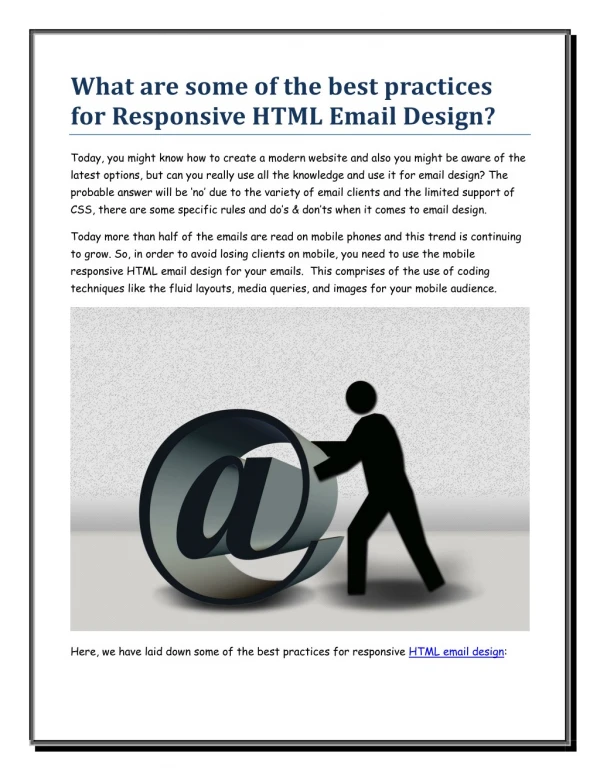
Coding a Responsive HTML Email
Coding a Responsive HTML Email. Lydia Roberts Consultant/Web Designer HighRoad Solution. What is Responsive Design?. An approach to web design that provides an optimal viewing experience across a wide range of devices.


Coding a Responsive HTML Email
E N D
Presentation Transcript
Coding a Responsive HTML Email Lydia Roberts Consultant/Web DesignerHighRoad Solution
What is Responsive Design? • An approach to web design that provides an optimal viewing experience across a wide range of devices. • A responsive website or email has a layout that changes configuration based on what size screen it is viewed on.
The Goal Non-responsive Responsive
How Does it Work? HTML (content) and CSS (style) are the foundation of any website or email. A new version of CSS – CSS3 – gives us the @media query rule. It's what makes responsive design possible! Support for @media: Android 2.2+, iOS, BlackBerry 6+, Microsoft Windows Phone 7.5+ See full list »
Best Practices • Single Column:Mobile max-width of ~300px • Key Information and CTA at Top • Keep Content Concise:Use teasers instead of lengthy articles. Eliminate table of contents and quick links where possible.
Best Practices • 13px minimum font size • Touch-friendly buttonsApple recommends minimum target area of 44x44px • High Contrast Colors (i.e., dark text on a white background) • Test, Test, Test across multiple email and device platforms, not just your organization's
Case Study: Redesign for Responsive Left: A typical, non-responsive layout
Case Study: Redesign for Responsive • Design is too wide • Header dates hard to read/cut off on narrow screens • CTA at bottom • Can't see links in sidebar, sidebar looks too similar to button • Icons too small to tap
Case Study: Redesign for Responsive • Design is 600px wide for desktop • Header is easy to read • CTA at top • Buttons look button-y! • Key info and Details in two columns below CTA • Icons made larger and Share button added
Final Results Mobile View Desktop View
Views: Desktop and Mobile One version of HTML, two different views
Before you code... • Design your email • Define what should happen in the mobile view
Define Mobile View • Reduce width from 600px to 300px
Define Mobile View • Full-width images need to be scaled down for 300px width
Define Mobile View • Columns should stack on top of one another
Define Mobile View • Footer links should stack on top of one another • Hide dividers between links
Target Cells with ID's • ID can only be used once • Use for unique elements
Target Cells with Classes • Classes can be repeated throughout email • Use for similar elements
Use spacer gifs to force widths • Apply an ID or Class so width of image can be changed for mobile view
Hiding Elements • Eliminate unwanted spacing by adding class=”hide” to table cells • Define class inside media query
@media (max-width: 480px) { /* styles go here */ } Media Query • Set the max-width • 480px is an iPhone 4 flipped sideways • Define styles inside the media query
@media (max-width: 480px) { table[class=”table”] { width:300px!important; } } Media Query • Define styles using selectors in brackets • Fixes a bug in Yahoo Mail • Use !important after every single rule • Overrides inline styles
@media (max-width: 480px) { ... img[id=”bodywidth”] { width:261px !important; } } Media Query • Resize the spacer gif • Subtract the two spacers on the left and right from 300px • 300-26-13=261
@media (max-width: 480px) { ... td[id=”header”] img, td[id=”footer”] img { width:100% !important; height:auto !important; } } Media Query • Resize header and footer images • Separate selectors with commas
@media (max-width: 480px) { ... td[class=”hide”], span[class=”hide”] { display:none !important; } } Media Query • Add a class to hide elements from mobile view • Include span in order to hide dividers in footer links
@media (max-width: 480px) { ... table[class=”column”] { width:100% !important; display:block !important; } } Media Query • Stack columns and make them full width
@media (max-width: 480px) { ... td[id=”social”] { text-align:left !important; padding-top:20px !important; } } Media Query • Align social icons to the left • Give some space above icons
@media (max-width: 480px) { ... td[id=”footerlinks”] a { display:block !important; margin-bottom:6px !important; } } Media Query • Stack footer links • Give a bit of space beneath each link
table[class="column"] { width:100% !important; display: block !important; } td[id="social"] { text-align:left !important; padding-top:20px !important; } td[id="footerlinks"] a { display:block !important; margin-bottom:6px !important; } } Completed Media Query @media (max-width: 480px) { table[class="table"] { width:300px !important; } td[id="header"] img, td[id="footer"] img { width:100% !important; height:auto !important; } td[class="hide"], span[class="hide"] { display:none !important; } img[id="bodywidth"] { width:261px !important; }
Voila! • Mobile view will be displayed based on screen size set in media query
Testing & Troubleshooting • Resize browser window to test • Other tools: CyberCrab or Firefox Responsive Design View
Testing & Troubleshooting • Use built-in code tools in Chrome & Firefox • Screenshot testing of major email clients & devices with Litmus
Congratulations! After Before [ iPhone5 ]
Resources • Anatomy of a Perfect Mobile Email • Emailology Boilerplate code, Tips & Tricks, Troubleshooting • Campaign Monitor Guide to Responsive Email Design • Which devices support media queries? • Mail Chimp Guide to Email on Mobile Devices • Yahoo! Mail issues with @media queries • Examples of Responsive Emails by Marketing Land • MORE Examples of Responsive Emails • Takeaway Design for all Inboxes


