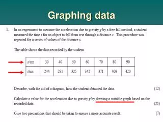

Graphing Data
E N D
Presentation Transcript
Section Graphing Data 1.3 In this section you will: • Graph the relationship between independent and dependent variables. • Interpret graphs. • Recognize common relationships in graphs.
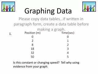
Section Graphing Data 1.3 Identifying Variables • A variable is any factor that might affect the behavior of an experimental setup. • It is the key ingredient when it comes to plotting data on a graph. • The independent variable is the factor that is changed or manipulated during the experiment. • The dependent variable is the factor that depends on the independent variable.
Section Graphing Data 1.3 Graphing Data Click image to view the movie.
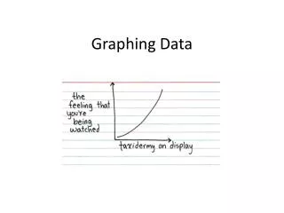
Section Graphing Data 1.3 Linear Relationships • Scatter plots of data may take many different shapes, suggesting different relationships.
Section Graphing Data 1.3 Linear Relationships • When the line of best fit is a straight line, as in the figure, the dependent variable varies linearly with the independent variable. This relationship between the two variables is called a linear relationship. • The relationship can be written as an equation.
Section Graphing Data 1.3 Linear Relationships • The slope is the ratio of the vertical change to the horizontal change. To find the slope, select two points, A and B, far apart on the line. The vertical change, or rise, Δy, is the difference between the vertical values of A and B. The horizontal change, or run, Δx, is the difference between the horizontal values of A and B.
Section Graphing Data 1.3 Linear Relationships • As presented in the previous slide, the slope of a line is equal to the rise divided by the run, which also can be expressed as the change in y divided by the change in x. • If y gets smaller as x gets larger, then Δy/Δx is negative, and the line slopes downward. • The y-intercept, b, is the point at which the line crosses the y-axis, and it is the y-value when the value of x is zero.
Section Graphing Data 1.3 Nonlinear Relationships • When the graph is not a straight line, it means that the relationship between the dependent variable and the independent variable is not linear. • There are many types of nonlinear relationships in science. Two of the most common are the quadratic and inverse relationships.
Section Graphing Data 1.3 Nonlinear Relationships • The graph shown in the figure is a quadratic relationship. • A quadratic relationship exists when one variable depends on the square of another. • A quadratic relationship can be represented by the following equation:
Section Graphing Data 1.3 Nonlinear Relationships • The graph in the figure shows how the current in an electric circuit varies as the resistance is increased. This is an example of an inverse relationship. • In an inverse relationship,a hyperbola results when one variable depends on the inverse of the other. • An inverse relationship can be represented by the following equation:
Section Graphing Data 1.3 Nonlinear Relationships • There are various mathematical models available apart from the three relationships you have learned. Examples include: sinusoids—used to model cyclical phenomena; exponential growth and decay—used to study radioactivity • Combinations of different mathematical models represent even more complex phenomena.
Section Graphing Data 1.3 Predicting Values • Relations, either learned as formulas or developed from graphs, can be used to predict values you have not measured directly. • Physicists use models to accurately predict how systems will behave: what circumstances might lead to a solar flare, how changes to a circuit will change the performance of a device, or how electromagnetic fields will affect a medical instrument.
Section Section Check 1.3 Question 1 Which type of relationship is shown following graph? • Linear • Inverse • Parabolic • Quadratic
Section Section Check 1.3 Answer 1 Answer:B Reason:In an inverse relationship a hyperbola results when one variable depends on the inverse of the other.
Section Section Check 1.3 Question 2 What is line of best fit? • The line joining the first and last data points in a graph. • The line joining the two center-most data points in a graph. • The line drawn close to all data points as possible. • The line joining the maximum data points in a graph.
Section Section Check 1.3 Answer 2 Answer:C Reason:The line drawn closer to all data points as possible, is called a line of best fit. The line of best fit is a better model for predictions than any one or two points that help to determine the line.
Section Section Check 1.3 Question 3 Which relationship can be written as y = mx? • Linear relationship • Quadratic relationship • Parabolic relationship • Inverse relationship
Section Section Check 1.3 Answer 3 Answer:A Reason:Linear relationship is written as y = mx + b, where b is the y intercept. If y-intercept is zero, the above equation can be rewritten as y = mx.
Section Graphing Data 1.3 End of Chapter
Section Mathematics and Physics 1.1 Electric Current The potential difference, or voltage, across a circuit equals the current multiplied by the resistance in the circuit. That is, V (volts) = I (amperes) ×R (ohms). What is the resistance of a lightbulb that has a 0.75 amperes current when plugged into a 120-volt outlet? Click the Back button to return to original slide.