History and Basic Principles
History and Basic Principles. C O L O U R. C O L O U R. IT DOESN´T EXIST. With this striking idea, start most of the articles and manuals on color theory.

History and Basic Principles
E N D
Presentation Transcript
History and Basic Principles COLOUR
With this striking idea, start most of the articles and manuals on color theory. Blue Ocean, red flower or green car are commonly used expressions. What we need to know is that they do not correspond to an objective reality because in essence, colours don´t exist.
The phenomenon of decomposition of light, was discovered in 1666 by Isaac Newton, who noted that when a beam of white light went beyond a glass prism, the beam is divided into a spectrum of colours identical to the rainbow: red, orange , yellow, green, blue, indigo and violet.
It is a sensation that occurs in response to nerve stimulation of the eye, caused by a light wavelength. The human eye interprets different colors depending on the longitudinal distances.
Elements for colour perception • Font • Observer • Object
COLOR CHARACTERISTICS 1. Hue or Tone 2. Saturation or Intensity 3. Brightness, Lightness or Value
HUE OR TONE Is the stimulus that allows us to distinguish one colour from another. It´s also defined as the qualitative variation of colour, in relation to the wavelength of the radiation
According to HUE colours can be divided into: warm: red, orange and yellow (colors associated with sunlight, fire ...) and cool: green, blue and purple (colors associated with water ...). Warm colours, give a sense of activity, joy, trust, dynamism, friendship and welcome. Cool colours give a sense of calm, seriousness and detachment.
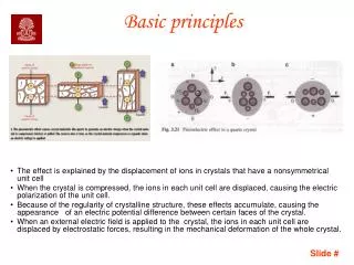
SATURATION OR INTENSITY It´s the more or less intense sensation of one colour, so, it´s level of purity. -Pure spectrum colours are fully saturated. (They are very BRIGHT COLORS.) - The intensity of a colour is determined by its character of shiny or off.
Medium saturation of colour Desaturated image Maximum colour purity In the examples below, the red colour of the strawberries has lost intensity until they appear gray in one case, but also loses intensity to add white in the second.
The intensity of the colour orange, decreases until a gray of the same value to lose saturation.
BRIGHTNESS, LIGHTNESS OR VALUE Is understood as the ability of a color to reflect white light impinging on it. It refers to the lightness or darkness of a pitch. The red of the images above, have different "values" of light, from the highest to the darkest ones.
A color is defined by its hue, brightness and saturation. Any color can be identified with values of these three variables. The black is obtained when there is no brightness (no light). The grays are obtained when the saturation is low (high light mixing or interference). Of the grays white is the brightest (maximum frequency waves of different lengths). On the other hand the color reproduction techniques need to use other models not based on perception: The RGB representation through screens, televisions, monitors and scanners based on luminous shafts. The CMYKfor representation in painting, printing, publishing based on mixing pigments.
The colors obtained directly naturally by decomposing sunlight or artificially by emitting light bulbs of specific wavelength are called additive colour. The union of all wavelengths of the visible spectrum for white is not necessary, because if we only mix red, green and blue, we will get the same result. It is for this reason that these colours are called primary colors, because the sum of the three produces white. Moreover, all colours of the spectrum can be obtained from them. In conception subtractive primary colours are different, particularly cyan, magenta and yellow. From these three colours we can get just about everyone else, except white and black. Indeed, the mixture of cyan, magenta and yellow pigments does not produce white, but a dirty gray, neutral. As for the black, it is not possible to obtain from the primary, being necessary to include in the set of subtractive primary colours, resulting in the CMYK model (Cyan, Magenta, Yellow, Black).
Created in 1963 and looking for a standard for communication and color reproduction in the graphic arts its full name is the Pantone Matching System, and is based on the publication of a series of catalogues on various substrates (surface to be printed), which provide a encoding standardized by a reference number and a specific colour Finally, there are several commercial systems for defining colours, the most known of them is the Pantone System.
The colour wheel represents the progressive and ordered succession of all the colors of the spectrum. It includes the primary and their opposites the secondary complementary. Tones located between primary and secondary are equal mixtures of adjacent tones that result in tertiary tones. Adding to that effect mixtures multiply the colours of the circle.
The circles represented here are composed of twelve basic colours. In the center black is represented as the sum of all of them. Aside from allowing us to observe the organization and interrelation of colours, the colour wheel is useful to select the right colours to our design.
In the pigment colours we have to differentiate between colours: PRIMARY Magenta, cyan and yellow. These are the tones that can not be obtained by mixing other colours, and are the base of all other.
In the pigment colours we have to differentiate between colours: SECONDARY Green, Red and Blue Violet. Results from the primary mixing of two equal parts.
In the pigment colours we have to differentiate between colours: TERTIARY These are the mixtures of the adjacent colours produced by the primary and secondary. These mixtures produce: Rose, violet, azure, spring green, chartreuse green and orange.
In the pigment colours we have to differentiate between colours: COMPLEMENTARY Each secondary colour is complementary to the primary and is not involved In its preparation. Complementary colors are those opposed on the color wheel
COMPOSITIONS WITH THE PRESENCE OF PRIMARY COLOURS
COMPOSITIONS WITH THE PRESENCE OF SECONDARYCOLOURS
COMPOSITIONS WITH THE PRESENCE OF COMPLEMENTARY COLOURS yellow and blue violet
COMPOSITIONS WITH THE PRESENCE OF COMPLEMENTARY COLOURS redand cyan
COMPOSITIONS WITH THE PRESENCE OF COMPLEMENTARY COLOURS magentaand green
Importance and meaning of the colour WHITE Is the absence of colour such as black are in the ends of the shades of gray. They have a limit, often brightness and saturation extreme , and value-neutral (no colour). White can express peace, cold, purity and innocence, it creates an impression of possitive light of vacuum and infinity. White is the universal background of graphic communication
Importance and meaning of the colour BLACK Is the total absence of light, symbol of silence, mystery and sometimes can mean impure and evil. Confers nobility and elegance, especially when it is bright.
Importance and meaning of the colour GREY It is the center of everything, but it is a neutral and passive center, symbolizing the indecision and the absence of energy, expresses doubt and melancholy. Symbolically, white and black, with shades of grey are the colour of the logic and substance: the form. Moreover, white and black with gold and silver are the colours of prestige.
Importance and meaning of the colour YELLOW It is the brighter, warmer, hottest and most expansive colour. It is the colour of the sun, light and gold, and as such is violent, intense and sharp. Usually interpreted as lively, jovial, exciting, emotional and impulsive. It is also related to nature.
Importance and meaning of the colour ORANGE More than red, has an active, radiant and expansive force. It has a cozy, warm, stimulating and dynamic quality, very positive and energetic.
Importance and meaning of the colour RED It means vitality, it´s the colour of blood, passion, brute force and fire. Fundamental colour, linked to the principle of life expresses sensuality, virility, energy, that is jubilant and aggressive. Red is the symbol of ardent and unbridled passion, sexuality and eroticism.
Importance and meaning of the colour BLUE It is the symbol of the deep. Intangible and cold, it predisposes favorable. It is a reserved colour and it´s within the cool colours. Expresses harmony, friendship, loyalty, serenity, tranquility ... and it has the virtue of creating the illusion of back. This colour is associated with the sky, sea and air.
Importance and meaning of the colour VIOLET It is the colour of temperance, of lucidity and reflection. It is mystical, melancholic and could also represent introversion. When violet turns to lilac or purple, it flattens out and loses its potential positive concentration. When it tends to purple it projects a sense of majesty.
Importance and meaning of the colour GREEN It is a calm and soothing colour. It evokes the vegetation, freshness and nature. It is the colour of calm indifference: it doesn´t convey happiness, sadness or passion. When something is green it raises the hope of renewed life. The green that fades to yellow, takes active force and brightness, if it dominates the blue its more sober and sophisticated.
Importance and meaning of the colour BROWN It is a masculine, severe and comfortable colour. It is reminiscent of autumnal atmosphere and gives the impression of gravity and balance. It´s the realistic colour, perhaps because it is thecolour of the earth beneath our feet.