Download
1 / 14
140 likes | 264 Vues
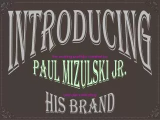
Welcome to the working portfolio of Paul Mizulski Jr., showcasing a creative philosophy grounded in curiosity, logic, and elegance. This presentation features a clean and organized design that promotes exploration through iconographic navigation rather than conventional text. Discover projects at various breakpoints for optimal user experience, including creative pieces for Halloween, album covers, and promotional materials. Each project reflects adaptable color schemes, playful features, and a commitment to aesthetics. Join me on this journey of creative expression that blends fun with design efficiency.

E N D
introducing Paul Mizulski Jr. the working portfolio created by his brand and demonstrating
My brand & my work curiosity, logic and elegance, Founded on principles of my portfolio and the work contained within are pure representations of these, the most essential components of my creative philosophy. The following presentation will explain how. Welcome!
The site Pictured above is an image of the home page at 1920 horizontal pixels. From this fundamental composition spawned the layouts of each project page as well as compositional variations specific to a total of 3 additional resolution break-points for viewport reactiveness. It’s clean, organized, relaxing, and void of any extraneous text, particularly that which is conventionally utilized for navigation. The absence of text-based navigation was consciously implemented as a means to encourage exploration and discovery. It’s also a way to push the universality and intuitiveness of iconographic and pictorial based guidance systems.
The 3 additional reactivity break-point compositions. . . reactiveness 3200 px. 480 px. 1024 px.
default default navigation hover hover Since text is absent of navigation interface components, it was necessary to enhance their attraction through hover / active / focus state animations. For visitors with less patience, standard arrows are implemented as an alternative way to navigate through the body of work in a more linear fashion. Given this nav system, links to additional projects may be added with ease without adversely disrupting the user experience.
Adaptiveuniformity For the sake of uniformity, each project page mimics the core design. Efficient resilience, however, is illustrated through the implementation of adaptive color palettes which correspond to each project with minimal impact on download speed.
silliness Having fun normality Having a good time is critical to the development of good designs. A visitor-selectable style-sheet switch panel was added to the uppermost section of each page. Used in a previous portfolio site as a way to increase download speed - since this version of my portfolio site is already considerably fast - the switch panel, here, was instead utilized as a way to just have a little fun
The goods Up next…
The seed for this movie poster, which promotes John Carpenter’s “Halloween”, was sown with a photograph of a jack-o-lantern that I carved out for the holiday of the same name. With the assistance of NASA stock imagery of our moon, the facial features present within the photograph of the jack-o-lantern were superimposed upon the moon in Photoshop. Hence, the name, “Jack-o-moon. Additional, typographic specific vector elements were added using Adobe Illustrator. The final result is this poster, several variations of which were optimized in PDF form for both print and digital distribution. Jack-o-moon
Presented here is an illustrated excerpt from the original tale, “The Juniper Tree”, defining the narrative tapestry’s most pivotal moment and over-arching theme of energized rebirth and redemption. The piece was completed entirely using Adobe Illustrator, more specifically, Illustrator’s freeform brushes and symbol creation tools. Invisible to this particular presentation is the vertical gutter which bisects the composition for physical book binding purposes. The imagery and typographic work was placed upon a photographic parchment texture as a way to demonstrate how the piece might appear when printed upon a similar substrate. the juniper tree
No more idols Presented here is a vinyl record jacket for the Chase and Status album, “No More Idols”. What began as an oscilloscope representation of the Chase and Status single, “Blind Faith” evolved into a more visually stimulating bar pattern. That evolved into a graphical representation of the widely variable Chase and Status soundscape. And, that evolved into physical media packaging material for 45-RPM vinyl-based music distribution. All, with the exception of the oscilloscope image captured within Microsoft Windows while using Windows Media Player, was constructed using Adobe Illustrator and optimized for both print and digital purposes.
This piece started quite simply as a portrait exercise utilizing the live trace tool in Adobe Illustrator. It wasn’t long before it became apparent that what had started as portraiture had tremendous potential as a full-blown promotional project for one of my favorite motion pictures, by one of my favorite directors, featuring one of my favorite actors. Depending on whatever mood is required during exhibition, several unique color combinations exist, each one optimized for both print and digital distribution purposes. I feel that this monochromatic, red scheme, however, is the most honest reflection of the atmosphere conveyed during this particular moment of the movie. Crazy jack
A demonstration of my creative flexibility peppered with tenacious rationale, this is “Paper Chair”. This is an abridged photographic collage showing the progressive evolution and refinement of a custom tailored chair, built entirely out of corrugated cardboard, without any adhesives or fasteners. The chair is a good example of my radical / rational design methodology - that when given certain parameters such as biometrics, materials, processes, functionality and durability - this chair was the ultimate result. As silly as it may seem to design and construct cardboard furniture, this particular example has sustained over 4 years of regular use. Paper chair
That’s all for now Goodbye!