Download
1 / 12
120 likes | 142 Vues
Analyzing the design, imagery, and language of RWD Magazine, a monthly publication catering to the hip-hop and urban music genres.

E N D
I chose to analyse RWD magazine because this magazine fits a similar genre of music to my new music magazine. This is a monthly magazine with an estimated monthly readership of 240,436+. It has a good relationship with the industry as thousands of copies are delivered to fashion brands, record labels and marketing companies. Also, they have an online version of the magazine. The main audience is aged between 15-24 year olds, but there are many older readers.
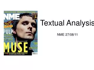
Front Cover Analysis Colours: There are not very many colours used on this magazine cover, as the colour scheme is made up of mostly white and blue. These are quite calming colours which makes the front cover give off a calming mood. This could imply the magazine is calming and relaxing to read and could possibly focus of music that relaxes the reader. Design: The design used here is very effective as the words and images fit together very well. The magazine has one main image which is conventional for magazines, also ensuring the cover does not look too messy. The statement ‘Tinie Tempah Tears It Up’ fits with the image, as the image is literally being torn which makes the magazine more eye-catching. Also a sans serif font style has been used for the coverline, making the magazine look more laid back. Images: The main image for this magazine cover features Tinie Tempah, who is a young and popular hip-hop artist. This image represents the genre of hip-hop as it features the fashion and style of the genre, by showing off a watch, jewelry and sunglasses etc. This is the type of figure that the audience aspires to be like and is a representation of the magazines target audience. However, this image carries some stereotypical assumptions about the type of people who read these magazines. The stereotypical group associated with this image are often seen as the kind who make trouble and break laws, which may not be a good image to portray. Pose, style, hair, make-up: It is common in most hip-hop magazines for a mid-shop of an artist being used. This is usually to show off the styles of urban music. Also, according to the theory of ‘The Male Gaze’ the pose could also be to attract the reader depending on their gender. For example, if the magazine was aimed at women, the image could be of a male in a pose that shows off their muscles and bodies. Composition and framing: As previously mentioned, a mid-shot has been used to frame the body of the featured artist. However, the image has been edited in order for it to look as if one image is ripping through the other. This is eye-catching as it is different and makes you want a closer look. The background is plain to make the main image stand out more, before noticing the text to the left. This main coverline is noticed as it is in a larger and different style font, and is on the left hand side, which is where audiences look first when reading a page. Written codes: Firstly, it is hard to make out what the title says, which could may lose the interest of someone browsing a shelf of magazines, as it is hard to read and they may not know what it means. On the other hand, curiosity could cause someone to read further into the magazine and find out more about it. The magazine assumes the reader knows about what's inside, as it does not give a lot of information. It simply states that the issue is special, and names some artists from the genre. The font is also quite small and does not clearly stand out. Language: The language does not address the reader, and shows little effort in grabbing their attention. However, the words ‘100TH ISSUE SPECIAL’ make the magazine sounds like it is going to be very interesting, and may attract their attention using this one statement. Overall Impression: The cover shows a good indication of who the magazine appeals to, however it does not give a good indication of what is going to be featured inside. The reader will be interested by the image and artists named, which shows that this magazine is aimed at specific readers, interested in this specific genre of music.
Contents Analysis Colours: The contents page for this magazine simply uses black font on a plain white background, however coloured images are used in order to make them stand out, as they could be the main focus of the page. This makes the page look dull, however could be useful as it draws the readers eye to the images of artists they’re interested in, which makes them want to read on. Design: The words and images have been split to control half of the page each, with images at the top and the actual text at the bottom. This allows the reader to first see the images in order to interest them, before going on to read the text. Bold and large font has been used to outline the headings, whereas the actual contents and page numbers have been squashed down, which suggests that the typical readers of this magazine are more interested in images rather than text. Images: The images used feature artists associated with the genre of music that this magazine is about. The images are usually representations of the target reader, or people who the readers look up to, which could imply this magazine is aimed slightly more at women. Pose, style, hair, make-up: The poses of the artist vary in each image, as some are looking the reader directly in the eye, and others are posing in a way which they look away from the readers. Composition and framing: Generally, the images all use mid-shots in order to show off the styles and fashions of the genre, as well as their facial expressions. The background is generally plain in each image as well as the whole page, which puts most of the focus on the people featured in the images. Also, as these images are at the top of the page, the readers will see them first as this is where the eye will look first, before moving on the text. The rule of thirds has also been used as the images lay on the vertical lines. Overall, the contents page does provide the information of what's inside the magazine, however has not promoted this information as the main feature of the page. It has tried to focus the readers attention through the use of images, which could imply that the readers are the type that are interested more in images rather than words. This could also show the readers are of a younger age group, who do not like a lot of text.
Double-Page Spread Analysis Colour: Similarly to the contents page, the colour scheme is quite simple as it uses black font on a plain white background and puts all colour into the images. Also meaning that the attention is drawn to the image first as this is the most eye-catching thing on the page. However, as this could be the house style of this issue, the magazine stays consistent throughout and the reader will not be thrown off. Design: The words and images fit together well as one page is devoted to text and the other is used for the main image associated with the article/feature. The headline is in a much larger font as this is the most important piece of text, it is also an informal font style which appeals to the reader and represents the genre of urban music. The page also uses a standfirst to introduce the story, which is also highlighted so readers will look to this first, before reading the body copy. Also, there is a drop cap used which makes the page more appealing, but as the letter is T it could be to represent the artist ‘Tinie Tempah’ who is the main focus of the article. The image is also made to look as if the man is pulling the page, which attracts the readers attention. The image uses negative space so that it does not appear overly busy or cluttered. This also allows the focus of the readers eye to go directly to the image itself and allows breathing room so the image does not appear squashed.
Theories • This magazine applies to Maslow’s hierarchy of needs as they can fulfill the need to be accepted into social groups of people with similar interests. This also boosts self-esteem of people who feel a sense of belonging to a group. This is why readers are attracted to these magazines, as the features on the cover are representing what the audience wants to be a part of. • This also uses the male-gaze theory as the images are of people posing to attracts certain readers. The cover uses an image of Tinie Tempah showing off the fashion of Hip-Hop with his glasses. watch and jewellery, as well as showing some of his muscles. this gives reader the inspiration to want to be more like this. • This also uses the theory of Branston and Stafford, which relates to stereotypes. As the media portrays certain images of certain groups in society, this is the image that we expect to see. The main image carries stereotypical assumptions of the magazine readers, which may not be good if the stereotypical group is badly looked upon.
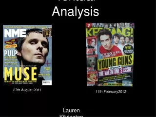
VIBE Magazine I have chosen to use VIBE for my research as this magazine fits a similar genre of music to my new hip-hop music magazine. VIBE Lifestyle Network is the parent company of VIBE Magazine and Vibe.com. The magazine is published six times a year, reaching 300,000 readers with the latest hip-hop news and features. It was launched in September 1992. It was bought recently by InterMedia Partners after previously being owned by Quincy Jones in partnership with Time Inc. VIBE has a circulation of approximately 800,000. The magazine chronicles the celebrities, sounds, fashion, lifestyle, new media and business born from urban music. The median age for VIBE readers is 28 year olds and has almost an equal amount of male and female readers. Also, the majority of it’s audience are African-American.
This magazine cover uses a colour scheme of yellow, white and black. These colours work really well as the bright colours stand out on the dark background and catch the readers eye. This also makes the features of the page easier to read and more noticeable from a distance. The design of the page works well as only a certain amount of colours have been used which makes the page look better and does not throw the reader off. The words fit well with the images as the text is bright and easy to read in front of the images. Also, even though the masthead is covered, it is still readable and makes the images stand out. The font used is mostly bold and in capitals which has a bigger impact on readers. The cover features well-known artists to the genre of music that the magazine represents, which is good as these are figures which the target readers look up to or aspire to be like. This means readers are more likely to pick up the magazine and have a look. The artists featured are also seen wearing the latest fashions of the hip-hop genre, and are looking the reader in the eye. This is a good way to attract the reader’s attention. A mid-shot is used to show the body language and style of the artists featured and the background is plain to focus the attention on the main features of the cover. The main coverline is on the right of the page which is unusual as most readers will look to the left of the page first, which means they may not notice this first of all. There is a good indication of what’s inside the magazine as a list of names are displayed at the top of the page which implies they are going to be featured. There are also other indications in smaller font of the contents of the magazine. The main features such as the masthead and main coverline are quite large and would stand out on a shelf. The language used hooks the readers in as words such as ‘GREATEST’ are used and ‘OF ALL TIME!!!’ . These address the reader and pull them in. Front Cover Analysis
The contents page uses white font on a dark blue background to emphasize the main features of the magazine and make them easily readable. One main image has been used of one of the artists from the front cover. This could imply that this artist is the main focus of this issue of VIBE, and allows the readers to know that the artist will be seen later in the magazine. The images and words fit well together with the background and the page is not cluttered up as there is blank space around the image and font. This put the focus onto the words and images to outline their importance. On this contents page the artist Bruno Mars is used. The images used are usually a representation of the target reader. Here, as well as on the cover, the image is of a male, which could imply the main target audience for VIBE are males. All the main font is on the left so that the reader will notice this first and read through before moving across the page to the image, which could be less important or here for the reader to take a small break before going on to any more reading. The font is larger, bolder and in upper case for the feature headlines as these are more eye-catching. This is so that if someone wants to quickly flick through the magazine, they will notice the names of the features without reading any of the information under it to get an idea of what’s inside. Contents Analysis
The double page spread uses black font on a white background and there is little colour used in the main image. This allows the reader to notice the image first, but does not pull all the attention away from the text. Alsoas the image is on the left page, the reader will look here first, which gives them a small break before any further reading. The article features an interview with an artist, so the questions being asked are in bold font so the reader does not get confused and the article is easier to read. The largest piece of font is the headline which stands out in order to let the reader know what the article is about. Also, as this is on the left the reader will see this first before going on to read the article. A stand first is also used to introduce the article, which is in a slightly larger font to allow it to stand out on the page. The article used is an interview with an artist for this genre of music. This indicates that readers of this magazine are interested in artist interviews which shows me what kind of features this target audience like to read. Also, as this is a first person perspective, it is more informal, which may mean this style of language is what the readers are more comfortable with for this type of magazine. Double-page Spread Analysis