The Population Pyramid
The Population Pyramid. What it is and how it works. Bar graphs are a handy way to illustrate numbers. Canada 1961. But a Population Pyramid is better. Consists of two back-to-back bar graphs population plotted on the X-axis and age on the Y-axis, in five-year age groups (cohorts).


The Population Pyramid
E N D
Presentation Transcript
The Population Pyramid What it is and how it works
Bar graphs are a handy way to illustrate numbers Canada 1961
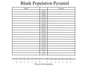
But a Population Pyramid is better • Consists of two back-to-back bar graphs • population plotted on the X-axis and age on the Y-axis, in five-year age groups (cohorts). • Males are shown on the left and females on the right • Measured by raw number or as a percentage of the total population. Canada 1961
Types of Population Pyramids Stationary • narrow base and roughly equal numbers in each age group, tapering off at the older ages. • Scandinavian countries
Expansive • broad base • rapid rate of population growth • low proportion of older people. • A steady upwards narrowing shows that more people die at each higher age band. • This type of pyramid indicates a population in which there is a high birth rate, a high death rate and a short life expectancy. • LLDC’s for the most part
Constrictive • a high proportion of aged persons and declining numbers. • Germany, Italy
can be used to find the number of economic dependents being supported in a particular population. • Under 15 (children who are in full time education and therefore unable to work) and those over 65 (those who have the option of retirement) • Dependency ratio = % under 15 + % over 64 % 15-64 • Population pyramids can be used to observe the natural increase, birth, and death rate as well as how many people of each age range live in the area. • There tends to be more females than males in the older age groups, due to females' longer life expectancy.
You can tell a lot from population pyramids • If a country’s population pyramid has a wide base, it means it has a lot of young people, that its birth rate is high. • If a country’s population pyramid gets narrow very quickly, it usually means it has a high death rate. • A country with a high birth rate and a high death rate is developing country. • See the examples on the next slide.
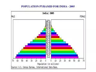
These are examples of population pyramids for three different types of countries and for the world overall, in the year 2000. Compare the least developed country example with that of a pyramid for a developed country. The narrow base of the pyramid for the more developed country indicates a low birth rate. The wider upper part indicates a lower death rate (because of modern medicine, good food, etc.). http://www.un.org/esa/socdev/ageing/fig1.gif
http://www.nd.edu/~dmyers/courses/old/102au00/bb.jpg After WWII there was a surge in the birth rates of most western countries. This was called the baby boom. The baby boom can be tracked though population pyramids of different time periods.
To view an animated population pyramid of Canada’s population from Confederation to 2001, click here. Use the control buttons at the bottom of the pyramid to stop the animation at a year when the baby boom is just getting started. What year did you pick? Start the animation again and this time stop it when you think you see the “echo” of the baby boom getting started. What year did you pick?
What do you notice about this pyramid? • Why do you think there is a “bulge” in the middle? • Notice the bottom 3 age groups – why is it that they are the largest?