Enhancing Data Representation for Epidemiology Students Through Infographics
This project aims to improve student understanding of data visualization in epidemiology through Infographics. References scholarly articles by Burris et al. (2013) and Orzech et al. (2011). Suggestions for adjustments and resolutions for effective teaching strategies provided.


Enhancing Data Representation for Epidemiology Students Through Infographics
E N D
Presentation Transcript
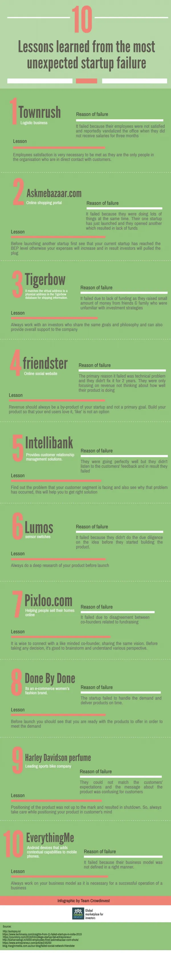
Infographics = Visualization Infogr.am Piktochart easel.ly
My Fear I am not an artist! Thanks, Jordan!
Notes from Meeting with Faculty Undergraduate epidemiology course 2 faculty + 2 sections = 200 students New faculty – first time teaching Students would be working in groups Piktochart
The Title should: • Address a research question or issue • Not too broad • Focus on story telling
References Needed three scholarly peer-reviewed articles Make adjustments in formatting style
Data Visualization Burris, J., Rietkerk, W., & Woolf, K. (2013). Acne: The role of medical nutrition therapy. Journal of the Academy of Nutrition and Dietetics, 113(3), 416-430. doi:10.1016/j.jand.2012.11.016
Title Slide B
FacultyA Faculty B ME
1. Students struggled with data representation. • Resolution: • Move assignment until later in the semester • Orzech, K. M., Salafsky, D. B., & Hamilton, L. (2011). The state of sleep among college students at a large public university. Journal of American College Health, 59(7), 612-619. doi:10.1080/07448481.2010.520051 • Piktochart
2 Time Consuming to Grade Resolution Have students submit articles cited and highlight sections used in the Infographic assignment. Piktochart
3 Only one simultaneous user Students expected Google Docs functionality. Resolution: Smaller Groups Piktochart
4 Poor Attendance Watch video in class Piktochart