**ESTABLISHING PATTERNS OR TRENDS IN THE DATA COLLECTED**
372 likes | 1.72k Vues
**ESTABLISHING PATTERNS OR TRENDS IN THE DATA COLLECTED**. BY DR. ARTEMIO P. SEATRIZ MMSU-CTE LAOAG CITY. Introduction

**ESTABLISHING PATTERNS OR TRENDS IN THE DATA COLLECTED**
E N D
Presentation Transcript
**ESTABLISHING PATTERNS OR TRENDS IN THE DATA COLLECTED** BY DR. ARTEMIO P. SEATRIZ MMSU-CTE LAOAG CITY
Introduction In the conduct of your experiment or your investigation, you collected a lot of information. What do you call these pieces of information that you have collected from your experiment? These are called data. Since these data are unorganized and unordered, they are called raw data.
Generally, it is very hard to interpret data in its raw form – unorganized and unordered data. Data in its raw form have little or no meaning at all. So, as the investigator you should do something to make the gathered data meaningful.
In this seminar-workshop, we are going to look at the different forms of data, how to present data, and how to make your collected data meaningful.
I. Classifying Data Data may be classified in different ways: A. Quantitative Data vs. Qualitative Data Quantitative data – data gathered based on measurement or counting like height of plant, weight of plant, number of seedlings in a plot
Qualitative data – data gathered using a non-standard scale or unequal intervals or discrete categories like leaf condition categorized as healthy or not healthy; color of leaves as green, dark green, light green or yellow green, etc.
B. Continuous Data vs. Discontinuous/Discrete Data Continuous data – data gathered through measurement like heights of plants, weights of plants, flowering time, etc. Discrete data – gathered obtained through counting like number of leaves per plant,
number of pods produced per plant, number of mangoes per basket, number of seedlings in a plot, etc.
Data may also classified according to scales of measurement – nominal, ordinal, interval or ratio. Nominal data – data where objects are placed in discrete categories which cannot be ranked in ascending or descending order like brand of detergents, color of leaves, etc.
Ordinal data – data where objects are placed into categories that can be ranked or ordered in an ascending or descending manner like condition of leaves of plants categorized as healthy or not healthy; Interval data – data collected using a scale with equal interval but no absolute zero value like temperature in 0C.
Ratio data – data collected using a scale of equal interval and an absolute zero like height of plants, weights of plants, number of leaves per plant, etc.
II. Tabulating and Graphing the Data Although you have classified your data as quantitative or qualitative; discrete or continuous; nominal, ordinal, interval or ratio, they do not say anything yet or they do not have any meaning yet. To be able to extract meaning from your data, you have to organize or transform your raw data in to a more compact or organized way.
Tabular Presentation – presenting data in rows and columns Table 1. Height of plants. ======================== Plant No. Height of Plants (cm) Horse manure Urea ------------------------------------------- 1 26 25.7 2 23 26.2 3 23.5 24.6 4 25.3 27.0 5 26.5 25.8 6 24.8 27.6 7 25.6 27.4 ==========================
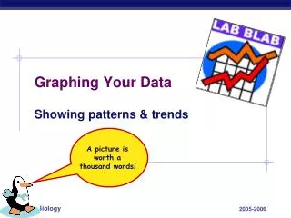
Graphical Presentation – pictorial or visual representation of data - pictures are easier to understand than words * What are the different kinds of graphs? * What is the appropriate type of graph for a certain set of data?
III. DESCRIBING DATA Two ways of describing a set of quantitative or numerical data: 1. Measures of Central Tendency Mean Median Mode
2. Measures of Variation Range Quartile Deviation Mean Deviation Variance Standard Deviation
IV. INTERPRETING QUALITATIVE AND QUANTITATIVE DATA After you have organized and presented your data in a more compact form, you are now ready to analyze, interpret and synthesize the relationships between and among your data variables.
Guide in analyzing and interpreting data 1. Write a topic sentence stating the independent and dependent variables. Give reference to table and graph. 2. Write a sentence comparing the measure of central tendency of the collected data. 3. Write a sentence describing the variation.
4. Write a sentence stating how the data support the hypothesis. Example: The responses of plants to compost and urea were investigated. The responses measured in the study were height of plants, how long plants started to flower, number of pods produced per plant and total weight of plants per plot. The data are shown in Table 1.
It can be noted from the table that the mean height of plants grown in soil with fertilizer was higher than that of plants in the control group (without fertilizer). The mean height of plants grown in soil with horse manure was higher than that in urea. The bar graph shows the trend. The range of plant height in the control group (without fertilizer) was greater that that of the plants grown in soil with horse manure and urea.
The data supported that hypothesis that plants grown with fertilizer would be taller than plants grown without fertilizer. The flowering time would also be shorter with the use of fertilizer.
V. TESTING HYPOTHESIS After determining the measures of central tendency and variation of your data, you can present a summary table showing these measures showing these descriptive information.
Example: Table 2. Mean heights of plants grown in soil with and without fertilizers. ================================ Descriptive Without Horse Urea Information Fertilizer Manure (cm) (cm) (cm) ---------------------------------------------------------- Mean 20.60 32.60 30.80 Range 5 8 6 Maximum 21 33 32 Minimum 16 25 26 Number of Plants 7 7 7 ==================================
Consider the following questions: 1. Are there significant differences in the mean heights of the three sets of plants? 2. Can you conclude that fertilizers improve plant height? 3. Are the differences due to the application of fertilizer alone or is it by chance?
How do you answer these questions? To be able to answer these questions, you should use inferential statistics particularly the area of hypothesis testing.
List of some appropriate statistical tools ============================== Category Analysis Quantitative Qualitative of Data Data Data ================================ Descriptive Measure of Mean Median statistics Central Range Mode Tendency/ Variance Frequency Variation Standard distribution deviation
Inferential Statistical Parametric Non- Statistics Test parametric Two dependent samples t-test Wilcoxon test Two independent t-test z-test F-test Three or more inde- pendent samples ANOVA F-test ================================