Challenges with Data Visualization in Financial Presentations
In this correspondence, I express my difficulties with separating red and yellow columns in my financial data visualization assignment. Despite repeated attempts and using enhanced Windows metafiles, I was unable to achieve the desired flying effects for my columns as demonstrated by Dr. Rosener. I had success with other assignments, but this one proved challenging. As a workaround, I decided to create the illusion of a table using separate pictures that convey similar effects. I hope the final product meets expectations, despite the extra effort required.

Challenges with Data Visualization in Financial Presentations
E N D
Presentation Transcript
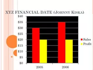
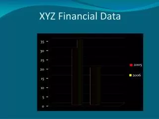
XYZ Financial Data 35 30 25 2005 20 2006 15 10 5 0 Sales Profits
Dear Dr Rosener, I tried getting my red columns and my yellow columns to fly in separately and I never could!! I do not know what I did wrong. I could get things to fly in from varying directions in other assignments…but I was unable for my columns to be separated in this assignment. When I saved it as a enhanced windows metafile I thought that would break up all the little pieces and allow me to do the varying animations. But one I inserted it back in and ungrouped it, my Office program said it was just a bitmap?? Why did it separate some things in the picture but not others. So, needless to say, I tried doing this assignment over and over again and still couldn’t get it to work the way you did. Instead of working with a table like you had proposed, I decided to insert different separate pictures that look like a table and still shows the same effects that you had demonstrated. It was more work to set it up this way but the only way that I could think of to get it to look right. I hope you still like it!!
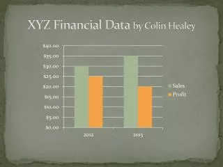
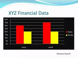
XYZ Financial Data $45 $40 2005 $35 $30 2006 $25 $20 Sales Profits