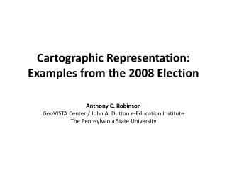
Cartographic Representation: Examples from the 2008 Election
410 likes | 557 Vues
Cartographic Representation: Examples from the 2008 Election. Anthony C. Robinson GeoVISTA Center / John A. Dutton e-Education Institute The Pennsylvania State University. How many ways can you map an election?. Electoral Vote Winners, 2008.

Cartographic Representation: Examples from the 2008 Election
E N D
Presentation Transcript
Cartographic Representation: Examples from the 2008 Election Anthony C. Robinson GeoVISTA Center / John A. Dutton e-Education Institute The Pennsylvania State University
Electoral Vote Cartogram – Areas Resized By # of Electoral Votes
County Choropleth – Winners (2 Classes) Choropleth = Color-Filled Areas
County Choropleth – Percentages of Votes UnclassedChoropleth = Uses Continuous Color Ramp, Not Set # of Color Classes
Shifts in Voting, Manipulated Color Saturation – Huffington Post Saturation = Intensity of Color
“The Past Isn’t Dead”, Allen Gathman, SE Missouri State University
Polling Place Equipment, Verified Voting Foundation Color Connotation = The Cultural Meaning of a Color
Reported Voting Problems, ourvotelive.org Choropleth Maps = Not Useful to Map Totals, Should Map Rates Instead
Google Earth Mashup, Kenton Ngo of DailyKos Map Mashup = Custom Map Created by Mixing Data From Multiple Web Sources
Every design has its purpose (often more than one) • Many are designed by people who have no cartographic training • The point of view of election maps is often highly opinionated • All of them are worth thinking about!
There is no “best” way to design a map • Every map simplifies reality to communicate an idea • Most people see maps as facts • Take it upon yourself to make responsible maps
![Election Expenditure Monitoring [EEM]](https://cdn1.slideserve.com/1694912/election-expenditure-monitoring-eem-dt.jpg)