Prototype, UI, Ux , and Risks
Prototype, UI, Ux , and Risks. Pongtip Aroonvatanaporn [Content by Supannika Koolmanojwong ] CS577 September 23, 2011. Outline. UI Risks Prototype User Experience Human Interface Guidelines. UI Risks. New to client (success criteria): IKIWISI

Prototype, UI, Ux , and Risks
E N D
Presentation Transcript
Prototype, UI, Ux, and Risks PongtipAroonvatanaporn [Content by SupannikaKoolmanojwong]CS577September 23, 2011
Outline • UI Risks • Prototype • User Experience • Human Interface Guidelines @USC CSSE
UI Risks • New to client (success criteria): IKIWISI • New to client's organization: changes in the way business is done • Types of Users: • Novice • Expert • Developer • “Administrator” @USC CSSE
Top 10 risks @USC CSSE
Prototype in 577ab • Focus on addressing the highest risk items • Login/logout module ? • Proof of concepts/algorithms • Check interoperability between COTS/Services/modules • Show progress to clients, consolidate the idea @USC CSSE
Models – Tools to Expose Risk • System Boundary and Interface Model • Benefits Realization Model • Success Models • Models of Model Clashes ("Model Clash Web") • Cost and Schedule Estimates (from COCOMO II) • Project, Transition and Support Plans (modeled in MS Project) • OCD, SSRD and SSAD • UML 2.0 Models • for client: Activity, State and Use-case • for developers: Class, … • Core-Capability Drivethru • Prototypes @USC CSSE
Good GUI prototyping tools • iRise • Balsamiq Mockup • IPlotz • FlairBuilder • MockFlow • Pencil Project • Hot Gloo • Cacoo @USC CSSE
Prototypes • Low-tech prototypes to explore concepts (not as status assessments) • “test-drivable” prototypes • Functioning prototypes • status assessment @USC CSSE
Low-Tech Prototypes • Kind: • throw away prototypes • to explore concepts • not as status assessments • Process • Role play use of prototype in alternative TO-BE work processes • Stimulate creative discussions with: • “What would happen if…?” • “Had you thought about …?” • “If we did X, what would happen?” • “What are strengths & weaknesses of…?” @USC CSSE
Low-Tech Prototypes @USC CSSE
“Test-drivable” Prototypes[Functional UI Prototype] • Executable Use-cases or State-machines • Simulated Application back-end; tool front end • iRise • Other tools? • Quasi-functional back-end:Produces "results", but maybe not sensible ones, as front end put through its paces • Mocked up website/pages; simplistic server • Functional (linked, …) website/pages; functional server • Prototype that evolves into system/product? @USC CSSE
iRise “Test-drivable” Prototype Samples @USC CSSE
Status Assessment Prototypes • Valuation Prototype • Sufficient for Stakeholder Commitments • Developers: clear understanding of software functionality • System/Project Requirements Engineer: can full-fill clients operational needs • Client: IKIWISI? • Foundations Prototype (even if in 577a): “Executable Architecture” • Demonstrate that you can integrate all the component types • Including COTS/OS, etc. • Stubs OK only for some (not all) to be developed capabilities • Demonstrate that something works: use eValid on integrated • Core Capability Drive-through @USC CSSE
Outline • UI Risks • Prototype • User Experience • Human Interface Guidelines @USC CSSE
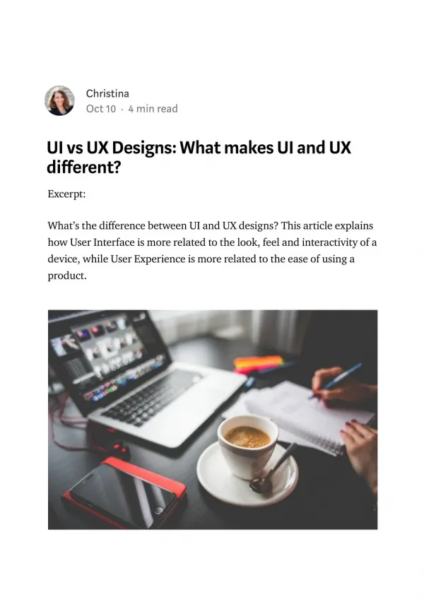
Ux – User Experience Design • Focus on usability • Not look-and-feel • Attractiveness can be a part of it • Benefits for a good user experience design • More customers will be willing to purchase • More customers will resist doing business with competitors • More customers will recommend you http://www.forrester.com/rb/Research/best_practices_in_user_experience_ux_design/q/id/54101/t/2 @USC CSSE
Great user experience design @USC CSSE
User Experience Design Best Practices • Become your users to know how to design for them. • Design first to avoid leaving user experience to chance. • Trust no one — test to make certain your users are happy. • Inject user experience design into your software development life-cycle (SDLC) process. @USC CSSE
Mac OS X Human Interface Guidelines • Understanding of the Fundamentals • Great User Experience that Integrates Mac OS X Technologies • Attention to Detail • Gorgeous Graphics and the Right Words Make a Positive Impression http://developer.apple.com/library/mac/#documentation/UserExperience/Conceptual/AppleHIGuidelines/Intro/Intro.html#//apple_ref/doc/uid/TP30000894-TP6 @USC CSSE
Understanding of the Fundamentals • Resolution • Operating systems • Gestures, Clicks, and Keystrokes • User Help Is Unobtrusively Available • Multiple Users Can Use a Single System • Internationalization @USC CSSE
Clean, Beautiful Typography Pervades the UI • system font (Lucida Grande Regular 13 point) - text in menus, dialogs, and full-size controls. • emphasized system font (Lucida Grande Bold 13 point) -the message of an alert. • small system font (Lucida Grande Regular 11 point) - the informative text in alerts. It is also the default font for column headings in lists, for help tags, and for small controls. • emphasized small system font (Lucida Grande Bold 11 point) -title a group of settings that appear without a group box, or for brief informative text below a text field. • mini system font (Lucida Grande Regular 9 point) is used for mini controls. It is also used for panel labels and text. • application font (Lucida Grande Regular 13 point)- for user-created content. • label font (Lucida Grande Regular 10 point) - labels on toolbar buttons and to label tick marks on full-size sliders. • view font (Lucida Grande Regular 12 point) - text in lists and tables. @USC CSSE
The Philosophy of UI Design: Fundamental Principles • Metaphors • file folders for storing documents • Users already have a “mental model” • E.g. - Email: to create a new letter, select a recipient, and send the letter • Familiarity - standard user interface elements • Simplicity - streamlined and focused, not have to compete with the details for the user’s attention. • Availability – (accessible) Avoid hiding such components too deeply • Discoverability - providing cues, clickable = aqua color @USC CSSE
Explicit and Implied Actions • Explicit actions clearly state the result of manipulating an object • Select command that is available/active • Implied actions convey the result of an action through visual cues or context. • Drag file into trash implies removal Consistency • Consistent to • Standard, other versions, other modules, users’ expectation @USC CSSE
Noun-then-verb • users can see on the screen what they’re doing and that users can point at what they see • User Control • Allow the user, not the computer, to initiate and control actions. • provide users with the capabilities they need while helping them avoid dangerous, irreversible actions • Feedback and Communication • When a user initiates an action, always provide an indication that your application has received the user’s input and is operating on it • When minimizes a window, it doesn’t just disappear. Instead, it smoothly slips into the Dock, clearly telling the user where to find it again. @USC CSSE
WYSIWYG (What You See Is What You Get) • no significant differences between what users see onscreen and what they receive in the final output • Use a preview function if necessary • Don’t hide features by failing to make commands available in a menu • Avoid providing access to features only in toolbars or contextual menus. Because toolbars and contextual menus may be hidden, the commands they contain should always be available in menu bar menus as well @USC CSSE
Forgiveness • making most actions easily reversible. • Perceived Stability • standard graphical elements • a clear, finite set of objects and a set of actions to perform on those objects • Providing status and feedback by letting users know that the application is performing the specified task. @USC CSSE
Aesthetic Integrity • Your product should look pleasant on the screen • Keep graphics simple, and use them only when they truly enhance usability • Don’t overload windows and dialogs with dozens of icons or buttons. • Don’t use arbitrary symbols to represent concepts; may confuse or distract • All icons should be rendered at the highest quality • All text should be anti-aliased, which is automatic when you use the standard system fonts. • The font size and type should be consistent within a window • The control size should be consistent within a window—for example, don’t mix small and standard controls • Always use checkboxes for multiple choices, not for mutually exclusive choices • Use push buttons for immediate commands such as “Open” • Avoid using push buttons to display pop-up menus or serve as tabs • Avoid using bevel buttons as tabs @USC CSSE
Avoid Burdening Users with App-Management Tasks • “Users view your app differently than you do.” • As much as possible, restore the user’s previous state • Support Auto Save and Versions, if appropriate • Decide whether users need to explicitly quit your app • Avoid calling attention to file formats @USC CSSE
Focus on Solutions, Not Features • Avoid feature cascade. It can be very tempting to add features that aren’t wholly relevant to the main focus of your app, but doing so can lead to a bloated interface that is slow, complex, and difficult to use. Always ask yourself if a proposed feature directly supports the user’s goal, and if it doesn’t, leave it out. • Heed the 80-20 rule. The 80-20 rule states that roughly 80% of users use only a handful of an app’s features, while only about 20% of users might use most or all of the features. Thinking of your user audience in this way encourages you to emphasize the features that enable the main task and helps you identify the features that power users are more likely to appreciate. @USC CSSE
Embrace Modelessness • Think carefully about an app design that requires users to enter modes frequently • Balance modelessness with the need for a distraction-free experience • Clearly indicate the current mode • Make modes easy to leave @USC CSSE
Make Your App Easy to Use • When appropriate, use metaphors that represent concrete, familiar ideas • Make sure your app description clearly states what users need in order to use your app • Use progressive disclosure to present the most common choices first. • When appropriate, use panels to simplify the UI More information: http://developer.apple.com/library/mac/#documentation/UserExperience/Conceptual/AppleHIGuidelines/Intro/Intro.html#//apple_ref/doc/uid/TP30000894-TP6 @USC CSSE