Download
1 / 33
330 likes | 632 Vues
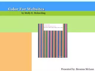
Color For Websites. by Molly E. Holzschlag. Presented by: Breanna McLean. why is color important?. color not only makes the site more visually appealing…. assists communication psychological impacts on user. why is color important?. color not only makes the site more visually appealing….

E N D
Color For Websites by Molly E. Holzschlag Presented by: Breanna McLean
why is color important? color not only makes the site more visually appealing… • assists communication • psychological impacts on user
why is color important? color not only makes the site more visually appealing… • assists communication • psychological impacts on user
web design woes cross-platform, cross-browser color design • many platforms in use: Windows, MacOS, Linux & Unix • means many variations from one computer system to another • impossible to obtain consistency the web-safe color palette • 216 colors • safe to use across browsers use it or forget it?
color relationships similar to people relationships? • complementary • harmonious • discordant • color temperature
the color wheel • primary way of describing color relationships complementary colorshigh in contrast after-image split-complementarycontrast, but not as much triadharmonious, esthetically pleasing analogouslow contrast monochromatic additive (light) color wheel
more color relationships harmonious color: soothing calm, peaceful discordant color: clash, cause nervousness, appear intense next to each other color temperature: warm vs. cool
simultaneous contrast the color on the right appears to be brighter than the color on the left
color properties how can you use these color properties to your advantage?
spa site soft colors welcome visitors and put them at ease
athletic sites high contrast colors energize & invigorate
case study: artist Joe Forkan’s website http://www.joeforkan.com “Monster”
case study: artist Joe Forkan’s website http://www.joeforkan.com “Cruel Memory” “Tide”
using color strategically • users respond to visual cues on a psychological level • well-educated designers know how to strategically create and place color and graphics to “tease, please, and satisfy” their visitors • rules of choosing color- natural color association for your product - audience demographics “Did you know that a visitor has formed his first impression of your site within the first nine seconds of a visit?”
natural color association blue is often associated with water
using color strategically • users respond to visual cues on a psychological level • well-educated designers know how to strategically create and place color and graphics to “tease, please, and satisfy” their visitors • rules of choosing color- natural color association for your product - audience demographics “Did you know that a visitor has formed his first impression of your site within the first nine seconds of a visit?”
global color Not only should your site’s color palette match the product, but you should choose colors that match your audience’s values. To help you do that, the following gallery of general color themes explains the symbolism of color and the psychological relationship between it and people.
designing for a global audience PURPLE = bad “Associated with mourning or New-Age and alternative religions in some cultures. Should be avoided in many instances. Interestingly, purple is rarely found in nature.” nature earth health good luck jealousy renewal money
designing for a global audience BLUE = good “Color immortality in China, holiness for the Jews, color of Krishna in Hinduism. Blue is the safest global color.” trust conservative security technology cleanliness sorrw order
safe sites Dell, Microsoft, AOL, WalMart, etc.
designing for a global audience RED “In China, a symbol of celebration and good luck.” power energy love warmth passion aggression danger
designing for a global audience GREEN “Tends to be calming and antidepressant. It is associated with money in the U.S., but not in many other countries.” nature earth health good luck jealousy Renewal money
designing for a global audience YELLOW “Sacred and imperial color in Asian cultures, represents joy and happiness in several Western cultures. Women tend to respond quite positively to many values of yellow. optimism hope philosophy dishonesty cowardice betrayal
designing for a global audience ORANGE “Symbolizes that a product is inexpensive in the U.S., so it should be avoided when designing sites that are expressing sophistication, elegance, and luxury.” energy balance warmth
designing for a global audience BROWN “Brown is usually quite neutral and associated with nature.” earth reliability comfort endurance
designing for a global audience GRAY “Is widely used as a neutralizing color. Silver tones express sophistication.” intellect futurism elegance modesty sadness decay
designing for a global audience WHITE “Salvation, holiness, purity in most Western and many world cultures, but mourning in some Western and many Eastern cultures. Should be used with care in certain instances. Because white is such a necessary color for contrast & design, it’s wise to mix it with another color that has stronger, more obvious, significance.” purity cleanliness precision innocence sterility death
designing for a global audience BLACK “Represents mourning in many cultures, also evil and dark spirits. Paradoxically, black is seen as sophisticated and elegant, especially in cosmopolitan, prosperous areas.” power sexuality sophistication mystery fear unhappiness death
gender just one more thing…. men’s and women’s reactions to color are significantly different just some theories - hard to make assumptions: • blue stands for men much more than women • men prefer blue to red, women red to blue • men prefer orange to yellow, women yellow to orange • women’s color tastes are thought to be more diverse than men’s
creating your palette • Finally! You have enough information to create a color palette for your site. • list of colors • swatch file Color Black White Orange Lime Rich Yellow RGB Value 000 255, 255, 255 255, 153, 0 153, 204, 0 255, 204, 51 Hexadecimal Value 000000 FFFFFF FF9900 99CC00 FFCC33
conclusion Designers should feel good about the use of color, and be assertive in how it’s used. But you must also think carefully about why you’re using a given color or selection of colors, and to whom that color is being delivered. Without forethought, the results could weaken your color message - or worse, make it ineffective altogether.