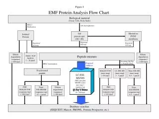
Constant Pressure Analysis Chart
Constant Pressure Analysis Chart. Radar Summary Chart – An example of the radar echo intensity information available every hour from the national radar network is shown on a weather radar summary chart.


Constant Pressure Analysis Chart
E N D
Presentation Transcript
Constant Pressure Analysis Chart • Radar Summary Chart – An example of the radar echo intensity information available every hour from the national radar network is shown on a weather radar summary chart. • Radar Summary Charts show weather radar echo intensity scales as a measure of precipitation rate. Contours represent radar echo intensity levels 1, 3, and 5.
Constant Pressure Analysis Chart • Constant Pressure Analysis Charts - Weather information for computer generated constant pressure charts is observed primarily by balloon-ascending radiosonde packages. • Each package consists of weather instruments and a radio transmitter. • During ascent instrument data are continuously transmitted to the observation station. • Radiosondes are released at selected observational sites across the USA at 00Z and 12Z.
Constant Pressure Analysis Chart • The data collected from the radiosondes are used to prepare constant pressure charts twice a day. • Constant pressure charts are prepared for selected values of pressure and present weather information at various altitudes. • The standard charts prepared are the 850 mb (hPa), 700 mb (hPa), 500 mb (hPa), 300mb (hPa), 250 mb (hPa), and 200 mb (hPa) charts.
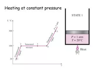
Constant Pressure Analysis Chart • Charts with higher pressures present information at lower altitudes while charts with lower pressures present information at higher altitudes.
Constant Pressure Analysis Chart • All constant pressure charts contain analyses of height and temperature variations. • Also, selected charts have analyses of wind speed variations. • Variations of height are analyzed by contours, variations of temperature by isotherms, and variations of wind speed by isotachs. • Contours are lines of constant height, in meters, which are referenced to mean sea level.
Constant Pressure Analysis Chart • Contours are used to map the height variations of surfaces that fluctuate in altitude. • They identify and characterize pressure systems on constant pressure charts.
Constant Pressure Analysis Chart • Contours are drawn as solid lines on constant pressure charts and are identified by a three-digit code located on each contour. • To determine the contour height value, affix "zero" to the end of the code. • Fore example, a contour with a "315" code on the 700 mb/hPa chart identifies the contour value as 3,150 meters.
Constant Pressure Analysis Chart • Also, affix a "one" in front of the code on all 200 mb/hPa contours and on 250 mb/hPa contours when the code begins with zero. • For example, a contour with a "044" code on a 250 mb/hPa chart identifies the contour value as 10,440 meters. • The contour interval is the height difference between analyzed contours. • A standard contour interval is used for each chart.
Constant Pressure Analysis Chart • The contour intervals are 30 meters for the 850 and 700 mb (hPa) charts, 60 meters for the 500 mb (hPa) chart, and 120 meters for the 300, 250, and 200 mb (hPa) charts. • The contour gradient is the distance between analyzed contours. • Contour gradients identify slopes of surfaces that fluctuate in altitude. • Strong gradients are closely spaced contours and identify steep slopes.
Constant Pressure Analysis Chart • Weak gradients are widely spaced contours and identify shallow slopes. • The contour analysis displays height patterns. • Common types of patterns are lows, highs, troughs, and ridges. • Contours have curvature for each of these patterns. • Contour patterns can be further characterized by size and intensity. • Size represents the breadth of a system.
Constant Pressure Analysis Chart • Sizes can range from large to small. • A large pattern is generally more than 1,000 miles across, and a small pattern is less than 1,000 miles across. • Intensities can range from strong to weak. • Stronger systems are depicted by contours with stronger gradients and sharper curvatures. • Weaker systems are depicted by contours with weaker gradients and weaker curvatures.
Constant Pressure Analysis Chart • For example, a chart may have a large, weak high, or a small, strong low. • Contour patterns on constant pressure charts can be interpreted the same as isobar patterns on the surface chart. • For example, an area of low height is the same as an area of low pressure. • Winds respond to contour patterns and gradients. • Wind directions parallel contours.
Constant Pressure Analysis Chart • In the Northern Hemisphere, when looking downwind, contours with relatively lower heights are to the left and contours with relatively higher heights are to the right. • Thus, winds flow counterclockwise (cyclonically) around lows and clockwise (anti cyclonically) around highs. • (In the Southern Hemisphere these directions are reversed.) • Winds that rotate are termed circulations.
Constant Pressure Analysis Chart • Wind speeds are faster with stronger gradients and slower with weaker gradients. • In mountainous areas, winds are variable on pressure charts with altitudes at or below mountain crests. • Contours have the effect of "channeling" the wind.
Constant Pressure Analysis Chart • Isotherms are lines of constant temperature. • An isotherm separates colder air from warmer air. • Isotherms are used to map temperature variations over a surface. • Isotherms are drawn as bold, dashed lines on constant pressure charts. • Isotherm values are identified by a two-digit block on each line.
Constant Pressure Analysis Chart • The two digits are prefaced by "+" for above-freezing values as well as the zero isotherm and "-" for below-freezing values. • Isotherms are drawn at 5-degree intervals on each chart. • The zero separates above-freezing and below-freezing temperatures. • Isotherm gradients identify the magnitude of temperature variations.
Constant Pressure Analysis Chart • Strong gradients are closely spaced isotherms and identify large temperature variations. • Weak gradients are loosely spaced isotherms and identify small temperature variations.
Constant Pressure Analysis Chart • Isotachs are lines of constant wind speed. • Isotachs separate higher wind speeds from lower wind speeds. • Isotachs are used to map wind speed variations over a surface. • Isotachs are analyzed on the 300, 250,and 200 mb (hPa) charts. • Isotachs are drawn as short, fine dashed lines.
Constant Pressure Analysis Chart • Isotach values are identified by a two- or three-digit number followed by a "K" located on each line. • Isotachs are drawn at 20-knot intervals and begin at 10knots. • Isotach gradients identify the magnitude of wind speed variations. • Strong gradients are closely spaced isotachs and identify large wind speed variations.
Constant Pressure Analysis Chart • Weak gradients are loosely spaced isotachs and identify small wind speed variations. • Zones of very strong winds are highlighted by hatches. • Hatched and un-hatched areas are alternated at 40-knot intervals beginning with 70 knots. • Areas between the 70- and 110-knot isotachs are hatched. • Areas between the 110- and 150-knot isotachs are un-hatched.
Constant Pressure Analysis Chart • This alternating pattern is continued until the strongest winds on the chart are highlighted. • Highlighted isotachs assist in the identification of jetstreams.
Constant Pressure Analysis Chart • It is important to assess weather in both the horizontal and vertical dimensions. • This not only applies to clouds, precipitation, and other significant conditions, but also pressure systems and winds. • The characteristics of pressure systems vary horizontally and vertically in the atmosphere. • The horizontal distribution of pressure systems is depicted by the constant pressure charts and the surface chart.
Constant Pressure Analysis Chart • Pressure systems appear on each pressure chart as pressure patterns. • Pressure charts identify and characterize pressure systems by their location, type, size, and intensity. • The vertical distribution of pressure systems must be determined by comparing pressure patterns on vertically adjacent pressure charts. • For example, compare the surface chart with the 850 mb/hPa chart, 850 mb/hPa with 700 mb/hPa, and so forth.
Constant Pressure Analysis Chart • Changes of pressure patterns with height can be in the form of position, type, size, or intensity. • The three-dimensional assessment of pressure systems infers the assessment of the three-dimensional variations of wind.
Constant Pressure Analysis Chart • Constant pressure charts are used to provide an overview of selected observed en route flying conditions. • Use all pressure charts for a general overview of conditions. • Select the chart closest to the desired flight altitude for assessment of en route conditions. • Review the winds along the route. • Consider their direction and speed.
Constant Pressure Analysis Chart • For high altitude flights, identify jet stream positions. • Note whether pressure patterns cause significant wind shifts or speed changes. • Determine if these winds will be favorable or unfavorable (tailwind, headwind, crosswind.) • Consider vertically adjacent charts and determine if a higher or lower altitude would have a more desirable en route wind.
Constant Pressure Analysis Chart • Interpolate winds between charts for flights between chart levels. • Review other conditions along the route of flight.
Constant Pressure Analysis Chart • Evaluate temperatures by identifying isotherm values and patterns. • Evaluate areas with moist air and cloud potential by identifying station circles shaded black. • Consider the potential for hazardous flight conditions. • Evaluate the potential for icing. • Freezing temperatures and visible liquid forms of moisture produce icing. • Evaluate the potential for turbulence.
Constant Pressure Analysis Chart • In addition to convective conditions and strong surface winds, turbulence is also associated with windshear and mountain waves. • Wind shear occurs with strong curved flow and speed shear. • Strong lows and troughs and strong isotach gradients are indicators of strong shear. • Vertical wind shear can be identified by comparing winds on vertically adjacent charts.
Constant Pressure Analysis Chart • Mountain waves are caused by strong perpendicular flow across mountain crests. • Use winds on the pressure charts near mountain crest level to evaluate mountain wave potential. • Pressure patterns cause and characterize much of the weather. • As a general rule, lows and troughs are associated with clouds and precipitation, while highs and ridges are associated with good weather.
Constant Pressure Analysis Chart • However, this rule is more complicated when pressure patterns change with height. • Compare pressure pattern features on the various pressure charts with other weather charts, such as the weather depiction and radar summary charts. • Note the association of pressure patterns on each chart with the weather. • Pressure systems, winds, temperature, and moisture change with time.
Constant Pressure Analysis Chart • For example, pressure systems move, change size, and change intensity. • Forecast products predict these changes. • Compare observed conditions with forecast conditions and be aware of these changes.
Constant Pressure Analysis Chart • Plotted wind direction and speed by symbol. • Direction is to the nearest 10 degrees and speed is to the nearest 5 knots. • If the direction or speed is missing, the wind symbol is omitted and an "M" is plotted. • If speed is less than 3 knots, the wind is light and variable, the wind symbol is omitted, and an "LV" is plotted.
Constant Pressure Analysis Chart • Plotted height of the constant pressure surface is plotted in meters above mean sea level. • If data is missing, nothing is plotted in this position. • Plotted temperature to the nearest whole degree Celsius is given. • A below-zero temperature is prefaced with a minus sign. • Position is left blank if data is missing.
Constant Pressure Analysis Chart • A bracketed computer-generated temperature is plotted on the 850 mb/hPa chart in mountainous regions when stations have elevations above the 850 mb/hPa pressure level. • If two temperatures are plotted, one above the other, the top temperature is used in the analysis. • Plotted temperature-dew point spread to the nearest whole degree Celsius. • An "X" is plotted when the air is extremely dry.
Constant Pressure Analysis Chart • The position is left blank when the information is missing. • Plot of constant pressure surface height change which occurred during the previous 12 hours in tens of meters is given. • For example, a +04 means the height of the surface rose 40 meters and a-12 means the height fell by 120 meters; data is superseded by "LV" or "M" when pertinent.
Constant Pressure Analysis Chart • Circles identify station position. • Shaded black when T-D spread is 5 degrees or less (moist). • Un-shaded when spread is more than 5 degrees.