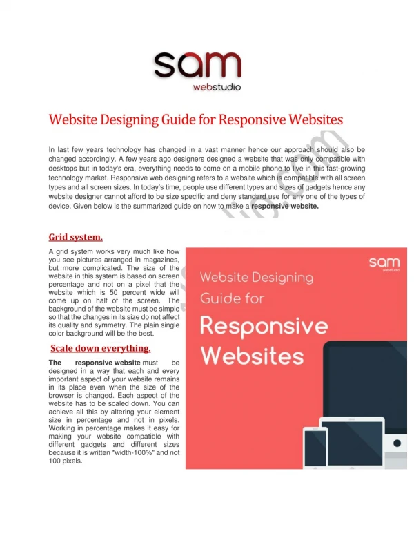
Website Designing Guide for Responsive Websites
<br>In last few years technology has changed in a vast manner hence our approach should also be changed accordingly. A few years ago designers designed a website that was only compatible with desktops but in today's era, everything needs to come on a mobile phone to live in this fast-growing technology market. Responsive web designing refers to a website which is compatible with all screen types and all screen sizes. In today’s time, people use different types and sizes of gadgets hence any website designer cannot afford to be size specific and deny standard use for any one of the types of device. Given below is the summarized guide on how to make a responsive website. <br>

Website Designing Guide for Responsive Websites
E N D
Presentation Transcript
Website Designing Guide for Responsive Websites In last few years technology has changed in a vast manner hence our approach should also be changed accordingly. A few years ago designers designed a website that was only compatible with desktops but in today's era, everything needs to come on a mobile phone to live in this fast-growing technology market. Responsive web designing refers to a website which is compatible with all screen types and all screen sizes. In today’s time, people use different types and sizes of gadgets hence any website designer cannot afford to be size specific and deny standard use for any one of the types of device. Given below is the summarized guide on how to make a responsive website. Grid system. A grid system works very much like how you see pictures arranged in magazines, but more complicated. The size of the website in this system is based on screen percentage and not on a pixel that the website which is 50 percent wide will come up on half of the screen. The background of the website must be simple so that the changes in its size do not affect its quality and symmetry. The plain single color background will be the best. Scale down everything. responsive website must be The designed in a way that each and every important aspect of your website remains in its place even when the size of the browser is changed. Each aspect of the website has to be scaled down. You can achieve all this by altering your element size in percentage and not in pixels. Working in percentage makes it easy for making your website compatible with different gadgets and different sizes because it is written *width-100%" and not 100 pixels.
StartRWD. Now as we have enough knowledge about the responsive website we can now start responsive web designing. It all starts with media queries from different fields. Media queries help your website activates size specific features. It tells your website to open sections which are only to be opened while visiting specific size. There are mainly three media queries, phone, tablets, and laptops. All three of these media queries work for the different size of the website. Generally we use 320px, 600pz, 768px and even 1080px. Grid response system. Once you master the settings of the media queries, then its time to hit the responsive grid system. Flexible grids only need few altering in settings. Firstly you have to switch sizing from pixel to percent. Select the maximum width for the container of your website. Once you switch these settings you'll be able to take help of any formula for how to display the best elements on different sizes screens. Responsive framework, content, images and background images. Use flexible grids for your website frameworks, which will make your complete website to adjust to the size of your screen. The background of your website should be a single image with flexible features and for this, you should use the content features of your programming. The typography of your website content must be flexible too. The fonts should adopt the size of the screen. The settings of font size should also be optimized accordingly. The images that you upload with your content should not be sized in pixels but in percentage which will help them to adopt the screen size quite easily. In this guide, we have described the processes that are relevant in responsive website designing and all the features that you need to use while designing. The basic knowledge of responsive website designing are explained in this article hence responsive website designing will never be a mystery to anyone now. Contact Us: Sam Web Studio Address: 2161/T-6, Office No: 208, 2nd Floor & 3B, 1st Floor, Guru Arjun Nagar, Patel Nagar Main Road City: New Delhi (India) Pin Code: 110008 Call Us: +91-996 835 3570 Visit Us: https://www.samwebstudio.com/