Responsive Websites Technology
With responsive websites design technology and techniques you can easily optimize and enhance user experience without resizing & scrolling for any device

Responsive Websites Technology
E N D
Presentation Transcript
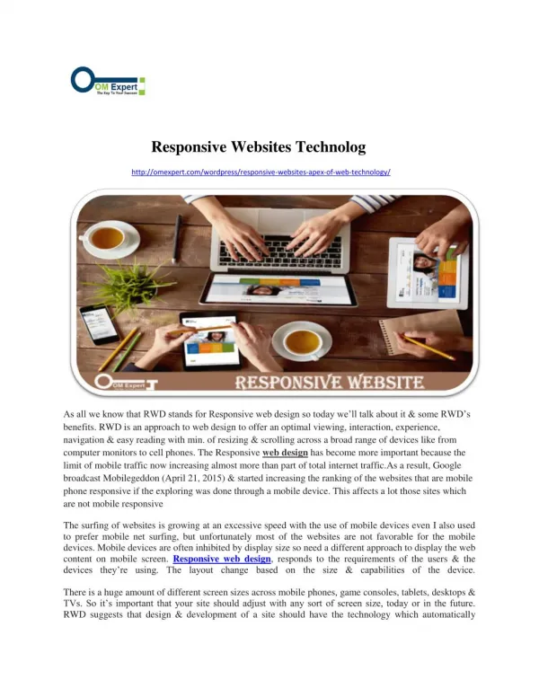
Responsive Websites Technolog http://omexpert.com/wordpress/responsive-websites-apex-of-web-technology/ As all we know that RWD stands for Responsive web design so today we’ll talk about it & some RWD’s benefits. RWD is an approach to web design to offer an optimal viewing, interaction, experience, navigation & easy reading with min. of resizing & scrolling across a broad range of devices like from computer monitors to cell phones. The Responsive web design has become more important because the limit of mobile traffic now increasing almost more than part of total internet traffic.As a result, Google broadcast Mobilegeddon (April 21, 2015) & started increasing the ranking of the websites that are mobile phone responsive if the exploring was done through a mobile device. This affects a lot those sites which are not mobile responsive The surfing of websites is growing at an excessive speed with the use of mobile devices even I also used to prefer mobile net surfing, but unfortunately most of the websites are not favorable for the mobile devices. Mobile devices are often inhibited by display size so need a different approach to display the web content on mobile screen. Responsive web design, responds to the requirements of the users & the devices they’re using. The layout change based on the size & capabilities of the device. There is a huge amount of different screen sizes across mobile phones, game consoles, tablets, desktops & TVs. So it’s important that your site should adjust with any sort of screen size, today or in the future. RWD suggests that design & development of a site should have the technology which automatically
responds to the user’s choice, action, preference & surrounding based on screen size, platform & orientation. The responsive site’s practice contains a mix of flexible layouts & grids, images & a sharp utilize of CSS media queries. The website supposed to automatically switch to accommodate for resolution, image size & scripting abilities, as the user switches from their laptop to tablet. Cost Effective I’ll ask you this question that which site is more cost effective, a single website that match to the need of all devices or having two separate sites? Single website cost less than two & they also don’t need to sustain two separate web addresses for your site, isn’t it? Mobile Usage Is On The Rise You know what more than 58% of American adults have a smart phone & almost 60% of all website traffic is from mobile devices. Sometimes I think that there are presently more mobile devices on earth than people & every month it continues to grow, so every month more & more prospects and clients will view your website from a mobile device. If their experience interacting & viewing with your site is poor, it will decrease the choice of your brand & they’ll likely visit your competitor’s site. Great User Experience A responsive site means no more zooming & pinching, no more side scrolling, to view a complete look site on a mobile screen. It is the user experience that makes visitors to like content on any site with the device of their choice, anytime & anywhere. Pleased customers using your website pages & blog posts lead to more sales & profits. The great user experience reduces bounce rates of websites. Reach more visitors If you make sure that the experience they will have on your site on the various devices is good, then definitely more visitors will come to your site, you are more likely to hold them as visitors & later switch them to customers. RWD is recommended by Google, with its mobile arrangements. This is because responsive design sites have one URL & the same HTML, despite of device, which makes it easier & more efficient for Google to crawl, index, & organize content. Easier to Manage One Website It’s easier to manage one website which runs on many different devices rather than manage different websites for different devices. This would eliminate the need for a different development & design segment for every new gadget on the market. If you are not making, strengthen responsive design sites that automatically mean that you are developing two different sites for two different devices like one for website & other for mobile. By doing this you are publicly releasing the duplicate or replica content for the same product on the internet. Future Scalability
One of the best things which I like the most about a responsive website is that this approach gives you the best chance to sustain new & different screens of the devices in the future. Responsive sites are so flexible, scaling up or down as required to best fit the screens. This means that our responsive websites will already be ready to meet the new devices with design & experience best suited to whatever the screen sizes of new devices hit the market. Shopping Trend On Mobile Devices Online shopping is easier than driving or moving from store or shop to another shop & it is even easier if you can do it in your favorite chair, while watching TV at your home or office. 80% of consumers regularly, including me use their mobile phones to shop online & 70% of shoppers now use mobile phones while in stores during the holidays. Even I, almost each & everything prefer to buy online because it’s very easy & simple way of shopping. If the vision of your products and services are not easy to analyze from a phone, you are losing out on an opportunity. http://www.omexpert.com/

