Media Research
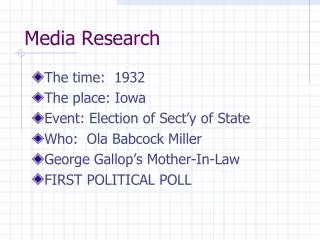
Media Research. Ryan Duffin. Text platform conventions of a magazine. In the majority of magazine covers, certain text platform conventions are expected/required such as: The issue number A barcode Information in regards to the main articles present within the magazine


Media Research
E N D
Presentation Transcript
Media Research Ryan Duffin
Text platform conventions of a magazine In the majority of magazine covers, certain text platform conventions are expected/required such as: • The issue number • A barcode • Information in regards to the main articles present within the magazine • An image that has some kind of relative value to the content within the magazine • Laminated paper • A link to any website that may be associated with the magazine • Photography and colour to a high, industry class standard • A masthead
Genre conventions of a sixth form school magazine Within a sixth form school magazine cover, particular things would be expected as basic conventions such as: • An image of the school logo or emblem present somewhere • Images that represent the school in some manner, such as students wearing the uniform, the logo or the school itself • Information regarding the main article/articles within the magazine and usually an image associated with it • Colours of a formal nature, usually following the colour scheme associated with that particular school • Serif fonts • If any students are shown, they will be displayed in such a matter that conveys the school in a positive light (correct uniform smiling etc)
Analysis of a good school magazine Colour- The colours are simple, minimalistic and blended Together smartly in an effort to convey a particular image in regards to how the people running the school want their school to be portrayed to anybody that happens to see it. The creamy white/brown background gives off a tea stained type look to it which makes the magazine appear older and more traditional almost Victorian which links in with the name of the school. The colour read used in the school logo can connotate a sense of passion or a desire to learn, grow and better oneself Font- The font used makes the letters within each word appear further apart, mostly on the words “VICTORIA SCHOOL” which is implemented in an effort to highlight the importance of the school and cause it to appear even more significant than it already is cultivated with the sheer size and the way in which it is shadowed and textured cause it appear old and traditional which is likely to represent the values in which the school contains and makes it appear significantly more intellectual as a result of the chosen font type Image- the only image present is the insignia/logo of the school and fulfils the purpose of forming a separate identity of itself separate from all other school magazines and being the only image on the cover is significant in that all attention as far as images are concerned is directed on the logo meaning it is certain to be seen and appears much more classy than the magazine would be had there been lots of secondary images cluttered around the page Language- The language present on this magazine cover is purely informative and does not consist of any persuasive techniques and devices as such, however that is made up for in the subtle persuasive techniques used by other means present on the cover. Besides the name of the school and the date in which it was founded (or perhaps the year the magazine was published) there is also a piece of Latin text present as part of the school logo and regardless as to what it means, it is significant due to the fact that it shows the deep roots of the school as Latin these days is regarded as a Language which is no longer used except by those who have a large degree of intellect so it signifies class in that respect Layout- In terms of layout, the name of the school/magazine is allocated at the top, as is a convention with the Majority of magazines so that it is easily spotted out and is the first thing read. There are no words beside each other, they are all over or underneath the word which came before or after it, this is done to make the text clear and easily digestible as well as further highlighting the high class of the magazines target audience.
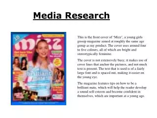
Analysis of a bad school magazine Colour- The only thought out contribution as far as colour is concerned appears to be the usage of the colour blue due to it being a part of the main colour sheme of the school and is seen as being a relaxing colour which aids with learning, however the way in which it is used here, especially when put with the yellow and brown text makes the magazine cover appear tacky as if it was produced by somebody that had limited knowledge of the software they were using to make it. The only reasoning behind the different colours of text appear simply to differentiate them from the other parts of text so that the reader can see which pieces are related. Font- No interesting font is used in this cover nor does it appear much thought has gone into it. It appears to have been put on the default setting and while it’s easily read, it appears boring and ammeter. The only real variation appears to be the title which is in italics presumably to make it stand out or look different from the rest of the text, but again is nothing complex and does nothing to persuade you to read in any manner and is in many ways unnecessary. Image- The primary image is that of a student and is poorly chosen due to the reasons that not only is it poorly cropped out of it’s original image, it’s also poorly representing the school in that the student has what would be seen as poor uniform with a short tie and buttons undone and is also a badly taken picture anyway with there still being red eye present, something which could easily be removed and in not doing so it shows lack of effort within the people who created the magazine and as a result of that it also makes the school look bad. The other two images are equally bad in that they both seem to have been copied and pasted with no attempts made to properly crop the images or to adjust them so that they blend in better contributing further to creating a poorly crafted magazine cover. There is a school logo however, but it s represented poorly with a white box around it which could have been filled in or cropped out. Language- The most impressive part of this magazine cover, although still not outstanding. Title used to alert readers what school the magazine is of besides the logo. Exclamation marks and question marks are used in the information regarding content within the magazine in an effort to raise excitement and interest in what is inside the magazine and there is information as to the date in which this particular issue was published so if one was to collect or be subscribed to this magazine, they would be able to order the issues chronologically. Layout- The main image is located in the middle of the page, which highlights it as being above the others in terms of importance, weather it was a good choice of image or not. The secondary images (the logo and the image of children holding a certificate) are allocated at the bottom and top right hand corners which leaves an imbalance on the left hand side unless the barcode on the bottom left hand corner of the cover suffices as an image. The date in which the magazine was published is located at the top region of the magazine while directly beneath it resides the title of the magazine and all the lesser information that is of less importance are dotted beneath that, around the central image.