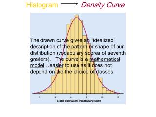
Histogram Analysis Tool for Quantitative Data
This tool allows analysts to summarize quantitative data in sorted format, generate scattergrams, dot plots, frequency histograms, and more. Input original data, set histogram bins, view analyses in various formats.

Histogram Analysis Tool for Quantitative Data
E N D
Presentation Transcript
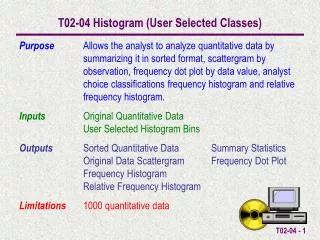
T02-04 Histogram (User Selected Classes) Purpose Allows the analyst to analyze quantitative data by summarizing it in sorted format, scattergram by observation, frequency dot plot by data value, analyst choice classifications frequency histogram and relative frequency histogram. Inputs Original Quantitative Data User Selected Histogram Bins Outputs Sorted Quantitative Data Summary Statistics Original Data Scattergram Frequency Dot Plot Frequency Histogram Relative Frequency Histogram Limitations 1000 quantitative data
An Example A college professor has a grading scale of A+ > 100 A 90 to 100 B+ 88 to 89.99 B 80 to 87.99 C+ 78 to 79.99 C 70 to 77.99 D 60 to 69.99 F 0 to 59.99 For the test scores shown here what is the Grade Distribution Histogram.
EXCEL Histogram Bins 0 59.99 69.99 77.99 79.99 87.99 89.99 100 An Example The grading scale must be interpreted in terms of the Bins used by the EXCEL Histogram Data Analysis Tool. They must be arranged from smallest to largest. F 0 to 59.99 D 60 to 69.99 C 70 to 77.99 C+ 78 to 79.99 B 80 to 87.99 B+ 88 to 89.99 A 90 to 100 A+ > 100
Data can either be entered directly into the OriginalData cells or copy/paste special/values into the cells.
Once the data is entered SummaryStatistics (Count, Max, Min & Range) are automatically calculated. The SortMacro can be run to sort the OriginalData into the SortedData cells. This also automatically calculates the necessary information for the DotPlot.
The HistogramBins are entered here. The HistogramMacro can be run to automatically calculate the Histogram Frequency Information.
The Histogram Frequency Information is displayed along with an interpretation of the “hard to read” EXCEL output (e.g. the number of data observations greater than 89.99 and less than or equal to 100 is 5).
WorksheetTabs can be selected to view the Original Data Scattergram, Frequency Dot Plot & User Selected Classes Histogram.
The Scattergram displays a plot of the observations in the sequence they were entered.
The Frequency Histogram shows the histogram for the chosen UserSelectedClasses. The legend should be read bottom-up.