Download
1 / 4
40 likes | 60 Vues
eCommerce website is hard to master & maintain as improving Mobile User experience is limited by multiple constraints that you donu2019t have with mobile apps.

E N D
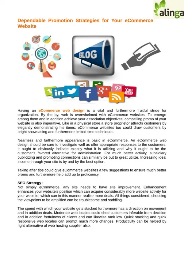
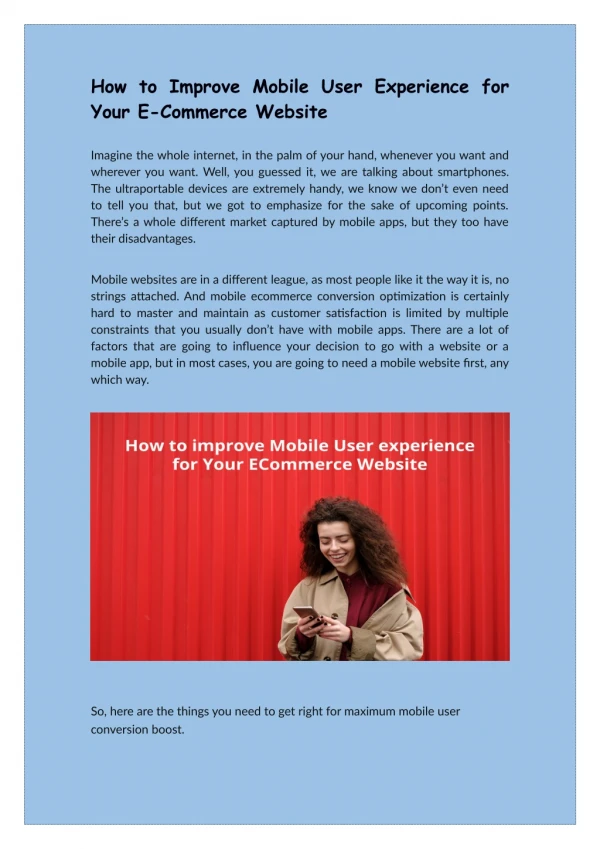
How to Improve Mobile User Experience for Your E-Commerce Website Imagine the whole internet, in the palm of your hand, whenever you want and wherever you want. Well, you guessed it, we are talking about smartphones. The ultraportable devices are extremely handy, we know we don’t even need to tell you that, but we got to emphasize for the sake of upcoming points. There’s a whole different market captured by mobile apps, but they too have their disadvantages. Mobile websites are in a different league, as most people like it the way it is, no strings attached. And mobile ecommerce conversion optimization is certainly hard to master and maintain as customer satisfaction is limited by multiple constraints that you usually don’t have with mobile apps. There are a lot of factors that are going to influence your decision to go with a website or a mobile app, but in most cases, you are going to need a mobile website first, any which way. So, here are the things you need to get right for maximum mobile user conversion boost.
1. Mobile first approach, always As we discussed above, the desktops are steadily dying and the time is worse for responsive websites. Mobile first approach is an approach focused on putting a mobile website first, instead of making a desktop site responsive for mobiles. Mobile first approach focuses completely on user experience instead of just making it work for mobiles. Since most of the people started their businesses at the time of desktop and PC boom, they plan to skip on the mobile first approach and go ahead with the responsive approach. The responsive approach will help you fit the screen in correct resolution but will wreck the whole UX, especially in case of an e- commerce user experience. Making websites responsive is cheaper and faster, and usually, work for most business niches, but probably isn’t going to work for e-commerce conversion optimization. The things to get right for this particular segment are a bit too much compared to selling a service or information. 2. Keep it simple and fair The ease of use is one of the most important factors that’s going to affect customer conversion on your mobile E-commerce website. When people browse a lot of buyable at once, it gets important to keep it simple to scroll between them and ease of use of your website matters a lot. Minimization will hugely beneficial for your website, however, that’s not true for every kind of e-commerce conversion optimization. But in most cases, whenever you are selling a huge number of similar products, minimization will help you take an upper edge against competitors. Avoid ads of any kind for maximum impact and customer conversion. Too much information might even shoo some potential customers away, look at best E-commerce of the market to see what actually works. It’s not actually so although, Amazon’s design is different from others, and is still the number one around the world. Simple is sometimes better, but getting deep into what the user actually wants is best. Make sure you put yourself from another perspective using your website and think if you would absolutely love to shop on it or not or choose a mobile application development company.
3. Filtering and sorting Filtering and sorting is an absolute necessity for each and every type of E- commerce mobile website. Getting it right is a bit difficult, and you have to work deeply on how to get it right for your particular business. People should be given options they need, not the ones that go with stats, add the mix of both maximum customer conversion. Don’t try to tamper with selected options of a user by inserting unnecessary advertisements on top of the page. You might want to reserve the top stop for the best reviewed. Also, make sure you let people add reviews to the products they purchased, and add an option to sort it that way. 4. Sleek and to the point design The main page of a particular product is the one which sets the line between a customer buying the product or walking away. The phones nowadays are
getting bigger and wider, each and every day. Think about both types of user, lefties and righties. Ensure that every call to action is reachable by the thumbs of the user, no one likes to get too uncomfortable when it comes to browsing (especially shopping). Maintain the product image quality and peek zoom, to ensure you build trust with the customer. There are millions of e-commerce conversion optimization techniques in the world, what’s going to separate you and the others are the design you breathe into your website. A lot of websites start and close down each day, and your design thinking is very necessary to ensure customer retention, if not conversion. There are a lot of fake websites starting each day, with simply one intention, to rip off customers. We aren’t implying a bad design usually feels like a fake website, but most users will believe so, as soon as they stop a missing design element, cluttered screen, or bad icon placing. Take care of all these, and you would be building great trust with your customers. 5. Speed is the most basic necessity Patience is a virtue, and most people and your customers would give it up when it comes to the loading time of your website. An under-optimized mobile website isn’t any better than not having a mobile website at all. Your website’s bounce rates would tell you all about it, whenever you are ready to listen. All E-commerce websites are heavier considered to generic websites, as you would have to show a lot of images at once. Optimization and planning will be heavily required to reduce page load times and increase speed for maximum customer conversion. Reference: improve-mobile-user-experience-for-ecommerce-website/ https://semidotinfotech.com/blog/how-to-