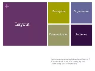
Layout
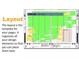
Layout. Layout of a page. Layout: is the arrangement of type and visuals on a printed or electronic page. It is about arranging type and visual on a two-dimensional surface so all information is legible, clear and attractive. Much like arranging a room. How do I design a successful layout?.

Layout
E N D
Presentation Transcript
Layout of a page • Layout: is the arrangement of type and visuals on a printed or electronic page. • It is about arranging type and visual on a two-dimensional surface so all information is legible, clear and attractive. • Much like arranging a room
How do I design a successful layout? • Who will be looking at or reading this? • What style is appropriate for this audience? • What is the purpose of the design? • What information or message has to be communicated? • Where will it be seen?
Basic Factors to keep in Mind • Most important design principles in creating a successful layout are: • Emphasis • Unity • Balance
Emphasis • AKA: Focal Point • Choosing which element should be the focal point • What primary message or information needs to be communicated • Which elements is the most interesting • Which element is most important • Secondary point of information • Example: time of an event or zip code
Establish a focal point • Make it the brightest • Make it a different color, create a contrast in color • Move it in a different direction, contrast of position/direction • Make it the biggest • Make it a different value, create value contrast • Make it a different texture, create texture contrast • Have all other elements lead to it • Make it a different shape • Isolate it • Make it dull if everything else is bright • Make it sharp if everything else is hazy
Book Jacket Cover For: “The Transparent Society” by David Brin Designer: Steven Brower Strong, saturated color contrast Position: top right “In contrast I face this jacket a high tech ominous feel to convey the warning within, that Big Brother is here and technology has made it possible.” Steven Brower
Grubman Animals Client: Grubman Photography Designer: Steve Liska High contrast, startling visual grabs your attention Fuchsia circle containing the type is the focal point because of its color and difference from the other visuals on the page. Visual Hierarchy
Visual Hierarchy • Arranging elements according to emphasis • Sets a priority order for all the information in the design • Several elements: title, subtitle, text and visuals. • Establish your ABC’s • What should the viewer see first? • What should the viewer see second? • What should the viewer see third? And so on.
Establishing Visual Hierarchy • Position: because we read left to right, top to bottom. • Size: We tend to look at BIGGER things first • Color: We tend to be attracted to brighter colors but also look to colors that stands out • Value: gradation of values, high to low contrast can establish flow • Visual Weight: We tend to look at “heavier” elements first
Advertisement, “ Great Ideas of Western Man: Ralph Waldo Emerson” 1952 Client: Container Corporation of America Collection. Denver Art Museum Designer: Herbert Bayer Client insists lots of text and visuals Encapsulated the text in shapes that flow from one to another Vertical axis; visuals and texted are balanced on either side.
Unity • It must hold together: be unified • Four of the most important devises are: • Correspondence: repeat elements to create correspondence or connections • Alignment: • Flow • Grid
Potlach #4 “Situation Critical”- Now is Not the Time to Compromise Client: Potlach Corporations Designer: PetrulaVrontikis Color Alignment Connections between and among elements, shapes and objects when their edges or axes line up with one another.
Balance • Balance = Comfort • imbalanced = Uneven, feeling of something not right • Balance is: equal distribution of visual weight in a layout • Must consider visual weight, position, and arrangement
Spread from a new edition of Aesop’s Fables, Artwork created in 1947Artwork: John Hedjuk, architectDesign firm: Milton Glaser, Inc
Client: Conqueror Fine Paper Designer/Illustrator: Frank Viva
Multi-page designs • Books • Magazines • Newspapers • Brochures • Newsletters • reports • Editorial or Publication design
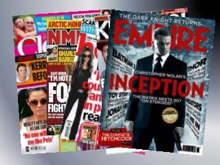
The Grid • How many grids do you see? • Are there photographs on the page? • Is there a title and subtitle? • Organized by a grid • Grid is a guide, a modular compositional structure made up of verticals and horizontals that divide a format into columns and margins. • (Grid is a traditional layout term. When working in some electronic page design software programs, the term used is “master page” or “Template”).
What does a grid do? • Provide a consistent visual appearance for a design • Underlies all the design elements • A way for designers to establish unity for either a single or multi-page format • Size and shape of the paper: important in consideration in establishing a grid. • Many elements to organizing: display type, test type, and visuals. • Establish an underlying structure that can help maintain: clarity, legibility, balance, and unity.
Try this: • 8 ½” x 11” paper • Place a margin around the entire format (boarder). Decide on the number of inches for the margin. The margin can be adjusted to any size that you find aesthetically pleasing and functionalable. • Center space or “Live area” within which to place and a arrange design elements. • Single-column grid
Now… • Take another 8 ½” x 11” paper and place them side by side to form a 17” x 11” rectangle • Create a single column on this new piece of paper using the same method as before • Are the columns the same? • Do they repeat one another? • Are they mirror images? • Now divide the columns with horizontals.
Flip over one pieces of paper • Again create margins and divide the remaining are into two columns. • Now divide the columns into four • Divide them again into eight • Divide the columns with horizontals. • Analyze the differences in appearance and function.
Many types of grids • Even and odd grids • Usually two to four columns and three to six • Break with the grid occasionally for the sake of dramatic or dynamic affect • However… if you break too often the visual consistent structure it provides will be lost.
How do I know which grid to use on a design? • Design concept • Format • Amount of information that needs to be in the design • Each format has a different structure and presents different considerations.