Strategic Advertising Analysis: Mac vs. Estee Lauder vs. Maybelline
Dive into the world of cosmetics advertising with a detailed analysis of Mac, Estee Lauder, and Maybelline campaigns. Explore the use of imagery, typography, color, and messaging to attract specific demographics and convey brand identity. Learn how these leading brands leverage various techniques to promote their products effectively and engage consumers.

Strategic Advertising Analysis: Mac vs. Estee Lauder vs. Maybelline
E N D
Presentation Transcript
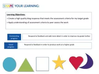
Practical Production - Advertising Learning Objectives: To understand what is required for the advertising project. To be clear as to my deadlines.
Research & Pre-Production Phase • Examples of questionnaire/focus group and analysis of results. • Radial analysis of at least three adverts similar to the product you are going to produce.
Research & Pre-Production Phase • Mock-ups/storyboard for adverts • Original photography if possible • Consideration of choice of fonts • Consideration of use of colour • Mood boards etc.
Mac cosmetics Two different images, second image attracts the demographic as it shows the difference by using mac makeup. This advert includes lip makeup, eye makeup and face makeup. This attracts the demographic as they would have a variety of makeup to choose from This advert would attract the female demographic as it uses feminine colours such as, pink, red, purple etc. A variety of eye makeup has been used, this shows the demographic the variety of makeup they have, this is also similar to the other advert as it has, eye makeup, lip makeup and also face makeup White, plain typography, This doesn’t have much of an affect on the demographic as its plain and simple, but again could attract a mixture of audiences as it shows the makeup is plain and simple, not heavy on makeup Flawless, bright and vibrant skin, this again attracts the demographic as it shows that mac makeup gives you flawless, glowing skin The black background makes the images of the makeup stand out more as it’s a plain and dark background which is then covered by different varieties and colours of makeup
Estee lauder cosmetics This advert specialises on mascara as you can see the product in the corner, this is also shown by the lighting used which is low key lighting, as it is being directed on the eyes to attract the demographic. The logo for Estee Lauder is plain but posh as the writing is italic and curly. The typography is also all caps lock and bold, although this may not attract many demographic as its very plain and simple but again could attract demographic as some people may not want heavy on makeup. The main colours used in this advert is, gold, black and silver, all these colours attract the female demographic as again they are feminine colours, also the gold and silver are rich, elegant colours. There are also different sizes and shapes of mascara on the advert, this could attract the demographic as it shows them they have a variety of mascaras. This advert specialises in eye make such as eye-shadow. This advert again uses the colours gold, which again attracts the female demographic and also the female model which has flawless skin, which shows the outcome of using Estee Lauder products Estee Lauder advertises most of there products on print adverts. The images used would be a model and the product, the layout would be the model on the left and the product on the right, this is used in almost all products by Estee Lauder.
Maybelline cosmetics Maybelline advertise their products similar to Estee lauder as the model is on the left and the product is on the left. This advert gain specialises in face make-up (foundation) and attracts the demographic as the models faces are flawless and glowing. These are only 2 type of foundation, but by these adverts the demographic is able to realise that this brand may have a variety of foundations and again will attract new demographic as they would want to try new products. The typography used is again very simple and plain as this connotes that this brand uses light and soft make-up. Also they show that the product is based on or is from New York. The text given on this print advert give information about not only the product but also the brand itself. The information given attracts the demographic as the more information given the more demographic is attracted as they want to try something new or want to have the same look as the model. They also have a Facebook sign, this shows that you could find more information about the product online as Facebook is a well known site This advert is on eye make-up (mascara) the model used has flawless skin and also vibrant eye make-up. You are dramatically attracted to the face as there is a wild cat behind the model, this connotes as wild cats are vicious and could attract the demographic as the taglines used ‘new cat eyes’ and also the fact that cats eyes are different to human and majority of animals eyes. The image of the mascara relates back to the wild cat as there are animal prints and the colour used as well This print advert specialises on lip make-up as you can see the product on the right hand side. The model’s facial expression is very strong yet soft as she doesn’t look intense or struggling. There are also images of roses and flowers, this connotes that the product is soft and again colourful. I have annotated this advert as my final product is going to be lip make-up. This advert includes certain words that would attract the demographic like ‘moisture extreme’ by using these words and phrases more people would want to by the product as they not only get a rosy lip colour but also get something healthy out of it.
When analysing adverts consider the following: • Audience • Representation • Institution • Language
The background of the poster looks like its set at some sort of field or park. Parks are associated with children as they play there and its somewhere they love to be. So the fact that the background of the advert for innocent kids smoothies are set there means that they will associate something they love with innocent smoothies. They weather is also nice in the poster which adds a sense of happiness to the advert and the smoothie itself. Its basically saying to the child that the smoothie brings you happiness Also the name of the smoothies being ‘innocent’ smoothies aims at the point that they are trying to portray by saying the smoothies are healthy by saying they’re innocent but it also aims at the demographic being children when promoting their kids smoothies, as children are thought of as being innocent. When it says at the bottom of the advert if you don’t get everything you are promised in the advert you can tell your mum. It works well and shows its advertised to children as most children always run to their mum when something is wrong or if somebody has lied. The camera angle they’ve used could also suggest that the advert is targeted at children as they have used a close up shot on the ground which then appeal to children because they also close to the ground. The logo also appeals to children as they’ve made it to be like a face with a halo which again links in with the smoothies and the ingredients they are putting into the smoothies being innocent. They have used cartons to put the smoothie in instead of using bottles. Cartons are also associated with children’s drinks too because they are easier for them to use and won’t spill them easily. They have also made the cartons themselves quite plain but it works because they have made the faces on the carton a bright colour. The colour they tend to use is the colour of the fruits they put in to that particular smoothie. The bright colours again link to the child audience because they will stand out.
The setting of the advert also links in with the products being natural and organic as they have used fields as trees as their background to interpret the nature side and how healthy their smoothies are. They have surrounded the product with fresh fruit and it indicates that they use fresh fruit in their product. It almost looks like they’ve just made the smoothie they are showing us and the fresh fruit around it is the left over ingredients. Again like in the previous adverts they have used the same shot being a close up on the ground. They want to audience to focus mainly on the product that they are presenting as they have blurred the background. Innocent have used this shot with if a close up on the ground to show the audience the different type of packaging you can buy the product in being a large carton to share with family or something that will last you a long period of time, a small bottle which is good for on the go and a small carton which is directed at children. The lighting of this advert looks as though they have put a spotlight on their product, this as well gets the audience to focus on the smoothies. The tagline that they have used ‘innocent smoothies. Innocent by nature’ is a play on words with the word innocent as the connotation of the word is organic and natural. This is what innocent are trying to tell the public about their smoothies, That they are organic and good for you.
For this particular advert I think they have aimed it at business people as they have used a city background. So if you were rushing around working it would be quick and easy to have a healthy smoothie that fills you up and it uses a tagline ‘here to save the peckish’. They have also used another tagline reading ‘nothing but fruit’ meaning they are trying to tell the audience that there is no added preservatives, flavours or sugar and that they are a really healthy drink and one of your 5 a day. They have surrounded the product with fresh fruit and it indicates that they use fresh fruit in their product. It almost looks like they’ve just made the smoothie they are showing us and the fresh fruit around it is the left over ingredients. The red cape around the small bottle of the smoothie could mean that its just as powerful and healthy as the larger cartons, and even though its small its still part of your 5 day. Using the tagline ‘here to save the peckish’ works well as it is saying to the viewer that if your hungry and in need of a snack you can have a nice, refreshing, healthy smoothie instead of having a packet of crisps or a full fat chocolate bar. It’s a lot brighter where the smoothiesare as the background looking over the city is quite dark and gloomy. This could be trying to tell the viewer that these smoothies will brighten your day. The setting of the advert is in the morning which could mean you can have one before breakfast and mainly before work as they’ve used a city background. They have also made it look like the smoothies are higher up than the city. So it makes the audience feel that they could be on top of the world if they have one of these smoothies which again links in with the red ‘superhero’ cape around the smaller bottle.
Plans should be made for both your print advertisements and your websites: • Images • Colours • Fonts • Layouts • Logos • Slogans • Language • Web addresses • Hyperlinks Highest marks will be rewarded to those of you who link your planning to your research. Make notes on your work such as ‘images chosen as audience have responded well to them’ or ‘Childline’s website successfully uses rhetorical questions and imperatives which has prompted our decision to use them also’ and so on…
Plan • Use a variety of ways to present your initial ideas. Choose the programme you use carefully. Alternatively you could do it on paper. • The message of your campaign • Sub-headings and bullet points • Mind-maps • Flow diagrams • Image/mood boards • Pictures and photographs • Storyboards • Scripts • Paragraphs
Mood boards – images and colours These are boards with images or colours which will form the basis of your final designs. You can then give reasons why you have chosen the colours/images based in your research from your primary sources (the questionnaire results) and your secondary sources(the research and analysis you have done of current products on the market.) For example…
Research & Pre-Production Phase To be completed by 7th June
Production Phase • Three adverts for your chosen product • These can be a mix of print (magazine) adverts or broadcast (TV) adverts.
Production Phase To be completed by 28th June.
Evaluation • You need to consider the following: • How the aims of the production have been met. • How the product follows the codes and conventions of advertising. • How the product represents people, places and events. • What regulations and controls have been applied to the product. • The strengths and weaknesses of the product in appealing to its audience. Due: 5th July.