Download
1 / 13
150 likes | 337 Vues
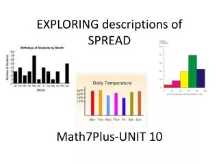
EXPLORING descriptions of SPREAD Math7Plus-UNIT 10. Describing Data. There are two ways to describe a set of data : Graphically Dot plot – Bar Graph – Histogram – Boxplot Numerically - using a single number to describe the relationship of the data

E N D
Describing Data There are two ways to describe a set of data: • Graphically Dot plot – Bar Graph – Histogram – Boxplot • Numerically-using a single number to describe the relationship of the data • Measures of Center: Mean and Median review these descriptions in your notes • Measures of Spread- Today we will focus on the numerical descriptions
Measures of Spread describe how much values typically vary from the center These measures are: • Range – a description of how far apart the distance from the highest to lowest data pieces; found using highest minus lowest data • Interquartile Range (IQR) – a description of the middle 50% of the data ; found using Q3 – Q1 • Mean Absolute Deviation briefly view description in your notes and then continue with the PPT.
Now let’s explore “deviations from the mean” as a way to determine how accurately the mean may describe “typical”.
Thinking about the Situation Consider the following test scores: Who is the best student? How do you know? Take a few minutes to decide with your partner
So with all students having the same mean, let’s see if we can dig a little deeper in our comparison. The MEAN ABSOLUTE DEVIAITON (MAD) will help us. Let’s take a few minutes to explore MAD.
Mean Absolute Deviation (MAD) Add to notes STEP 1: Find the mean STEP 2: Subtract the mean from each piece of data STEP 3: Find the absolute value of each difference STEP 4: Find the mean of the new differences (deviations) NOW WE WILL TRY THIS METHOD.
Mean Absolute Deviation Write the list of numbers shown on the number line and then find the Mean Absolute Deviation 0 1 2 3 4 5 6 7 8 9 10 11 STOP AND COMPLETE CHART on NOTES
So what exactly is deviation? -4 -3 +5 -1 +3 0 1 2 3 4 5 6 7 8 9 10 11 (-4) + (-3) + (-1) = -8 (+5 ) + (+3) = +8
Mean Absolute Deviation -3.2 +3.2 0 1 2 3 4 5 6 7 8 9 10 11 Notice that our Mean Absolute Deviation or MAD was 3.2 and most of our original data does fall within plus or minus 3.2 points of the mean of 5.
Highlight the following in your notes: A low mean absolute deviation indicates that the data points tend to be very close to the mean and not spread out very far so the mean is an accurate description of “typical”, and a high mean absolute deviation indicates that the data points are spread out over a large range of values.
Now take a few minutes to go back to our original question about the best student. Find the MAD score for each student and then make a decision based on all of your data about the best student. Be prepared to discuss.
Now you try the CLASSWORK found on your handout. When you and your partner have completed the work individually, check to see if you agree. We will review this section together in a few minutes