Download
1 / 22
220 likes | 392 Vues
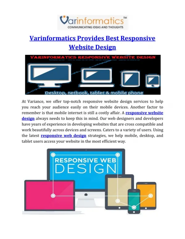
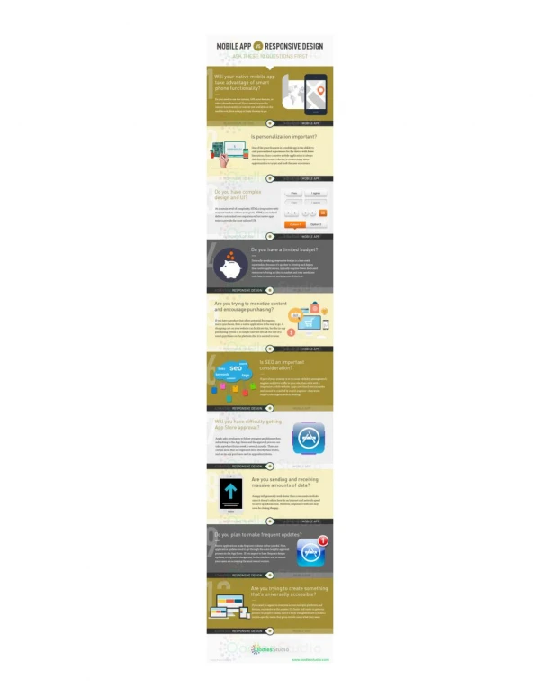
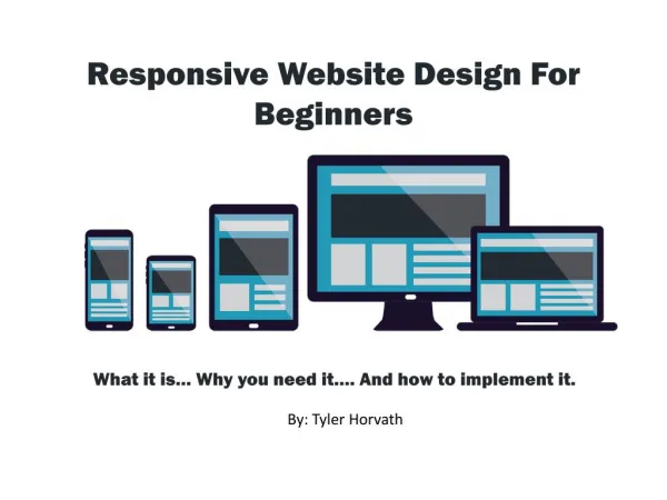
Responsive design implies that website design and development should respond to your customers’ behavior and device based on screen size, platform and orientation.

E N D
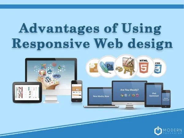
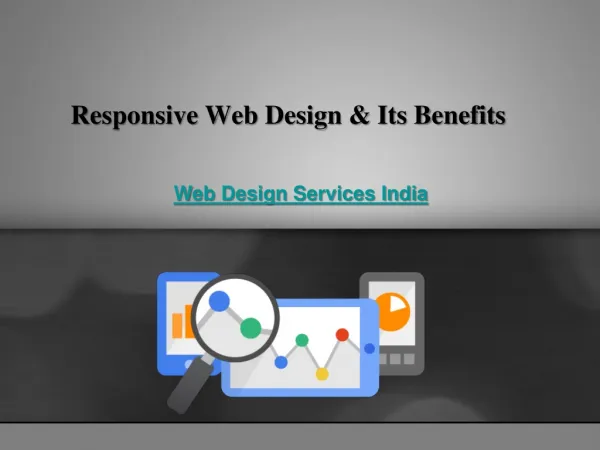
Responsive Web Design & Its Benefits Web Design Services India
While not really a new approach to web design, it solves many of the design challenges caused by the proliferation of new types of mobile devices because the result is a website design that stretches.
Responsive design implies that website design and development should respond to your customers’ behavior and device based on screen size, platform and orientation.
Minimizes or removes content based on the user’s screen size • Whether that screen is a desktop monitor,
Smartphone or tablet For instance if a customer chooses to view your ecommerce site using their Smartphone, • The content will realign to fit the available space.
Responsive design consists of a mix of flexible grids and layouts, images and an intelligent use of Cascading Style Sheets (CSS) media queries.
In other words, the website has the technology to automatically respond to the user’s preferences.
As the user switches from a laptop to a tablet, your ecommerce website automatically switches to accommodate for resolution, image size and scripting abilities.
The web page detects the visitor’s screen size and orientation and then changes the layout accordingly.
This means you no longer need a separate design and development phase for each new gadget on the market
Instead, you design a site once and format it differently for many devices. • Freeing you from having to create and maintain countless custom-made solutions for each new category of users.
Saving time, you also decrease the development costs of adding a separate mobile application to your ecommerce strategy.
Save time and cut costs • Improve overall operational efficiency
Create a consistent user experience • Increase conversions • Be future focused
Responsive website design is not a one size fits all solution for every ecommerce or mobile site.
Weigh your options carefully and beware of hype. • Keep in mind that responsive design may not be the best approach for you if, for example:
Although responsive design can certainly address these characteristics and requirements
The costs are often higher and planning and development can take longer.
Your website if too detailed or complicated • Your navigation menu is complex • Your site is primarily image driven with minimal use of text • Your users or customers need access to all of the content at all times
THANK YOU Web Design Company India