Accessibility Through Responsive Design
This initiative, presented by Devis, focuses on creating accessible websites and applications that comply with 508 and WCAG 2.0 standards. By employing responsive design principles, including fluid grids, flexible media, and media queries, we aim to ensure that digital content is available to everyone, especially individuals with disabilities. Our approach challenges traditional mobile development methods and seeks to optimize the user experience across various devices. Join us in promoting inclusivity and accessibility in technology, helping employers and people with disabilities connect effectively.

Accessibility Through Responsive Design
E N D
Presentation Transcript
Justin Stockton Email: jstockton@devis.comTwitter: @poorgeek
Topics • Accessibility as availability • Approaches to mobile development • What is responsive design? • Fluid Grids • Flexible Media • Media Queries • Approaches to testing
Disability Employment App Challenge • Presented through Challenge.gov in summer of 2012 • Sponsored by Department of Labor’s Office of Disability Employment Policy (ODEP) • Build accessible websites and apps to help employers and people with disabilities
https://accessjobs.devis.com/ Proof of Concept!
Our Goals • Very focused and simple to use • Accessible (508 and WCAG 2.0 compliant) • Easy for employers to manage • Adding markup to existing job postings includes them in our search • Challenge ourselves to achieve a more universal design
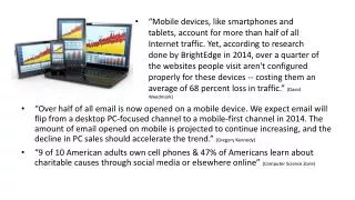
Smartphone Ownership • Survey conducted by Pew Internet and American Life Project, July-August 2012 • http://www.pewinternet.org/Reports/2012/Smartphone-Update-Sept-2012/Findings.aspx • 45% of Americans (16+) now own smartphones (~107 million people) • Increased from 35% in May 2011 (increase of ~24 million people)
Tablet Ownership • Survey conducted by Pew Internet and American Life Project, July-Sept 2013 • http://pewinternet.org/Reports/2013/Tablets-and-ereaders/Findings.aspx • 35% of Americans (16+) now own tablet computers, up from 4% in September 2010
Why is this Meaningful? • 21% of cell phone owners primarily use their phone to access the internet • http://www.pewinternet.org/Reports/2013/Cell-Internet/Summary-of-Findings.aspx
Refining Our Definition of Accessibility • We have a responsibility to ensure that the web is usable for everyone • Accessibility as “availability” • Taking a device–agnostic approach to accessible web design and making it available to as many people as possible on as many devices as possible
“No Mobile” Approach • Website that does not offer a tailored mobile experience (either app or website) • Can still be viewable on most devices, but not particularly usable • Not common, but still a problem
What’s Wrong With Traditional Mobile Approaches? • Features left out for mobile users • Might make sense, but too often due to assumptions instead of user studies • Content parity • Same content should be available everywhere • If redirects are not properly set up, sharing links can be problematic • Maintaining several code bases
Native Mobile Applications • Barrier to entry • Device and even OS version • Accessibility • Different considerations and techniques compared to web design • varies based on platform • Less of an issue for web applications
Mobile Websites • “Browser sniffing” • Method that identifies which browser and operating system you are using • Requires maintaining a list of browsers and operating systems • Some websites only serving mobile to Webkit-based browsers, regardless of whether other browsers could render them • Accessibility • Disabling zoom
Mobile Websites and Native Apps Are Not Evil • Both offer experience tailored to mobile devices • Native applications can take advantage of advanced device capabilities • Web browsers are catching up
New Approach - Responsive Design • Proposed by Ethan Marcotte on A List Apart in May 2010 • http://www.alistapart.com/articles/responsive-web-design/ • One website for all devices • Optimized for different contexts (not devices) using: • Fluid grids • Flexible media • CSS Media Queries
Grid Systems • A way of organizing different pieces of information along vertical and horizontal axes • Have existed in some form since medieval times
Fluid Grids • Fluid grid = width of boxes is defined in percentage rather than fixed units (pixels, em) • Can grow or shrink as the screen width changes • Allows for utilizing all available space • Avoids issue of horizontal scrolling
Semantic Grid Code Example .span4 { width: 33% } Traditional grid markup in HTML: <article class=“span4”> </article>
Flexible Media • Similar concept to fluid grids, but applied to images and movies • Dimensions of media can change depending on screen size • Not used much on Access Jobs • Logo • Screenshots
Flexible Media Code Example img, object { max-width: 100%; } • Can result in problems in older browsers that don’t support max-width (Internet Explorer 7) • Set width to 100% • Flickr documented how to deal with poor image scaling using proprietary Microsoft CSS filters • http://code.flickr.net/2008/11/12/on-ui-quality-the-little-things-client-side-image-resizing/
Responsive Images • Desire has arisen to serve different images based on media queries • Existing images look blurry on displays with high pixel density • If images are going to be viewed at small sizes, no point in serving large resolution images • Tricky because bandwidth != screen size
Several Approaches • New attribute for HTML image element – “srcset” • New HTML picture element • Both allow specifying additional image sources depending on different criteria • Still in “proposed” status, not part of specification • W3C Responsive Images Community Group
Media Queries • Part of CSS3 specification • Extends existing media type functionality that allowed style sheets for print, screen, etc. • Gives more granular control as to when different CSS rules are applied • Based on media features such as screen width/height, screen orientation, pixel density, etc…
Media Query Code Example .job { display: block; } @media screen and (min-width: 650px) and (max-width: 960px) { .job { margin: 0.52%; display: inline-block; width: 48.6111%; } }
Breakpoints • Breakpoints are defined resolution points (typically width) specified in media queries at which different CSS styles are applied • Breakpoints used on Access Jobs: • Below 650 (small screen) • 650-960 (tablet) • Above 960 (desktop) • Should be chosen based on your content rather than known resolutions of popular devices
Media Query Support • Mobile browsers • iOS Safari (3.2+) • Android Browser (2.1+) • Desktop browsers • Internet Explorer (9+) • Firefox (3.5+) • Chrome (4+) • Safari (4+) • Full list at http://caniuse.com/css-mediaqueries
How To Handle Lack of Media Query Support • Respond.js • Adds support for min/max-width to IE 6-8 • Mobile-first approach for other browsers • Default CSS = single column layout • Introduce additional complexity inside media queries (unsupported browsers will just ignore this) • Can still target with browser-specific style sheets if this approach is undesirable
Responsive Design and Accessibility • Responsive design does not make a site accessible, so care must be taken to comply with existing accessibility guidelines • Besides improving availability: • Flexible layouts handle zooming/scaling very well • No horizontal scroll bars • Lowers barrier to entry for assistive technology • Inexpensive mobile devices now come with built-in assistive technology • Freedom of choice for assistive technology
Testing • Need to take a pragmatic approach – testing on every device is unrealistic • Examine web analytics to find appropriate devices to target • Take advantage of devices owned by yourself and coworkers • Consider starting a local device lab • Simulators/Emulators are available for iOS (Mac Only), Android • Desktop browsers are typically multi-platform • If not, virtualization can be used • Browserstack.com • http://www.modern.ie/
Mobile Testing and Debugging • Don’t need to manually retest on each device • Adobe Edge Inspect • Mixture • Remote inspection • Web Inspector Remote • Adobe Edge Inspect • Remote Web Inspector (iOS/Mac)
Testing Access Jobs • Physical Device Testing • iPhone, iPad, Android Phones • Desktop Testing • Testing multiple versions of IE using VMs • http://www.modern.ie/en-us/virtualization-tools • Testing breakpoints • Manually (resizing browser) • http://responsivepx.com/
Any Questions? Email: jstockton@devis.com Twitter: @poorgeek