Color in Design
Color in Design. Uses of Color. Call attention to specific data or information Identify elements of structure and processes Portray natural objects realistically Depict the logical structure of ideas and processes Portray time and progress

Color in Design
E N D
Presentation Transcript
Uses of Color • Call attention to specific data or information • Identify elements of structure and processes • Portray natural objects realistically • Depict the logical structure of ideas and processes • Portray time and progress • Increase appeal, memorability, and comprehensibility • Reduce errors of legibility or interpretation • Increase the number of dimensions for coding data
Pitfalls of Color • May cause problems for color deficient vision (12% of males) • May cause visual fatigue with strong colors • May contribute to visual confusion if too complex • May have negative cultural or historical associations • Yellow and Black • May exhibit confusing cross-disciplinary or cultural connotations • Red to the US and Red to China
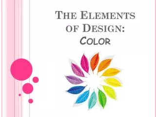
Spectrum & Hue • SPECTRUM: All the possible colors in a color space • HUE: specific location on color wheel or in color spectrum
Value • VALUE: describes how light or dark something is. The following example shows a red hue at varying values
Saturation SATURATION: defines the intensity of a color. Muted refers to colors with little saturation.
Contrast CONTRAST: separation between values. Text color must contrast with background to be readable. High Contrast is easy to read… Low Contrast is often difficult to read….
The Color Wheel • There are 12 hues in the spectrum of color. • They are divided into three categories…
The Primary Colors • Red, Yellow, and Blue • These colors cannot be combined from mixing any colors together.
The Secondary Colors • Green, violet, and orange • Made by combining the Primary colors together.
The Tertiary Colors • Yellow-green, blue-green, blue-violet, red-violet, red-orange, yellow-orange. • Made by combining a primary and a secondary hue. • Named by the Primary color first.
Another look • Color wheels show how colors are related – imagine a circular rainbow spectrum (of course many hues can exist on this spectrum) Secondary Tertiary Primary
Color Relationships • Working with the colors can result in a harmonious design. Here are some color combinations that work.
Analogous • 3-5 colors next to each other on the color wheel
Complementary colors • opposites on the color wheel
Monochromatic • Single hue with different values of that hue
Applying Color • Saturation and value are as important as hue. These attributes of color can be used to create contrast. • Try designing in gray first (This will train your eye to appreciate contrast)
Color Summary • Strive for high contrast (readability) • Effective color schemes are simple and harmonious • Use different colors or values for important information to attract attention
Tips for Designing with Color Use 3-5 colors in your design Minimum shift in color/size • Light text on dark background for dark environment • Dark text on light background for light environment
Tips for Designing with Color Use familiar, consistent color coding • Red – stop, danger, hot, fire. • Yellow – Caution, slow • Green – go, okay, safe. • Blue – Cold, water, death • Warm colors – Action, response • Cool colors – background, distance • Gray, white – neutral • Context-dependent
Tips for Designing with Color Use the same color for grouping related elements. Color to your audience • Men prefer blue to red, women red to blue • Men prefer orange to yellow, women yellow to orange • Young prefer bright, old prefer sober/restrained colors
Tips for Designing with Color Use redundant coding of shape, as well as color, if possible. The more cues to remember an object, the better. Use high-value, high-chroma colors to attract attention. • Bright red better / faster than yellow, orange • Older viewers have easier time with bright
Tips for Designing with Color • Watch out for default colors! • Some browsers default to a white background and others to gray. Specify a background color in your body tag to ensure all browsers use the same color.
Complementary Grayscale Analogous Monochromatic