C O L O R
370 likes | 543 Vues
C O L O R. C O L O R. Color. Color has always been recognized for its symbolic power and an appreciation of this reaches back to ancient times. However, the understanding and interpretation of color symbolism has changed over time and varies from culture to country. . RED. RED

C O L O R
E N D
Presentation Transcript
COLOR COLOR
Color • Color has always been recognized for its symbolic power and an appreciation of this reaches back to ancient times. However, the understanding and interpretation of color symbolism has changed over time and varies from culture to country.
RED • RED • Red through its association with fire and blood is used to represent danger, anger and violence. For the same reason it is also associated with affairs of the heart: love and passion. • In Paul Gauguin's 'Vision after the Sermon‘, Jacob wrestles with the angel in a blood red field of spiritual battle, an apt metaphor for his internal struggle against the will of God.
PAUL GAUGUIN (1848-1903)'Vision After The Sermon', 1888 (oil on canvas)
ORANGE • Orange symbolizes creativity, change, energy and endurance. It is the color that represents Autumn. As a secondary color it combines elements of the colors used to mix it: the creative passion of red with the energy and joy of yellow. • Mark Rothko, the American abstract expressionistartist, encouraged viewers to stand close to his large paintings so that they became spiritually immersed in the experience of color. 'Orange and Yellow' is the door to an inferno of color with a radiant energy that invites the spectator to open their emotions to "a spiritual kinship with primitive and archaic art".
MARK ROTHKO (1903-1970)'Orange and Yellow', 1956 (oil on canvas)
YELLOW • Yellow is the color of the sun - the life support for our planet. As such it has come to represent life, energy, happiness, hope and wisdom. • Vincent Van Gogh's 'Sunflowers' is painted almost entirely with yellow and without any shadows. It expresses the radiance of sunshine rather than giving us a detailed description of what the flowers look like. Van Gogh also uses yellow as the symbol of hope and friendship as the 'Sunflower' series was painted to welcome his friend Paul Gauguin to the Yellow House in Arles. Van Gogh painted two series of 'Sunflowers' between August 1888 and January 1889. This example is from the Van Gogh Museum in Amsterdam and is a copy of an earlier version which is in the National Gallery in London.
VINCENT VAN GOGH (1853-1890)'Sunflowers', 1889 (oil on canvas)
GREEN • Green, as the color of plants and grass, is the color of nature and all that is associated with health and growth. However, it is also used to represent more negative traits such as envy and inexperience. • Cézannes painting of 'The Bridge at Maincy' is a formal composition of horizontal, vertical and diagonal lines whose rigor is somewhat relieved by the curves of the bridge. What turns this steadfast structure into a woodland sanctuary is the myriad of greens which bathe the scene in a magical emerald light. Paul Cézanne called his paintings, 'constructions after nature''. He saw painting in abstract terms as the construction and arrangement of color on a two-dimensional surface. The composition was simply a vehicle to assist with the realization of this surface structure of pattern and color.
PAUL CÉZANNE (1839-1906)'The Bridge at Maincy', 1879 (oil on canvas)
BLUE • Blue is the coolest and most calming of all the colors. As the color of the sky, it has been used since ancient times to represent heaven. In classical mythology, blue was the color associated with the gods, Venus and Jupiter. In Christianity, it becomes the symbol of the Virgin Mary as Queen of Heaven. As the color of the ocean, it is also suggests qualities like freshness, purity and hygiene. • The calmness of blue is seldom more visible than in this 'nocturne' of the River Thames by Whistler. The view is at twilight from Battersea looking across to Chelsea. The style is strongly influence by the Japanese art of 'ukiyo-e' which translates as 'pictures of the floating world'.
JAMES MCNEIL WHISTLER (1834-1903)'Nocturne, Blue and Silver: Chelsea', 1871 (oil on wood)
PURPLE • Purple is the color of royalty, wealth and power. In times past, purple dyes were rare and expensive. Only the rich and powerful could afford to wear clothes of this luxurious color. • Catherine II, known as Catherine the Great, supported the development of the arts, literature and education in Russia. Her personal art collection became the foundation of the Hermitage Museum in St. Petersburg. She is portrayed here wearing a gown of the finest purple silk draped with ermine robes, clothes worthy of her noble status.
BROWN • Brown is the color of earth, wood and stone. As such, it evokes craftsmanship and the great outdoors. It is also used to represent humility: a down to earth virtue. • Although this painting is from Vincent Van Gogh's later body of work which is noted for the brilliance of its color, he reverts to the darker palette of his earlier work to reflect the humility of the subject matter. These are the tired old shoes of a humble peasant. Van Gogh paints this image in rugged earthy browns to suggest the hardship of their owner's life and to pay respect to the dignity of manual labor.
BLACK • Black and its association with darkness is used to represent death, evil, witchcraft, fear and mourning. • 'The Widow' by Käthe Kollwitz is one of a series of prints from a portfolio called Kreig (War) which deals with the wretched human tragedy of World War 1. This is a desolate image of a grief stricken wife who is embracing the memory of her departed husband. Black is the only appropriate color for such a sad and distressing subject.
GREY • Grey is the natural color of some metals and stone, but it also has some negative associations with the weather, boredom, decay and old age. Grey is a mixture of black (death) and white (peace) and is the color of ashes and dust. As such it is also associated with death and mourning. • 'Goat Skull, Bottle and Candle' by Pablo Picassois a modern 'Vanitas' still life - a traditional genre that addresses the idea of our mortality. Vanitas still lifes depicted objects that had a symbolic meaning: a skull as a symbol of death or a candle as the transient flame of life. • It is believed that this painting was inspired by the death of Nikos Beloyannis, the Greek resistance leader, who was executed for treason. Many thought that the charges of passing information to the Russians were simply an excuse to get rid of one of the figureheads of the Communist Party of Greece (KKE) and there were international protests, supported by Picasso, calling for his release. • Picasso often painted in monochrome to heighten the emotional tone of his work. He is noted for his blue and rose periods as well as the unifying brown tones of analytical cubism. However, he seems to reserve painting in grey tones (grisaille) for his images of death and oppression: 'Guernica' (1937), 'The Charnel House' (c.1944-48), the Goya inspired 'Massacre in Korea' (1951) and 'Goat Skull, Bottle and Candle' (1952) which is, in essence, an elegy for Nikos Beloyannis.
PABLO PICASSO (1881-1973)'Goat Skull, Bottle and Candle', 1952 (oil on canvas)
WHITE • White and its association with light is used to represent peace, purity and goodness. • In 1915, the Russian artist Kazimir Malevich developed a geometric style of abstract art which he called Suprematism. He believed that pure abstract form had a spiritual power with an ability to open the mind to ‘the supremacy of pure feeling’ and there was no purer color for that purpose than white.
KAZIMIR MALEVICH (1887-1935)'Suprematist Composition: White on White ', 1918 (oil on canvas)
PRIMARY COLORS Red, Yellow and Blue are the primary colors. These are the three basic colors that are used to mix all hues.
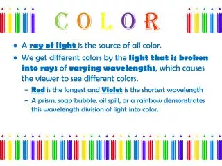
WHAT IS A HUE? • A hue is one of the colors of the spectrum. Hues have a circular order as illustrated in the color wheel above. The color wheel is a useful device to help us explain the relationships between Primary, Secondary and Tertiary colors.
SECONDARY COLORS Orange, Green and Purple are the secondary colors. They are achieved by mixing two primary colors together.
COMPLIMENTARY COLORS Opposite colors are diagonally opposite one another on the color wheel. Opposite colors create the maximum contrast with one another.
COLOR TINTS A tint describes a color that is mixed with white.
SHADES A shade describes a color that is mixed with black.
COLOR INTENSITY Color intensity is the strength or value of a color. In our illustration, the three violet rectangles are identical colors but they appear to change when surrounded by different colors. Therefore, the intensity of a color changes in relation to the color that surrounds it. This effect is known as Simultaneous Contrast.
TRANSPARENT COLORS Transparent colors are colors that you can see through. Paint is usually mixed very thinly to make it transparent. Watercolor is the most transparent paint, but oil and acrylics can also be thinned for a similar effect. Transparent paint is applied in what we call a ‘color wash’ in watercolor painting or a ‘color glaze’ in oil or acrylic painting. When you overlay two transparent colors they will mix to create a third. Different types of paint and certain colors are naturally more transparent than others.
OPAQUE COLORS Opaque colors are colors that you cannot see through. Paint is usually mixed very thickly to make it opaque. Oil and acrylic paint are the most opaque paints, but gouache is a type of watercolor also designed for this purpose. Different types of paint and certain colors are naturally more opaque than others. Titanium white is often added to very transparent colors to make them opaque.
WARM AND COOL COLORS Warm colors are said to be visually and emotionally exciting, while cool colors have a more calming effect. The red / yellow side of the color wheel is said to be warm, similar to the colors of fire. These colors appear to advance towards you and stand out more than other colors when viewed from a distance. The green / blue side of the color wheel is said to be cool, similar to the colors of ice. These colors appear to recede and fade into the distance. A knowledge of how warm and cool colors work is useful when arranging colors in a landscape to create the illusion of distance.
TONE Tone is the lightness or darkness of a color. It is used to suggest the effect of light and shade and to create the illusion of 3D form.
MATT AND GLOSS COLORS These terms refer to the reflective qualities of color. The matt color of the cube and the cone creates a dull non-reflective surface, while the gloss color of the sphere and cylinder gives a brighter reflective finish.
MONOCHROME/POLYCHROME COLORS The term monochrome refers to the use of one color or various shades of one color in a single form. Polychrome refers to the use of many colors in one form.