Download
1 / 35
350 likes | 475 Vues
Dive into essential statistical concepts including stem and leaf diagrams, scatter graphs, correlation, moving averages, and measures of spread like interquartile range (IQR) and box plots. Learn how to visualize data through histograms and frequency polygons, and understand calculation techniques for averages, medians, and ranges. This guide also covers probability methods, sampling techniques, and how to analyze data distributions effectively for improved decision-making in statistical analysis.

E N D
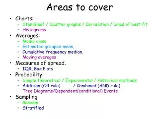
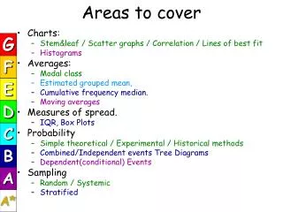
Areas to cover G • Charts: • Stem&leaf / Scatter graphs / Correlation / Lines of best fit • Histograms • Averages: • Modal class • Estimated grouped mean, • Cumulative frequency median. • Moving averages • Measures of spread. • IQR, Box Plots • Probability • Simple theoretical / Experimental / Historical methods • Combined/Independent events Tree Diagrams • Dependent(conditional) Events • Sampling • Random / Systemic • Stratified F E D C B A A*
Stem and Leaf • Remember the key. • Draw stem. • Add leaves – disordered. • Draw second stem for ordered leaves. • Use ordered stem and leaf to find median and range. D
Example - drawing a stem and leaf Question:- 29 students were set a simple task. Their completion times to the nearest second were: 47 61 53 43 46 46 68 48 72 57 48 54 41 63 49 42 58 65 45 44 43 51 45 38 46 44 52 43 47 (a) set these data into a stem and leaf diagram (b) find the median and range D
Example - drawing a stem and leaf Answer (a):- (3) re draw diagram with leafs in numerical order: Completion times 3 4 5 6 7 8 7366881 9254356437 374812 1835 2 Don’t forget the key D Completion times 4|7 means47 3 4 5 6 7 8 1 2 3 3 3 4 4 5 5 6 6 6 7 7 8 8 9 1 2 3 4 7 8 1 3 5 8 2 Median = 15th value. = 47 (remember the 40). Range = Biggest – Smallest 72 – 38 = 34
Scatter Graphs A good correlation means the points form a line called a LINE OF BEST FIT. £10,000 As the line slopes down, this is called a negative correlation. If the line slopped up then it would be a positive correlation £8,000 £6,000 Value of Car £4,000 D £2,000 A scatter graph is a graph with lots of points, rather than a line or curve. £0 New 1 Yr 2 Yrs 3 Yrs 4 Yrs 5 Yrs 6Yrs 7 Yrs Age of Car Estimated value of a 6 yr old car? Use the line of best fit – to find the value £2200
Scatter Graphs - Correlation This is called a zero correlation as there is little or no correlation 2.5 100% This is called a positive correlation 2 80% 1.5 60% Test Score Height (metres) 1 40% D 0.5 20% 0 Born 2 Yrs 4 Yrs 6 Yrs 8 Yrs 10 Yrs 12Yrs 0kg 15kg 30kg 45kg 60kg Age of Person Weight
Frequency Polygons A frequency distribution can be shown using a frequency polygon. 2. Draw in straight lines connecting points. 1. Mark the mid - points of each bar at the top with a point. A Frequency Polygon can be drawn onto an existing histogram. Extend lines if necessary ½ a class interval beyond first and last bars Test Scores 20 15 D Frequency 10 5 0 25-30 20-24 5-9 10-14 15-19 Marks
Test 1 Test 2 The same 55 students sat two separate maths tests. The scores for each are shown by the frequency polygons below. Comment on the differences. It is often useful to show frequency polygons, side by side, in order to compare distributions. Test Scores 20 15 Frequency 10 C 5 0 25-30 20-24 5-9 10-14 15-19 Marks
Frequency . Frequency Interval Frequency Density = 4 . = 0.4 10 Frequency Density = Histograms - Construction A
FD 2.0 1.6 1.2 0.8 0.4 Frequency . Frequency Interval Frequency Density = 4 . = 0.4 10 Frequency Density = Histograms - Construction AREA
Frequency Frequency Density x Frequency Interval = Histogram - Example 60 45 10 10 A
Modal Group • Mode – with grouped data this is called the modal group or class. D Modal group 60 < t ≤ 70
Estimated Mean • Draw frequency table if necessary. • Find mid-point of each group and add these in a separate column. • Multiply each mid-point by its frequency, and add these calculations in another separate column. • Total the frequency column. • Total the mid-point multiplied by frequency column. • Divide the Mid-point x Frequency Total by the Frequency Total. Check that it looks sensible. This answer is the Estimated Mean C
Time Taken by 200 Dansteed and Portway students to run 600 mFind estimated mean for this data. C Total20025484 Estimated mean = sum of mid-point x freq = total frequencies 25484 = 127.4 seconds 200
Cumulative Frequency Curves Cumulative frequency table Example 1.A P.E teacher records the distance jumped by each of 70 pupils. Distance = d (cm) No of pupils Upper Limit Cumulative Frequency 180 d 190 2 d 190 2 8 190 d 200 6 d 200 17 200 d 210 9 d 210 24 210 d 220 7 d 220 220 d 230 15 d 230 39 B 57 230 d 240 18 d 240 240 d 250 8 d 250 65 70 250 d 260 5 d 260 Cumulative frequency just means running total.
Cumulative Frequency Table Distance jumped (cm) Number of pupils Cumulative Frequency ¾ 70 2 2 180 d 190 190 d 200 6 8 200 d 210 9 17 60 ½ 210 d 220 7 24 220 d 230 15 39 50 230 d 240 18 57 240 d 250 8 65 ¼ 40 250 d 260 5 70 Cumulative Frequency Median = 227 30 UQ = 237 LQ= 212 20 10 0 180 190 200 210 220 230 240 250 260 Distance jumped (cm) Plotting The Curve IQR = 237 – 212 = 25 cm Plot the end point of each interval against cumulative frequency,then join the points to make the curve. B Find the Lower Quartile. Get an estimate for the median. Find the Upper Quartile. Find the Inter Quartile Range.(IQR = UQ - LQ)
Remember • The method of constructing a cumulative frequency graph enables you to find the median, UQ, LQ and IQ range • The advantage of finding the interquartile range is that it eliminates extreme values and bases the measure of spread on the middle 50% of the data. • The cumulative frequency is always the vertical (y) axis. • To plot the top point of each group against the corresponding cumulative frequency B
Interpreting Cumulative Frequency Curves 70 The cumulative frequency curve gives information on aircraft arriving late at an airport. Use the curve to find estimates to: (a) The number of aircraft arriving less than 45 minutes late. (b) The number of aircraft arriving more than 25 minutes late. 60 50 40 Cumulative Frequency 30 20 10 0 40 50 20 30 60 70 10 Minutes Late 52 60 – 24 =36 B
70 60 50 ¾ 40 Cumulative Frequency ½ IQR = 38 – 21 = 17 mins 30 20 ¼ Median = 27 10 UQ = 38 LQ = 21 0 40 50 20 30 60 70 10 Minutes Late Box Plot from Cumulative Frequency Curve B 0 10 20 30 40 50 60
Moving Average • Moving Averages, when graphed, allow us to see any trends in data that are cyclical • By calculating the average of 2 or more items in the data, any peaks and troughs are smoothed out. B
265 265.25 270.75 269.25 4 Period Moving Average B
500 x 400 x x 300 x x x x x x x x x x x x x x x 200 x x x B 100 1 4 2 3 1 4 2 3 1 4 2 3 1998 1996 1997
For example – 10 coloured beads in a bag – 3 Red, 2 Blue, 5 Green. One taken, colour noted, returned to bag, then a second taken. 1st 2nd R RR B RB R G RG INDEPENDENT EVENTS R BR BB B B B G BG R GR G GB B G GG
All ADD UP to 1.0 Probabilities 1st 2nd R RR P(RR) = 0.3x0.3 = 0.09 0.3 0.2 B RB P(RB) = 0.3x0.2 = 0.06 R 0.3 G 0.5 RG P(RG) = 0.3x0.5 = 0.15 R BR P(BR) = 0.2x0.3 = 0.06 0.3 0.2 0.2 BB P(BB) = 0.2x0.2 = 0.04 B B 0.5 G BG P(BG) = 0.2x0.5 = 0.10 R GR P(GR) = 0.5x0.3 = 0.15 0.3 0.5 B G 0.2 GB P(GB) = 0.5x0.2 = 0.10 B G GG P(GG) = 0.5x0.5 = 0.25 0.5
All ADD UP to 1.0 Probabilities Probability of at least one red. 1st 2nd R RR P(RR) = 0.3x0.3 = 0.09 A D D T O G E T H E R 0.3 0.2 B RB P(RB) = 0.3x0.2 = 0.06 R 0.3 G 0.5 RG P(RG) = 0.3x0.5 = 0.15 R BR P(BR) = 0.2x0.3 = 0.06 0.3 0.2 0.2 BB P(BB) = 0.2x0.2 = 0.04 B B 0.5 G BG P(BG) = 0.2x0.5 = 0.10 R GR P(GR) = 0.5x0.3 = 0.15 0.3 0.5 B G 0.2 GB P(GB) = 0.5x0.2 = 0.10 B 0.51 G GG P(GG) = 0.5x0.5 = 0.25 0.5
CONDITIONAL PROBABILITY Occurs when the probability of one event is altered by another prior event. If a card is drawn from a pack and is not returned, then this will alter the probability of any subsequent card drawn from the pack. A*
1st event 3 10 Red Green 7 10 CONDITIONAL PROBABILITY Coloured disks in a bag, 7 green and 3 red. One is taken at random and notreplaced, then a second is taken. A*
2nd event 2 9 Red Green 7 9 CONDITIONAL PROBABILITY 1st event 3 10 Red Green 7 10 A*
2 30 7 30 3 9 7 30 Red 14 30 Green 6 9 CONDITIONAL PROBABILITY 2nd event 1st event 2 9 Red 3 10 Red Green 7 9 Green 7 10 A*
Sample • Key features - a sample must be … • Random / Systemic • Stratified – representative of the population – not skewed by gender, age, etc. • Random / systemic and stratified help to minimise bias. • Advantage • Quicker • More manageable • Disadvantage • Conclusions can be unreliable due to size of sample • Conclusions can be unreliable due to the impact of outliers C
Worked Example You are to complete a survey of opinions regarding the new Pitstop cafeteria from the students in Saxon Hall. A summary of the number of students in the Saxon is included below. A sample of 50 students (5.9%) is taken. Calculate the number of students to be sampled in each group? A*
Solution Total number of Boys 426, Girls 415, all students 841. A sample of 50 represents 5.9% of the total number of Students. Take 5.9% of each year group, boys and girls, and round off appropriately A*
Solution Total number of Boys 426, Girls 415, all students 841. A*