Effective Use of Tables and Illustrations for Data Presentation
Utilizing tables and illustrations effectively can significantly enhance your data presentation. Tables are excellent for organizing and comparing data due to their structured nature, but they should remain simple and clear to avoid confusion. Always highlight important figures and use logical ordering for rows and columns. Graphics, including photographs and illustrations, can engage readers and convey messages efficiently. Strive for high-quality visuals, and ensure all images are relevant, well-labeled, and informative. Together, these elements improve comprehension and retention.

Effective Use of Tables and Illustrations for Data Presentation
E N D
Presentation Transcript
Tables • Good way to present numbers • Good way to organize text • Eg to compare 2–3 alternatives • Refer to them in the text • But • Tables can be hard to understand • Keep them to a minimum • Keep them simple
Questions on tables • What is the purpose of this table? • Is this the best way to present data? • How about a graphic? Numbers in the text? • Is the table complete in itself? • How does it relate to the rest of the text?
Data in tables • Put columns and rows in logical order • Put data to compare close to each other • Highlight important numbers • Cut out unnecessary figures • Give round numbers (3.5 tons, not 3.457 tons) • No significance levels or statistical tests • Reduce the number of rows and columns
Tables • Make the title talk • Put detail in a footnote if needed • Say where the information comes from • Date, place, project
Graphics • Important design element • Break up the text • Readers look at them before reading the text • Keep them simple • Make them clear
Photos • Show reality • Show colour • Expensive to reproduce • Hard to find good photos • If you can’t find a good photo, don’t use a bad one What do you see in this photo?
Photographs • Use digital camera • Taking photos • Take photos yourself • Colleagues take photos • Use professional photographer • Build up a photo library • Label photos with place, date, names, subject
Photographs • Photo quality • In focus, correct exposure • Not too light or dark • People doing things • Not just looking at camera • Get up close to subject • Check photo composition • Subject not right in centre • Use framing by trees, objects
Photos • Choose photos carefully • Crop them to highlight area of interest • Give a caption if needed Olivia Njemba (right) shows her tree nursery to visiting extension agents
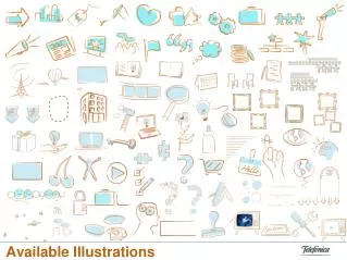
Illustrations • Attract the eye • Use them to carry a message • Not just for decoration • Provide labels and a caption if needed
Illustrations • Can be clearer than photo • Less distracting detail • Can show things that are not real
Illustrations • Easy to label • Cheap to reproduce • Need to find artist

