Hanel, Germany
What do you think these cartoons are saying?. Hanel, Germany. J. Gathorpe-Hardy. DTM and Population Pyramids Revision. Demographic Transition Model. Population Change. Outputs. Inputs. Deaths. Births. Natural Increase. Total Population. Emigrants. Immigrants. Migration.

Hanel, Germany
E N D
Presentation Transcript
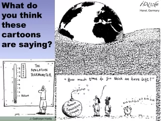
What do you think these cartoons are saying? Hanel, Germany J. Gathorpe-Hardy
DTM and Population Pyramids Revision
Demographic Transition Model
Population Change Outputs Inputs Deaths Births Natural Increase Total Population Emigrants Immigrants Migration The total population of an area is the balance between 2 forces of change: natural increase and migration Natural increase is the balance between birth rates and death rates
Doubling Time This map shows how long it will take for countries to double their population if it continued to grow at the present rate
Demographic Transition Model Stage 1 Stage 2 Stage 3 Stage 4 Total Population Natural Increase In Population Natural Decrease In Population Birth Rate Birth Rate Death Rate
Stage 1High Fluctuating • Low population • Increasing very slowly • High birth rate • High death rate • Ethiopia/Niger • UK: pre-1780 Stage 1 Birth Rate Death Rate Total Population
Reasons for Stage 1High Fluctuating • Little access to birth control • Many children die in infancy so parents have more to compensate • Children are needed to work on the land • Some religions encourage large families • Death rates are high due to disease, famine, poor diet, poor hygiene, little medical science Stage 1 Birth Rate Death Rate Total Population
Stage 2Early Expanding Stage 2 • Population growing at faster rate • High but decreasing birth rate • Decreasing death rate • Sri Lanka/Bolivia • UK: 1780-1880 Birth Rate Death Rate Total Population
Reasons for Stage 2Early Expanding Stage 2 • Improvements in medical care • Improvements in sanitation and water supply • Quality and quantity of food produced improves • Transport and communications improve movements of food and medical supplies • Decrease in infant mortality Birth Rate Death Rate Total Population
Stage 3Late Expanding Stage 3 • Population, still increasing, but rate of increase slowing down • Decreasing birth rate • Low death rate • Uruguay/China • UK: 1880-1940 Total Population Birth Rate Death Rate
Reasons for Stage 3Late Expanding • Increased access to contraception • Lower infant mortality rates so less need for bigger families • Industrialisation and mechanisation means fewer labourers required • As wealth increases, desire for material possessions takes over the desire for large families • Equality of women means they can follow a career rather than just staying at home Stage 3 Total Population Birth Rate Death Rate
Stage 4Low Fluctuating Stage 4 • High population, almost stable • Low birth rate • Low death rate • Canada/USA • UK: post-1940 Total Population Birth Rate Death Rate
Reasons for Stage 4Low Fluctuating Stage 4 • Rates fluctuate with ‘baby booms’ and epidemics of illnesses and diseases • Reasons for Stage 4 have improved and it stabilises Total Population Birth Rate Death Rate
Demographic Transition Model Stage 1 Stage 2 Stage 3 Stage 4 Total Population Natural Increase In Population Natural Decrease In Population Birth Rate Death Rate Ethiopia/ Niger UK: pre-1780 Sri Lanka/ Bolivia UK: 1780-1880 Uruguay/ China UK: 1880-1940 Canada/ USA UK: Post-1940
Is there a Stage 5? ? ? ? Stage 5: Depleting Population
Problems • What problems do you think there could be with the model? • It does not include the influences of migration • It assumes that all countries will go through the same pattern • There is no time scale • Reasons for birth rates and death rates are very different in different countries • And finally, is there a stage 5?
Population Pyramids • The population structure of a country is how it is made up of males and females of different ages. • The common method to show the structure is by a population pyramid. • This diagram is made up by putting two bar graphs (one for male, one for female) side by side. • From this you can read off what percentage of a population is of a certain gender and age range.
Developing Countries • This population pyramid is wide at the base, which means there is a large proportion of young people in the country. • It tapers very quickly as you go up into the older age groups, and is narrow at the top. • This shows that a very small proportion of people are elderly.
Developed Countries • This shape is typical of a developed country. • It is narrow at the base, wider in the middle, and stays quite wide until the very top, as there is a sizable percentage of older people. • Note that there are more old women than men.
Ever-Changing Populations UK Population – 1995-2050
Different Population Pyramids Stage 2 Stage 3 Stage 4 Stage 5
Population Sketches Stage 2 Stage 3 Stage 4 Stage 5
Demographic Transition Model Population Pyramid Model • Drawn as a line graph • Doesn't show male and female populations • Shows total population as a separate line • Gives details of countries in stages • Shows the relationship between birth and death rates and how these affect total population • Only one diagram necessary to show all stages • Drawn as a bar graph • Shows male and female population proportions • Total population is shown as the total area of the graph • Shows greater detail about the populations at each stage • 4/5 diagrams necessary to show all stages Differences between Models


