Understanding Demographic Transition: Birth and Death Rate Changes Over Time
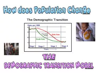
This graph illustrates the demographic transition, showcasing changes in birth and death rates over time, represented by red and green lines, respectively. It depicts four key stages of population change, highlighting how these rates affect total population growth. The birth rate is shown as a dotted line, the death rate as an unbroken line, and the total population as a dashed line. Explore how various regions, including LEDCs and MEDCs, fit into this model and what these changes mean for populations globally.

Understanding Demographic Transition: Birth and Death Rate Changes Over Time
E N D
Presentation Transcript
The red line shows how the BIRTH RATE has changed and the green line shows how the DEATH rate has changed. DEMOGRAPHIC TRANSITION – literally means how population has changed and that it is passing through stages of change. This axis shows numbers of both births and deaths so birth rates and death rates. The green and red lines are drawn from this axis. The area in the middle shows how much the population has grown. This axis shows that the change in population is over time and over time it passes through 4 stages.
What is different about this one? It has a TOTAL POPULATION LINE.
So what happens during STAGE ONE? WHY? Remember on this graph the dotted line is birth rate, the unbroken line is death rate and the dashed line is total population.
So what happens during STAGE TWO? WHY? Remember on this graph the dotted line is birth rate, the unbroken line is death rate and the dashed line is total population.
So what happens during STAGE THREE? WHY? Remember on this graph the dotted line is birth rate, the unbroken line is death rate and the dashed line is total population.
So what happens during STAGE FOUR? WHY? Remember on this graph the dotted line is birth rate, the unbroken line is death rate and the dashed line is total population. http://www.geographyalltheway.com/ib_geography/ib_population/ib_demographic_transition_model.htm
So how does the world fit into this? Rainforest Tribes Sri Lanka China Japan Sweden? (LEDC’s) (MEDC’s)