Tips for Creating a Seamless Mobile-Friendly Website
30 likes | 53 Vues
Discover essential tips for designing and developing a seamless mobile-friendly website. Learn how to optimize your website's layout, navigation, and content for a smooth mobile user experience. Enhance your online presence and engage mobile visitors effectively with these expert insights.

Tips for Creating a Seamless Mobile-Friendly Website
E N D
Presentation Transcript
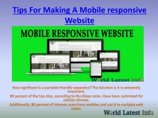
Tips for Creating a Seamless Mobile-Friendly Website In today's digital age, having a mobile-friendly website is crucial to stay ahead of the competition. With the increasing use of smartphones and tablets, it's important to create a website that not only looks great but also functions flawlessly on all devices. Here are some tips for the best mobile-friendly website development: 1.Use a Responsive Design: A responsive design automatically adjusts to the size of the screen it's viewed on, providing an optimal experience for the user. This means that your website will look great and be easy to navigate on any device. 2.Keep it Simple: Avoid cluttering your website with too much information or unnecessary features. Keep the layout clean and easy to understand, with a focus on user experience.
3.Optimize Images: Large images can slow down your website and negatively impact the user experience. Make sure to optimize all images for the web, compressing them without sacrificing quality. 4.Test on Multiple Devices: To ensure your website looks and functions properly on all devices, test it on various smartphones, tablets, and desktops. 5.Focus on Page Speed: A fast-loading website is crucial for both user experience and search engine optimization. Make sure your website loads quickly by optimizing images, reducing HTTP requests, and using a Content Delivery Network (CDN). Responsive websites are good for SEO because they provide a better user experience, leading to longer time spent on your website, lower bounce rates, and higher engagement. Google also favours mobile-friendly websites, making them more likely to appear higher in search engine rankings. At 33technologies, we provide the best mobile-friendly website development in Brisbane and Brendale. Our team of expert developers uses the latest technology and design principles to create websites that look great and function flawlessly on all devices. We offer a range of web development services, including custom website design, eCommerce development, and website maintenance. Our goal is to help businesses of all sizes succeed online by creating websites that not only look great but also provide a seamless user experience. If you're looking for top- quality website development in Brisbane, look no further than 33technologies.
In conclusion, having a mobile-friendly website is essential for any business that wants to succeed in today's digital age. By using responsive design, optimizing images, testing on multiple devices, focusing on page speed, and working with expert developers like those at 33technologies, you can create a website that not only looks great but also functions flawlessly on all devices, providing a seamless user experience for your customers.