Top 10 Tips to Create a Mobile Friendly Website
30 likes | 160 Vues
Mobile friendly websites are evolving and we recommend paying attention to the nitty-gritty of creating mobile-friendly websites. Read more @ http://www.webguru-india.com/blog/top-10-tips-to-create-a-mobile-friendly-website/

Top 10 Tips to Create a Mobile Friendly Website
E N D
Presentation Transcript
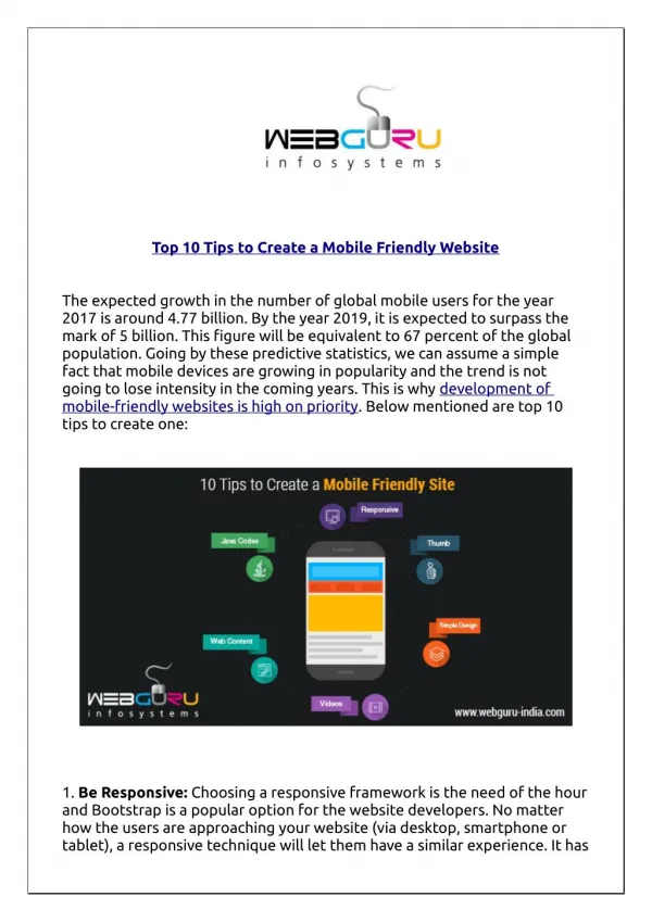
Top 10 Tips to Create a Mobile Friendly Website The expected growth in the number of global mobile users for the year 2017 is around 4.77 billion. By the year 2019, it is expected to surpass the mark of 5 billion. This figure will be equivalent to 67 percent of the global population. Going by these predictive statistics, we can assume a simple fact that mobile devices are growing in popularity and the trend is not going to lose intensity in the coming years. This is why development of mobile-friendly websites is high on priority. Below mentioned are top 10 tips to create one: 1. Be Responsive: Choosing a responsive framework is the need of the hour and Bootstrap is a popular option for the website developers. No matter how the users are approaching your website (via desktop, smartphone or tablet), a responsive technique will let them have a similar experience. It has
SEO benefits, could be easily managed and you need not have to separate the mobile URL. 2. Think with your Index Finger or Thumb: The site should be completely navigable using the index finger or the thumb. Users should be able to browse your site with their ‘phone hand’ only. In addition, the font size should be optimized so that the users need not pinch it to zoom in. 3. Keep a Simple Design: The short attention span of net users is notoriously famous and uninterrupted attention span is just 1.0 second. Thus, it is better to keep a clean and simple design and web content, which can instantaneously convey the core message. 4. Keep a Short and Attractive Web Content: The main thing is to present your story in minimum words and in an interesting manner. To engage the users’ attention, add only the essential copies to keep them engaged till the last sentence. 5. Focus on the Icon Design: Keep your site uncluttered and instead of using words, use conventional mobile icons to convey the instruction messages like ‘to make a call’ or ‘connect socially’. 6. Enhance the Speed with Optimized Images: The speed of the mobile web is slower than its cable-powered cousin. In U.S., it is 6.5 Mbps in general. Thus, it is better to strip down your site with heavy media files. Replace the bulky libraries such as jQuery Mobile with standalone codes of JavaScript. Replace the retina-ready images of desktop version with its lower resolution version. 7. Balanced Utilization of Java Codes: It is better to avoid too much JavaScript because it runs in different manners across different devices and browsers. 8. Easy Access to your Contact Info: Objective of a mobile website should be clearly portrayed at your site. For example, when you are running your business from multiple locations, your priority should be to provide the users with the addresses of your multiple stores; its opening and closing hours; booking or contact numbers and nearest location of the business. 9. Wise Addition of Videos: It is a good practice to add videos to mobile websites. This is because the mobile device users are 3 times more likely to watch video clips in general. The video player must support HTML5 version so that the clips would run on most of the devices. 10. Mobile Friendly Form Designs: Best practices of HTML and CSS will
help you to make your contact form mobile friendly. CSS styling allows for sufficient wiggle room around the form input fields and helps design button elements which are finger friendly for smart phone users. The different attributes of HTML5 aids in mobile user experience. For example, the placeholder attribute guides the user as to the kind of data that must be filled in the form. HTML5 comes with autocorrect and autocapitalize features that help to capitalize the data in the form entry field. Additionally, HTML5 form features are supported by different browsers used in Andriod phones and iOS Safari. Using these simple HTML and CSS codes can help to design mobile friendly forms for websites optimized for the mobile experience. You can compensate the number of form fields with the inbuilt technology of mobile devices. For example, as GPS is easily accessible through a mobile device, it is useless to ask for the city or state name and the ZIP code. Keeping in mind the aforementioned 10 tips, you can develop a wonderful mobile-friendly website. However, you can add more features to enhance the user experience. You can read the full blog: http://www.webguru-india.com/blog/top-10-tips- to-create-a-mobile-friendly-website/ -------------------------- WebGuru Infosystems Email ID: enquiry@webguru-india.com Phone No.: +91-33-40200844 Mobile No.: +91-9831159354 Visit Us: http://www.webguru-india.com Stay Connected Via: https://www.facebook.com/webguruinfosystems https://www.linkedin.com/company/webguru-infosystems-pvt--ltd- https://twitter.com/webgurutweet