Descriptive Statistics
Descriptive Statistics. Summarizing qualitative data Summarizing quantitative data. Summarizing Qualitative Data. The frequency distribution The relative frequency distribution The percent frequency distribution The pie graph The bar graph. Frequency Distribution.

Descriptive Statistics
E N D
Presentation Transcript
Descriptive Statistics • Summarizing qualitative data • Summarizing quantitative data
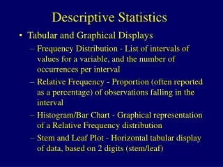
Summarizing Qualitative Data • The frequency distribution • The relative frequency distribution • The percent frequency distribution • The pie graph • The bar graph
Frequency Distribution The objective is to provide insights about the data that cannot be quickly obtained by looking only at the original data. A frequency distribution is a tabular summary of data showing the frequency (or number) of items in each of several nonoverlapping classes.
Marada Inn Example Guests staying at Marada Inn were asked to rate the quality of their accommodations as being excellent, above average, average, below average, or poor. The ratings provided by a sample of 20 guests are:
Using Excel’s COUNTIF function to construct a frequency distribution Formula Worksheet Rows 9-21 not shown
Relative Frequency Distribution • The relative frequency of a class is the fraction or proportion of the total number of data items belonging to the class. • A relative frequency distribution is a tabular summary of a set of data showing the relative frequency for each class.
Percent Frequency Distribution • The percent frequency of a class is the relative frequency multiplied by 100. • A percent frequency distribution is a tabular summary of a set of data showing the percent frequency for each class.
Using Excel’s COUNTIF function to construct a frequency distribution Value Worksheet Rows 9-21 not shown
Relative Frequency andPercent Frequency Distributions Relative Frequency Percent Frequency Rating Poor Below Average Average Above Average Excellent 10 15 25 45 5 100 .10 .15 .25 .45 .05 Total 1.00 .10(100) = 10 1/20 = .05
Using Excel’s COUNTIF function to construct a percent frequency distribution Formula Worksheet Rows 9-21 and columns A-B are not shown
Using Excel’s COUNTIF function to construct a percent frequency distribution Value Worksheet Rows 9-21 and columns A-B are not shown
Bar graph • These are used to display qualitative data. • On one axis (usually the horizontal axis), we specify the labels that are used for each of the classes. • A frequency, relative frequency, or percent frequency scale can be used for the other axis (usually the vertical axis).
10 9 8 7 6 5 4 3 2 1 Bar Graph Marada Inn Quality Ratings The bars are separated to emphasize the fact that each class is a separate category. Frequency Rating Excellent Poor Average Above Average Below Average
… continued Using Excel’s Chart Wizardto Construct Bar Graphs Step 1 Select cells C1:D6 Step 2 Click the Chart Wizard button Step 3 When the Chart Type dialog box appears: Choose Column in the Chart type list Choose Clustered Column from the Chart sub-type display Click Next > Step 4 When the Chart Source Data dialog box appears Click Next >
… continued Using Excel’s Chart Wizardto Construct Bar Graphs Step 5 When the Chart Options dialog box appears: Select the Titles tab and then Type Marada InnQuality Ratings in the Chart title box Type QualityRating in the Value (X) axis box Type Frequency in the Value (Y) axis box Select the Legend tab and then Remove the check in the Show Legend box Click Next >
Using Excel’s Chart Wizardto Construct Bar Graphs Step 6 When the Chart Location dialog box appears: Specify the location for the new chart Click Finish to display the bar graph
Soft Drink Demonstration Note: Excel file contained on text CD (Chapter 2--Softdrink
Pie Chart • The pie chart is a commonly used graphical device for presenting relative frequency distributions for qualitative data. • First draw a circle; then use the relative frequencies to subdivide the circle into sectors that correspond to the relative frequency for each class. • Since there are 360 degrees in a circle, a class with a relative frequency of .25 would consume .25(360) = 90 degrees of the circle.
Pie Chart Marada InnQuality Ratings Excellent 5% Poor 10% Below Average 15% Above Average 45% Average 25%
Soft Drink Demonstration Note: Excel file contained on text CD (Chapter 2--Softdrink