Repetition
Repetition Visual elements, such as colors, pictures, shapes, etc. should be repeated throughout. This will make the design flow and bring a cohesiveness to the overall work. Repetition works to: Bring consistency Strengthen sense of recognition for reader. Alignment

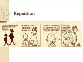
Repetition
E N D
Presentation Transcript
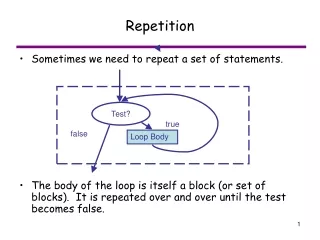
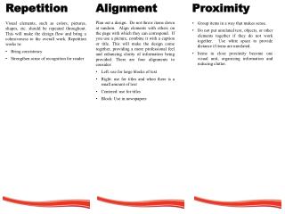
Repetition • Visual elements, such as colors, pictures, shapes, etc. should be repeated throughout. This will make the design flow and bring a cohesiveness to the overall work. Repetition works to: • Bringconsistency • Strengthensenseofrecognition for reader • Alignment • Plan out a design. Do not throw items down at random. Align elements with others on the page with which they can correspond. If you use a picture, combine it with a caption or title. This will make the design come together, providing a more professional feel and enhancing clarity of information being provided. There are four alignments to consider: • Left: use for large blocks of text • Right: use for titles and when there is a small amount of text • Centered: use for titles • Block: Use in newspapers • Proximity • Group items in a way that makes sense. • Do not put unrelated text, objects, or other elements together if they do not work together. Use white space to provide distance if items are unrelated. • Items in close proximity become one visual unit, organizing information and reducing clutter.
FontFamilies • When deciding on a font, combine contrasting types to emphasize importance and to make it more interesting. Simply choosing a serif and sans serif font is not enough. Apply options that will enhance the difference. Add feature: make the text bold or italic, all caps or all lower-case. Where you want attention drawn, make the text stand out in one way or another. Do not over do it, though. Stick to only two variations of font to keep the piece from becoming chaotic. • There are two major font families: • Serif: Font with a “foot” (such as Times) • Sans serif: Font without a foot (such as Arial) • Other fonts such as Apple Chancery are fun fonts and can be difficult to read. C. R. A. P. Basic Principles of design Created By: Megan Ogi • ContrastWhen designing, do not apply multiple elements with similar qualities. Keep them the same or go for the extremes. Some elements to watch out for include: • Color • Size • Line thickness • Space • These are are just a few elements to keep an eye out for. If the elements are not the same, then make them very different. For example, make big items bigand small itemssmall.