Principles of Design in Art: Mastering Color Variety and Harmony
310 likes | 424 Vues
Learn about color principles in art and design, including hue, value, intensity, warm vs. cool colors, and color combinations. Explore the use of color in famous artworks by Pablo Picasso, such as Guernica and Les Demoiselles d'Avignon.

Principles of Design in Art: Mastering Color Variety and Harmony
E N D
Presentation Transcript
Color Review Color Quiz TOMORROW!
Principles of Design – Concepts that govern how artists organize the Elements of Art THE PRINCIPLES OF ART/DESIGN Harmony Variety Economy Movement Proportion Balance Emphasis
Variety in art refers to the use of contrasting or different types of Elements in a work of art. Using Variety adds interest.
Variety creates… • Contrast – extreme or pronounced variation
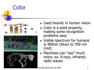
Color – the visual response to the wavelengths of sunlight identified as hues
Hue • Hue designates the common name of a color and indicates its position on the spectrum or on the color wheel.
Primary Colors • Red, blue, and yellow comprise the three primary colors. • The preliminary hues that cannot be broken down or reduced. These are the hues from which all other colors on the spectrum can be made.
Secondary Colors • Orange, violet, and green are the secondary colors. – • a color produced by mixing two primary colors.
Intermediate Colors – colors resulting from mixing a primary and a secondary color. (Red-orange, red-violet, yellow-orange, yellow-green, blue-green, blue-violet) Notice the primary color is always listed first… red-orange, yellow-green, blue-violet
Warm Colors • Warm, or advancing colors, are those that resemble fire and heat. Red, red-violet, red-orange, and yellow-orange are examples of warm colors. • Warm colors appear closer and are more eye catching than cool colors.
Cool Colors • Cool, or receding colors, are associated with peace and calm. Blue, blue-green, and blue-violets represent cool colors. • Cool colors in a composition tend to visually recede and look smaller. They are not easily seen from a distance.
Intensity – the saturation or purity of a hue. A vivid color is high intensity and a dull color is low intensity.
Local Color – the color as seen in the objective world (green grass, blue sky, red barn) Local Color Not Local Color
Complementary • Complementary color: two colors directly opposite each other on the color wheel. A primary color is complementary to a secondary color. (Red and Green, Blue and Orange, Violet and Yellow)
Value Value is the lightness or darkness of a hue achieved by adding white, gray, or black. • Tint - adding white to a hue • Shade – adding black to a hue Tint
Split Complementary • A color and two colors on either side of its complement.
Monochromatic • Monochromatic: colors having only one hue; The complete range of color from white to black.
Color is one of the most expressive elements in art because its quality affects our emotions directly. When we view a work of art we do not have to rationalize what we are supposed to feel about its color; we have an immediate, emotional reaction to it.
Color begins with and is derived from light. • Where there is light there is some color. • Where there is no light there is no color.
Pablo Diego José Francisco de Paula Juan Nepomuceno María de los Remedios Cipriano de la Santísima Trinidad Ruiz y Picasso (1881 – 1973) • born in Malaga, Spain Home where he was born
ABSTRACTION • “The process or result of generalization by reducing simplifying the information content of a concept or an observable phenomenon “ - - Wikipedia IN ART – Abstraction Means To: • Simplify, reduce and/or rearrange imagery in a composition
best known for co-founding the Cubistmovement (with Georges Braque) • Cubism: • objects are broken up, analyzed, and re-assembled in an abstracted form • the artist depictsthe subject from multiple viewpoints
went through a “Blue Period” in his art after the death of a friend The Old Guitarist 1903, oil on Panel And Femme aux bras Croises 1902
Blue Period” was followed by a “Rose Period” as he was coming out of his depression Boy with a Pipe, 1905
Les Demoiselle d’ Avignon • Oil on Canvas; completed in 1907 • Cubist style • Influenced by African Masks • Controversial – originally rejected by the art world
Guernica – painted for the World’s Fair - 1937 • depicts the bombing of Guernica, Spain by Germans during the Spanish Civil War