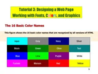
BASIC COLOR REVIEW
BASIC COLOR REVIEW. TIRADIC COLOR. Although the number of possible colors is infinite, we generally recognize the color wheel as having 12 colors These 12 colors are divided into three groups that include those primary, secondary, and intermediate colors


BASIC COLOR REVIEW
E N D
Presentation Transcript
TIRADIC COLOR • Although the number of possible colors is infinite, we generally recognize the color wheel as having 12 colors • These 12 colors are divided into three groups that include those primary, secondary, and intermediate colors • The system used to organize these is known as a TRIADIC COLOR SYSTEM • Colors are spaced equally on a color wheel • Yellow is at the top because it is the lightest value
TIRADIC COLOR PRIMARY TRIAD
TIRADIC COLOR SECONDARY TRIAD
COMPLIMENTARY COLOR • The further apart colors are, the more contrasting they are • Colors directly opposite each other are called COMPLIMENTARY COLORS • The compliment of any color is the combination of the other two colors in its triad.
TERTIARY COLOR • When a color is mixed with its compliment, it becomes neutralized and grayed • These colors are called TERITARY COLORS • Tertiary colors are also created by mixing two secondary colors • Tertiary colors are Maroons, Browns, Olives, and other mixes of all three primary colors in odd proportions.
NEUTRAL COLOR • Not all pigments contain perceivable color and look mostly achromatic • These colors appear to be on the gray spectrum and include black and white • We call these colors in pigment NEUTRALS
PHYSICAL PROPERTIES OF COLOR • HUE: Synonymous with COLOR • TINT: The result of a hue mixed with white • SHADE: The result of a hue mixed with black • CHROMATIC VALUE: The range from tint to shade of any hue • HIGH-KEY COLORS: Hues with added TINT • LOW-KEY COLORS: Hues with added SHADE • VALUE is extremely important in working with color. • HUE alone cannot do all the work.
PHYSICAL PROPERTIES OF COLOR • INTENSITY: the quality of light in a color, differentiating a brighter appearance from a duller one, or a color with a high degree of saturation or a neutralized color. • Color at its highest intensity is considered to be closest to the purest color because it has maximum light on it to see it at its most clear.
PHYSICAL PROPERTIES OF COLOR • It does NOT mean how white a spot on a surface has become with the maximum amount of light put on it. • It is NOT a highlight alone…
PHYSICAL PROPERTIES OF COLOR • It is the point BEFORE the color becomes blown out with highlights…
COLOR RELATIONSHIPS • TERTIARY COLORS: • When compliments are mixed together, three primaries are combined – because all colors are the product of primary colors and complimentary colors have one of the same primary colors and one of their own, making the total number of colors three. • The product of all three primary colors coming together are Tertiary colors.
COLOR RELATIONSHIPS • ANALOGOUS COLORS: • Colors that appear next to each other on the color wheel • They have a very harmonious relationship because three or four neighboring hues always contain one common color that unifies the group • Analogous colors can occur at the highest intensity group as well as more neutralized color groups
COLOR RELATIONSHIPS • MONOCHROME COLORS: • Tints and Shades that are all of the same Hue • There is no color change in monochrome work • Focuses mostly on the chromatic value range of a color
COLOR RELATIONSHIPS • COLOR TEMPERATURE: • All colors can be classified as WARM or COOL colors • RED, ORANGE, YELLOW and other colors associated with the sun and fire are considered warm colors • BLUES, GREENS, VIOLETS and other colors associated with water and sky are considered cool colors
COLOR RELATIONSHIPS • HUES can have a warm or cool sub-temperature… • Here is a warm blue:
COLOR RELATIONSHIPS More:
SIMULTANEOUS CONTRAST • Colors on their own might look completely different when placed next to another color…
SIMULTANEOUS CONTRAST • THE RULE OF SIMULTANEOUS CONTRAST: whenever two different colors come in to direct contact, their similarities seem to decrease and their dissimilarities seem to increase
SIX WAYS OF USING COLOR • To give spatial quality to the pictorial field: • Color can supplement and show its own value differences to give a plastic sense of depth
SIX WAYS OF USING COLOR • To create mood or symbolize ideas:
SIX WAYS OF USING COLOR • To communicate emotions:
SIX WAYS OF USING COLOR • To attract attention:
SIX WAYS OF USING COLOR • To organize a composition:
SIX WAYS OF USING COLOR • To identify objects in a composition:
Composing 3D Forms in 2D Space ELEMENTS OF COMPOSITION
COMPOSITIONAL TECHNIQUES • There are numerous approaches or "compositional techniques" to achieving a sense of unity within an artwork, depending on your objectives for the work. • For example, a work of art is said to be aesthetically pleasing to the eye if the elements within the work are arranged in a balanced compositional way. • However, there are artists such as Salvador Dalí whose sole aim is to disrupt traditional composition and challenge the viewer to rethink balance and design elements within art works.
RULE OF THIRDS • The rule of thirds is a helpful guideline for placing elements of a composition. • The objective is to stop the subject(s) and areas of interest (such as the horizon) from bisecting the image, by placing them near one of the lines that would divide the image into three equal columns and rows, ideally near the intersection of those lines.
RULE OF ODDS • The "rule of odds" suggests that an odd number of subjects in an image is more interesting than an even number. • Thus if you have more than one subject in your picture, the suggestion is to choose an arrangement with at least three subjects. • An even number of subjects produces symmetries in the image, which can appear less natural for a naturalistic, informal composition.
RULE OF ODDS • An image of a person surrounded/framed by two other persons, for instance, where the person in the center is the object of interest in that image/artwork, is more likely to be perceived as friendly and comforting by the viewer, than an image of a single person with no significant surroundings.
RULE OF ODDS • An image of a person surrounded/framed by two other persons, for instance, where the person in the center is the object of interest in that image/artwork, is more likely to be perceived as friendly and comforting by the viewer, than an image of a single person with no significant surroundings.
RULE OF SPACE • The rule of space applies to artwork (photography, advertising, illustration) picturing object(s) to which the artist wants to apply the illusion of movement, or which is supposed to create a contextual bubble in the viewer's mind. • This can be achieved, for instance, by leaving white space in the direction the eyes of a portrayed person are looking, or, when picturing a runner, adding white space in front of him rather than behind him to indicate movement.
SIMPLIFICATION • Images with clutter can distract from the main elements within the picture and make it difficult to identify the subject. • By decreasing the extraneous content, the viewer is more likely to focus on the primary objects. • Clutter can also be reduced through the use of lighting, as the brighter areas of the image tend to draw the eye, as do lines, squares and color. • In painting, the artist may use less detailed and defined brushwork towards the edges of the picture.
BALANCE • Balance is arranging elements so that no one part of a work overpowers, or seems heavier than any other part. • Balance also works to create significant hierarchies of elements in the work to bring attention to the works’ focal point. • The three different kinds of balance are symmetrical, asymmetrical, and radial.
SYMMETRICAL BALANCE Symmetrical (or formal) balance is when both sides of an artwork, if split down the middle, appear to be the same.