Download
1 / 5
50 likes | 419 Vues
2008 Color Expressions – Graphic Design. Engineer of Possibilities Reason / Description

E N D
Engineer of Possibilities Reason / Description The role of the graphic designer has evolved beyond one medium and they have become engineers of possibilities. Designers must be more strategic to respond to complex multi-platform customer needs. Designers are facilitating the possibilities and providing collaborative results. The designer guides the correct direction and destination while allowing the customer/client to determine their unique story. Here are the font choices, here are the colors, here are the icons…you are stage-directing it from behind the scenes. We design the map to get from here to “Main Street”. Limit their choices but give them choices.
Clarity – Clear Message Reason / Description A clear message is the basic principle of communication graphics and brand messaging. Simplicity and readability. Visual Relief. Trust. Authenticity. Provide authentic solutions. Walking the Talk Using clear iconography that represents a standard of compliance or responsibility with in product and/or company, how and where do you present the message as simply and clearly as possible. Truth in message and brand promise, under claim but over deliver. Don’t claim what you can’t deliver. Visual Relief: the importance of “white space” to the clarity of message, un-clutter the message. Reaction to information overload. Singular imagery. Clean, classic, concise use of color. Black & white with one singular color. Simplify copy, fewer words with concise meaning. Return to classic refinement. Beautiful sophistication. Use of non-serif lowercase fonts.
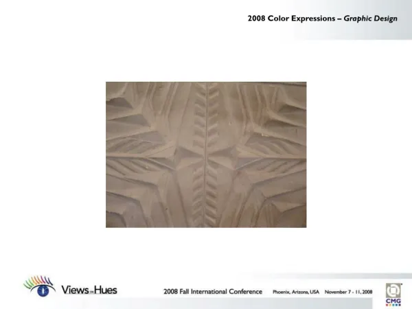
Luminosity and Dimensionality Reason / Description Logos, iconography, fabrics and architecture are all using dimension and illumination Logos, symbol marks and icons are visually 3-dimensional even if they are printed as flat graphics. Shading, depth, dimension, use of pleating and angles to create depth and light reflection. Textile designers are creating dimensionality and luminosity in fabrics through the use of textures, luster contrast, contrasts of scale. Light reflection and refraction can create a sense of illumination. Architect Zaha Hadid’s work show cases illumination and dimensionality. “Pleated” architecture mimics pleated fabrics. Dimensionality is obviously important in packaging. Illumination also related back to clarity.
Color Consistency Reason / Description Challenge of color, design and brand consistency during the translation from print to web, to recycled sustainable materials, digital proofing, digital printing, as well as, lighting and monitor calibration issues. There are serious cost and waste considerations for maintaining color consistency and rejecting production. When do you accept less than perfect because of sustainability, timing or cost issues. Whose responsibility is the waste? Is the product still sellable, even if it is not what I intended (from a color consistency standpoint)? Accepting the compromise of HTML. Adapting typography, color and design.