Design Decisions for My Music Magazine
70 likes | 161 Vues
Learn about the color and font choices I made for the front cover, double-page spread, and contents page of my popular music magazine. Discover the results of student feedback and how I integrated the most preferred options into my design.

Design Decisions for My Music Magazine
E N D
Presentation Transcript
Front Cover Colour choice 1 I asked 20 media students what colour choice for my front cover they would prefer. I decided I wasn’t going to use anymore than four colours, the rule of three applies in majority of magazines so that it doesn’t look too busy and disorganised. However a fourth colour is usually used in small amounts, for example white or black text will usually be seen on a magazine so I decided I would include a fourth colour that I will only use a small amount of on my front page. I have included black and white in all three of my choices because they stand out against all other colours, for example if I want text to be seen against a black background I can colour it white. Results Out of the 20 students that I asked 14 chose colour choice 1, 5 chose colour choice 2 and 1 person chose colour choice 3. Therefore I will include the colours from colour choice 1 on my front cover as it was the most popular choice. To do this I will have to consider the colour clothing the model for my photograph is wearing, the background colour, the masthead colour, text colour ect.. Colour choice 2 Colour choice 3
Double Page Spread Colour choice 1 I asked the same 20 students what colour choices they would prefer to see on a double page spread, I showed them a rough mock up of what I wanted my double page spread to look like and then asked which colours they thought worked well together but would still match the genre of my music magazine (popular). As it is a double page spread majority of the text on the page will be black which is why i have included it in all 3 choices, although i have shown white in all three choices as well I am unsure as to whether i will use the colour yet as I don’t know if it will be seen above the purple/grey or blue background, i have decided i only the text will be black, i will not use it as a background colour as it might make the magazine more associated to rock than pop. Results 8 people chose colour choice 1, 10 people chose colour choice 2 and 2 people chose colour choice 3. Although colour choice 2 was the most popular, I may have to reconsider colour choice during the production stage as I am still unsure on whether the colours will work well together. Colour choice 3 Colour choice 3
Contents Page I decided that I didn’t want to include many colours on my contents page. Because it is an informative page I want to keep it as clear and organised as possible, I've decided that several of the images on my contents page will be in black and white so it is mainly the important text that will be in colour, hence why I've only decided to include one prominent colour in my choices, the other two choices are black and white. Although the page will only have one prominent colour I will make sure I include a lot of it in the right places so that it isn’t a plain page. Results Out of the 20 people asked, 5 people decided colour choice 1 was the best as it would relate back to the front page, 10 people said choice 2 as the red will link back to the masthead, and 5 people said choice 3 was the best. Therefore colour choice 2 will be the colours i will include in my contents page.
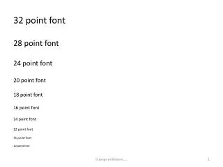
Font Choice Results
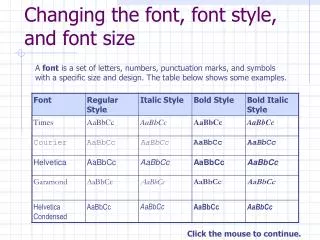
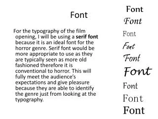
Front Page, DPS and Contents I have decided that throughout my whole magazine I will use the same fonts, this shows continuity but it also follows the rule of three. I will only be using three fonts on each page but I thought that using the same three fonts on all pages will make my magazine seem more organised. I want both serif and san serif fonts, the san serif fonts will be for large amounts of text, so that it is clear to read. It will also be used for additional information text. The serif fonts however will be used for titles and subheadings, this gives an element of class to the magazine. Although i have chosen to focus on Pop for my magazine genre i do not want to follow the stereotypical idea of pop. I do not want to aim my magazine at anyone younger than 17 therefore i will make sure that the conventions appeal to an older audience, including the serif fonts.
I asked 20 students which font choices they think worked the best together and which would be suitable for a popular music magazine, I gave examples of where I would use the fonts in my magazine if I were to choose them. Overall 12 people chose the first group of fonts, 5 people chose the second group and 3 people chose group 3. Therefore i will use the fonts in group 1 for my magazine. Music Magazine – Times New Roman Music Magazine – Felix Titling Music Magazine - Arial Music Magazine - Calibri Music Magazine – Brush Script MT Music Magazine - Verdana Music Magazine – Angsana New Music Magazine -Castellar Music Magazine – Goudy Old Style