Download
1 / 15
150 likes | 258 Vues
This evaluation details the creation of a British-themed music magazine, including its front cover, contents page, and double-page spread. The process was documented using WordPress, showcasing research, planning, and creative ideas. Key elements included audience feedback, use of Photoshop and InDesign for design, and consideration of visual appeal. The magazine targets a middle-class demographic aged 16-37, with content focusing on both British and non-British music themes. Artistic direction and technical skills developed throughout the project are also highlighted.

E N D
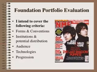
Foundation Portfolio Evaluation. By Lauren Hookings
Introduction • The task set was to create and complete a front cover, double page spread and a contents page of a music magazine. We had the choice of genre, style, photos and articles to put in the magazine but had to be a music magazine. • While creating the magazine we had to document our progress on an online blogging site called Word Press www.wordpress.com • The blog allowed us to show the research, planning and ideas we had for our magazines.
Audience • Males and Females • Primary16-26 • Secondary 27-37 • Middle class and lower middle. • Rock, old and new bands.
Developments of my magazine • Questionnaire • Research • Sketches • Audience feedback
Developments of my Magazine 1. My idea for a British themed music magazine came from an American themed NME issue. Also as you can see the mast head GMM is modelled on NME. 2. My sketch followed the forms and conventions of a front cover with the mast head up the top so readers can see it in a shelf the rule of thirds and above the fold. 3. I then went out and took photos. I had my models lie down on a union jack and I took it from a bird eye view. 4. Then using Photoshop I enhanced the colours of the flag, made the models black and white and variety of other tweaks. I didn’t use Indesign for my front cover because I didn’t have massive amounts of text to organise. I used Photoshop.
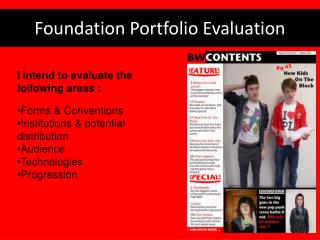
Developments of my Magazine • Researched contents pages. Choose this contents from Q magazine as a bases because I like it simple but effect style. • Sketched the layout • Using Indesign I created the page. As you can see the layout differs from my original sketch this is because in my opinion and in audience feedback they preferred the photos in the middle and text surrounding. However forms and conventions from the Q contents is still visibly present. Contents Page
Developments of my Magazine Double Page spread 1.I took was researching double pae spreads to find out common forms and conventions. I choose to base my spread on this spread from Kerrange. 2. I made a sketch of my spread to get the layout. 3. Choose my photo and wrote my article on Microsoft word first then I placed it Indesign. 4. Using photoshop edited picture and made another page that fitted the background of the photo so they blended together and used Indesign to create the layout of the spread.
Forms and conventions Mast Head and brand Two shot medium close up. Tagline Sell lines Hook point Gaze Column inch Caption Barcode
How my front cover targeted my audience. • The models are a similar age to my audience and there are both male and female models. • The colour scheme of black, white, blue and red is attractive and common colours. • The text is bold and New Times Roman which is professional so shows the audience it is a well produced magazine.
Technical skills • Photoshop. I already knew how to use this software from other projects however I improved my skills through making the magazine. • Indesign. This was a brand new software to me. I found it very useful in setting out my layout. • Digital Cameras. I have used camera’s before but I improved my skills for instance using the macro button also how different angles and positions can give off different connotations. • Blog. I never used a blog before but I found it very useful in viewing and organising my work. Would defiantly use it again.
Photo shoots • I did 3 photo shoots so that there are a variety of shots, models and angles in the magazine. • My theme for the magazine was Britain therefore used the union Jack in many of my photos also other iconic objects like the mini. • I also took some photos without the British theme so that the contents page had a variety of photos and shows the audience that some articles aren't all British themed.
Institutions andpossible distributions • I priced my magazine at £2.50. I think this is a reasonable price because it is not cheap or expensive so it targets my audience of the middle class. • Articles in magazine were on my theme. However I also advertised other non-themed based articles. • Pictures. Photos were both of male and female artists therefore appeal to both genders. Models are relatively young 16-26 which is my target audience age range. • Colours of my magazine are bright and would stand out on a magazine rack therefore attract more readers to buy it. • I believe that my magazine could have its own website like most music magazines so that the reader can enter competitions online or provide feedback and email us on articles they want to see.
Social Representations • My magazine is for the middle and lower middle class. The magazine represents this social group because of the straightforward language and the use of common colloquialisms. • In addition my magazine advertises gigs and music stores therefore the audience who buy this magazine would have spare money aside to spend on these luxuries.
My Progression • Use form and conventions of other magazines to make mine look more professional. For instance above the fold. • Improved skills on photoshop enabled me to experiment more and achieve better results for instance the colour balance tool made the union jack stand out. • Take care and time in the presentation of my work on the magazine also on my blog and keep to deadlines. • Research and sketch before attempting to start a magazine page.
Conclusion • Overall I am pleased with the outcome of my music magazine. If I had more time I would of taken comments from audience feedback and make changes to the pages based on the comments.