Note to presenters
This interactive presentation demonstrates the Stroop effect, illustrating common frustrations with user interfaces. Engage your audience by having them call out the colors of words, not their meanings, to provoke humor and frustration. Use this experience as a springboard to discuss the challenges and contradictions in interface design, emphasizing the importance of audience-awareness among designers. Consider language and projection differences when presenting, and explore further resources like "The Design of Everyday Things" for deeper insights.

Note to presenters
E N D
Presentation Transcript
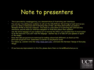
Note to presenters • This is provided by csunplugged.org, as a demonstration of frustrating user interfaces. • You can use it by asking your audience to call out the COLOUR (not the writing) of each word as you put it up. After a humourous and frustrating time of that, ask them what button you press in Windows XP/98 to stop the computer. This leads to a discussion of frustrating and contradictory interfaces, and the need for interface designers to think more about their audience. • Use the native language of your audience (or to reverse the effect, you can show how it’s much easier to do the exercise if you can’t read the language – another way is to take off your glasses or squint at the image). • Note that data projectors are notorious for making colours look different, so check out the particular projector first. Sometimes it’s better to use physical cards. • For follow-up, consider sites like http://www.useit.com/, and books like Normans “Design of Everyday things”. • If you have any improvements to this file, please share them via tim.bell@canterbury.ac.nz
The Stroop effect... EnglishChinese SvenskJapaneseKorean
The Stroop Effect (English)