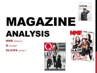
Foundation Production Magazine Analysis
Foundation Production Magazine Analysis. THE ARTISTS AND YOUR AUDIENCE. The bands involved in the magazine are young which will attract a younger, more stylish teenagers like the stylish bands on the front cover.

Foundation Production Magazine Analysis
E N D
Presentation Transcript
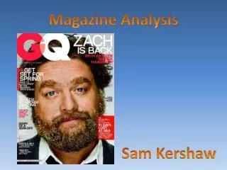
THE ARTISTS AND YOUR AUDIENCE • The bands involved in the magazine are young which will attract a younger, more stylish teenagers like the stylish bands on the front cover. • The bright eye capturing use of colours help to convey to the audience the magazine is exciting and interesting. The different colours represent the different information, bands and stories within the magazine. • The target audience social group is emo’s/scene kids. This is because due to my research music is an important part of life to this social group and that scream/metal/rock music is their type of music to be listening to. • The title of the magazine ‘Scream Scene’ represents ‘Scream’ music for ‘Scene’ kids. My title will let people know the type of music and the type of target audience. SCREAM SCENE
TARGET AUDIENCE Teenagers – scene kids/emo’s Demographics • Usually between the ages of 13 and 18 • usually go to local shows have extremely tight groups. • there for the music but usually they are there for the social time. • conforms to the current trends promoted by the punk/Goth/emo/hardcore music genre. • is expressing themselves through the music they listen to and make and the clothes they wear. Products they might consume: • black Hair dye • Eyeliner • eye shadow (sometimes and is usually pink) • plug in the ear. • lip piercing • black t-shirt with a random band • skinny jeans • converse • checked slip on shoes. • Tattoo • Bandana in hair. • Bows are popular • Music
SEMIOLOGY The message encoded within this picture is stating the fact that a popular, stylish, band member ‘Elliot Carter’ is now a vegetarian. Teenagers often comply with the trend s promoted by their favourite magazine's and artists- their ‘idols’. The magazine is promoting that he is a vegetarian- he is a popular successful music artist who is admired by many fans. He may influence his bands to become vegetarian's due to them wanting to copy him due to his talent, success and popularity. I researched what interests my particular audience (scene kids) , other than Screamo music, such as style, clothing, social scene, hobbies, likes and dislikes. The bright colours give off a positive effect. The bright colours are eye capturing- helps to attract my particular audience. Due to my research I learnt that Scene kids mostly wear bright neon colours. Each colour gives the magazine variety as each colour gives off a different feel to the magazine. The red colour mixed with the pink, gives off a warmth, loving, passionate effect. But the red could also give off a more dangerous and edgy effect, but mixed with the pink creates innocence. The black and purple colours portray the darker sides to the magazine as these colours are promoted mostly by the emo/punk trends. the yellow and green colours help make the magazine appear brighter, but also give us as the audience a sickly feel. The green colour gives of a jealousy effect giving us as the audience the idea that the stories inside may not all be positive- creating interest. I chose to reflect smoking. This is because I want my magazine to come across as rebellious, but also a harmless and innocent effect. This reflects some of the life's of my target audience. Smoking and drinking is popular with the scene kid scene, but the bows in their hair give off the idea that really they are harmless and innocent. I want these teenagers to feel as though the magazine relates to them as it is exactly what they are into.
Costume This costume was effective in communicating an emo theme due to the black colours and lack of bright clothing. This costume helped show the bands interests and influences, which may be interest fans. This costume was effective in communicating the bands beliefs as just because they a rock stars they due not all comply with the trashy ‘live with on the edge’ style of a rock star. The checked pattern of the shirt is a popular style with the emo scene. It could also represent the bands believes. It could be a metaphor- creating a chess board- representing that life a game and should not be taken so seriously. The fact that in this picture he is wearing a ‘Enter Shikari’ t-shirt also helps to identify the bands influences and current music interests.
Costume The stripy clothes help show the current trends of emo/scene kids. She is wearing a ‘My Chemical Romance’ t-shirt (the most popular emo band in the world) which suggests that she is into the emo fashion and style, suggesting that what she wears is current and popular. This costume helped to communicate clearly my target audience do to the style and colours of the clothing. Studded belts, colourful braces and scarf's and popular within the emo scene. This also gives the target audience the idea of style that is currently in fashion for emo/scene kids. This costume has many different patterns; stripped, skulled, studded and checked, giving a ‘mixed emotion’ effect. The pink tutu gives off a cute girly look whilst the skulled tie and checked pattern suggests a more edgy and dark look.
CONVENTIONS OF LAYOUT, OF FONT, OF COLOUR, OF LAYOUT, OF LANGUAGE, OF STYLE, OF POSE Contents page analysis The larger picture of the girl laughing gives the magazine a happy and more positive effect. Whereas the photo below is more a serious (a band member practising guitar- taking music seriously). This suggests that a larger percentage of the magazine is positive, happy and fun but that it does contain serious elements to it e.g. Dan Benson admits his addiction to speed.
Double page spread analysis I decided to write an extract on his passion for song writing as fans will gain more respect for a band knowing that they write their own music. Fans will be interested in where his great songs come from, and perhaps the meanings of the lyrics and whether or not they really relate to his and the bands lives. I decided to write an issue on a popular famous and role model for many teenagers, to become a vegetarian. Many people and fans may be interested in this wanting to know his views so that perhaps they will agree and change to be like him. But will this be down to true belief? Or simple copying their role models. This title ‘Dan Benson admits his addiction to speed’ creates tension and interest with the readers due to the fact that sometimes drugs are referred to as ‘speed’. People may think he is addicted to drugs- interesting them greatly on how he became this way. In fact the issue is about his addiction to driving fast. A double meaning is created.
Front cover analysis I decided to cross over both titles to give off an ‘X marks the spot’ effect. Suggesting that Scream Scene is a prize to be won due to its excitement and interesting stories. It could also give off a danger effect due to the X meaning end. Giving off the more emo side to the magazine. This creates edginess, suggesting the magazine is not as happy and cheerful as it may seem It also gives off the look of a bow (hair accessory) which is popular within the style of my target audience – scene kids. ‘London gets louder may interested the audience due to the bright eye capturing bold capital letters. People may want to know why London is getting louder and may buy the magazine to find out. I chose to use this picture as I felt that it helped convey a mixture of feelings . The location is in a dark alley way giving off a rebellious teenage girl effect attracting an older more rebellious audience. But the pink tutu and blue bows in their hair help to give off a more innocence and cute effect attracting more young stylish teenagers. I chose to use the picture representing Past Sundown’s new album. The album cover suggests love and jealousy due the green and red colours. He also appears standing behind a curtain, suggesting that he is about to perform. It could suggests that is hiding away, and wants something that he cannot reach. Nervousness. r
In many of my pictures I noticed that all my models for my magazine are looking away from the camera, making no eye contact what so ever with the camera. My intension was not for them to look away, I did not give any orders as where to look so that I was able to first improvise and evaluate what worked and what didn’t. As my pictures were ment to be of emo/scene kids and of course emo stands shortly for ‘emotional’, looking away from the camera gave off a shy and insecure feel. Therefore looking away worked well with my magazine.
EMO SUBCULTURE • A big part of teenage subcultures today is the music aspect of it all. The emo subculture is a combination from the punk rock and the hardcore tendencies. The name emo comes from emotional hardcore and its roots are in Washington in the middle of 80s. For founders of the emocore tendency could be shown Rites of Spring, Embrace and Rain. The sadness, the love, the sense of guilt is the basic topic in the lyrics of emo music. The values, expressed through the music, consist in emotional topics, often associated with the despair,, the broken heart, the hope and the self hatred. • The dangers emo subculture... • The emo subculture has become extremely successful with many teenagers today. But unfortunately not all aspects of being ‘emo’ are positive. The values and the beliefs of the emo culture preaches are extremely dangerous the most for the health and for the life of the young people. But here it is not about alcohol and cigarettes, but for something more dangerous and frightening, called suicide. Emo’s promote suicide as a way of escaping your problems, seeing it as a cure. It is seen they take their lives as a way of fighting the problem, believing that after death they shall go to a better world. This pose is done quite deliberately to give off a deathly effect. The head is tilted to one side and the tongue shows the idea of how you make look after death, but in a more exaggerated way to create humour. The black and red colours represent blood and death. The magazine in no way attends to promote death and suicide but only to reflect on emo values and styles to relate more to the teenage scene/emo kid audience. The black star creates a more stylish, fashionable cute look the emo scene, representing their dreams. Emo’s hold hopeful attitudes about life but take to much emphasis on the positive aspects of life, disregarding what is good. Stars, hearts and other symbols are popular with the emo scene as they incorporate this into their clothing to create meaning in everywhere e.g. Hearts represent death and broken hearts- love, and the stars' represent their hopes and dream being destroyed, causing them to become depressed which links with he idea that emo’s are self-harmers and can be suicidal.
In this photo I decided that we would be directly looking at the camera to see what sort of message this created to my audience and whether it worked well with the message and themes of my over all magazine. I felt that looking straight at the camera made things seem more serious and tense. Almost as if we are saying ‘look at us’. The pout is a predictable, common teenage girl pose, giving teenage girl readers the idea that we are just like them. The swinging on the bar effect gives off a young childish effect. This lets the audience know that we are fun, energetic band. In this photo are all are tilting our head to the side- this was to create an attitude effect. The hand to the wall gives off an angry rebellious effect, whilst the hand to her head gives off a more innocent effect.
CAMERAS COMPUTERS AND PROGRAMMES The technologies enabled me to create a full magazine with different fonts, create manipulated pictures and use a variety of colours. This helped me in communicating my correct message to my target audience in different ways- through font, title and pictures. There is a lot of choice of technologies, software and programmes that we can use to develop and create our magazine. The large amount of choice, makes it more difficult to choose due to the variety- making the magazine production take longer. We are too dependent on digital technology. Without it we would not be able to manipulate easily. It would be much more time consuming. With out digital technology the pictures within magazine would have to be much more real. The media doesn’t want to generally show ‘real’ – photo shopping, air brushing.
Title I liked this idea for my magazine title as the black gave off a confident, edgy, dark, deathly effect which was the right type of meaning I wanted to convey. I digitally manipulated the title by making the ‘a’ and ‘n’ bigger- as though they are explosive- representing scream music- as it is very louder. I used small spikes on the end on the edges of the words to give off a dangerous effect, reflecting on emo’s self- harming and dangerous/deathly life values. I decided to change my title as I did not feel it was bright enough and eye capturing to attract my particular audience. I used a red colour to still give off the deathly effect, but used a pink to show the magazine is not only deathly but also has positive happy sides to it. I felt that my first title was also more hard to read, it could not be simple glanced unlike my second title, which is much clearer to read. Although the black and pink colours are quite similar, I do not think that the red writing stands out clear enough with contrast against the pink background. Therefore I will change the background to red in order to communicate the emo values, but change the text to a more bright colour to reflect upon the happier more positive views such as a yellow or a green. This will create a good contrast with the two colours helping the text to stand out clear. SCREAM SCENE! SCREAM SCENE!
Stages of development I decided to add a picture of someone looking towards the side, as though looking at another page of the magazine due to its exciting and interesting information. The picture of him looking away also created an emotional, camera shy effect. The green and blue colours mixed well together, due to their contrast, making it clear in difference of the two sections. I then decided to add another picture as I felt that the magazine was now having too much of a serious effect, so I put in a picture of a girl laughing to indicate to the audience that the magazine is also funny, fun and entertaining. I decided to out the contents sign down the left hand side of the magazine as I was able to make it large and bold to make it stand out to the viewers, but also not taking up too much space of the contents page. I decided to change the bottom picture to a more serious picture as now I felt that the contents page seemed to happy, fun, colourful and exciting and lacked a serious passion for music. There were no darker colours in the magazine to reflect upon the more deathly, emo side to it. So I decided to put in a red back ground picture.
I decided to go with a green checked pattern. Checked shoes and shirts are very popular within the emo scene therefore the magazine may appeal to them. ‘Rawer’ would communicate to them that it was a scream magazine due to the sound it makes. The block red title communicated death and blood due to the red colour. Letting the audience know it is a magazine for emo kids. I made a choice to combine both a lighter and more fun effect to the magazine with a darker more emo effect. I mixed the reds and pink’s and blues together. This created a more mixed feeling towards the magazine, creating question over it. The red, black and dark blue colours created a negative effect, whilst the pinks, greens and yellows created a more positive effect. I decided that my magazine was looking to emo and serious, so I decided to give it a lighter effect, using pinks, yellows and blues. The picture helped to communicate attitude to the audience due to the poses and metal bars.
As the pink writing in the title was not clear enough to be seen within the red block behind, I decided to put in another clearer title on top of it, as though I have put clear emphasis on the title of the magazine to show its importance.
I used a lot of white writing as I felt that this writing was clearest on top of the red background. But I soon felt that the white writing was boring and repetitive and did not help in showing the different stories so I then decided to start make each story a different colour so that the reader was aware and was not kept bored, as they can see there are different things to be read. I decided to use different colours so that my magazine did not lack the variety, edgy effect. I decided that each title for a different story o issue within the article was the same colour so that it was clear to the audience what the section was (a story or issue). I decided to not use a large picture in the middle as I decided that picture were not my main focus. I wanted to now communicate a message and meaning to my audience through the writing and what the band member as actually talking about to see if it is only pictures that influence teenagers to comply to new trends, or whether it is people’s values and beliefs as well.
Elliot Carter goes vegetarian ‘I don’t think its right the way animals are tortured. I watched a clip of how KFC produce their food and I was almost SICK! I can’t stand it. How would you like it if that were you? I won’t be a part of that cruelty.’ I decided to use the idea of being ‘vegetarian’ within my magazine. My teens after hearing the issue on Popular artists and ‘Hottie’ Ollie Sykes becoming a vegetarian, many ‘scene’ and ‘emo’ girls and boys ‘agreed’ his view and also went vegetarian. This interested me greatly as I questioned whether they truly agreed with his views or were just creating a new trend for emo’s and scene kids; to become vegetarian’s. I wanted to incorporate this idea into my magazine, to create parallels between ‘Elliot Carter’ and Ollie Sykes and to convey a double meaning to the audience. Bring Me The Horizon front man Oli Sykes has become the new face of animal rights organisation PETA2. The singer became vegetarian in 2004 after seeing an online documentary about animal cruelty online. "I actually decided to go veggie after I saw a video on PETA2's website," Sykes told Kerrang!. "When I saw how animals are tortured on factory farms, I couldn't justify being a part of that cruelty. I thought, 'Imagine if that were me'. Straight away, I said, 'That's it - I'm going vegetarian'." The singer, who is "thrilled" to be the new face of PETA2, previously raised funds for the charity by designing a T-shirt for his Drop Dead clothing line sporting the slogan 'Meat Sucks'. "I did the design myself," says Sykes. "We wanted to do a shirt for a charity and PETA2 is a great cause. It ended up raising a few thousand pounds for them, which I think they appreciated!"
Interview for double page spread I decided to talk about the image that the bands create for their fans as this will interest the audience as they may want to know why it is that they are really dressing this way and the kind of style and message that their cloth designer wanted to truly communicate. I wanted my readers to see the bands point of view as to why they try to create a certain style for their fans and to think to themselves and question why they dress this way and how influenced they are my their idols and favourite bands. I want my audience to see that its not all about communicating a particular message but mostly just for fashion and creating a new style, keeping the fashion life fresh and interesting by create new exciting looks for a particular subculture. I want them to know that they shouldn’t listen to music just for the style, popularity and attention from certain types of people. So how does the fact that Elliot here has become the poster boy for part of this generation of teenagers make you feel? That he is selling vast amounts of t-shirts from his ‘Love animal’s’ design company. Dylan: I suppose he’s doing really well with that. It’s good that band doesn’t only have music talents, but also other sorts. Are you trying to create a new image for kids and your fans? Elliot: It doesn’t matter if you don’t have an image or you do. It’s all down to the music at the end of the day. You certainly have a striking hairstyle and large number of tattoos for a young man that claims that image doesn’t matter. You appear to have spent an awful amount of time and money on your image. Elliot: Everyone keeps saying I’ll regret it at some point. To be honest I probably will. I like my life at the moment, I’m happy with the way I look. I’m having the time of my life so I might as well do everything I want to do and worry about it later. Sean: We often have to justifying ourselves to the press for the things we do that might go against society or our beliefs. Some of you fans are being accused of only going to shows, to show off their new hairdo rather than as a mark of genuine appreciation for their music. How do you feel about this? Matt: People shouldn’t pay to see music if they don’t really like it.
Overall I have learnt that every single idea you change you make to you wok and magazine means something, conveying something different each time to the target audience. Every aspect and piece of detail within a magazine as been thought though carefully to communicate something to the audience. It is important to consider the meaning of everything you see within your magazine and that everything has been put there for a specific reason and is never random.